Imagine a user who is ready to sign up for your site. They go to your form and enter their information. The way you align your field labels affects how quick users can fill out your form.
Do you want to provide users with a painless experience or do you want to give them a hassle? If you want to make their experience quick and easy, use top aligned labels on your form fields.
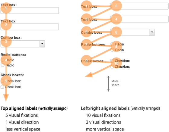
Top aligned labels are faster and easier to fill out than left and right aligned labels. This is because top aligned labels only need half as many visual fixations. Top aligned labels also allow users to move down the form in one visual direction. Left and right aligned labels require two visual directions to fill out.
The only drawback with top aligned labels is that they can make the form long. But users are scrolling more often these days, so this isn’t a problem. By reducing the whitespace between fields, you can decrease the form length. You can also break the form up into multiple pages to make the form shorter.
The difference between top and left/right aligned labels is clear. Top aligned labels are easier on the eyes and make forms easier to fill out. Although they can make the form longer, users will benefit more from the less time and effort it takes to complete it.
If top aligned labels can give users a better experience with forms, it’s worth adopting. Designers should think more about their field label alignment. It can make the difference between users completing a form or abandoning it.
Book

Affiliate

“Top aligned labels have proven to be faster and easier to fill out than left or right aligned labels”
Hi, thanks for the post. Could you point me to any links that demonstrate the above quote? I’d be interested to see how big the effect is between top-aligned and right-aligned.
Thanks!
AC
Came across this which might be useful
http://www.slideshare.net/lukew/web-form-design-best-practices
Remember the 2000 election Florida ballot foo-raa?
That was essentially a problem with horizontally-aligned labels.
And at that, they weren’t even correctly aligned:
http://jerz.setonhill.edu/design/usability/use-ballot.htm
As that web site points out, although the Democratic candidate was the second option on the left hand side, the matching bubble was the third one down, because bubble #2 went to the Reform party, listed on the right hand side.
Thanks for the insight. I didn’t know that. 2000 was so long ago I can’t remember if I voted or not.
I agree with this article, but
“In fact, by reducing the font size of the labels and the white space between fields you can decrease the form length.”
… is a bit obvious, no?
I like this site though. Good work.
“This is because top aligned labels require twice as less visual fix a tions than left or right aligned labels.”
This is terrible sentence structure. It weakens the argument and causes cognitive dissonance.
How about you try “half as many” rather than “twice as less”.
This is really interesting. Have you actually a/b tested it?
Looks like I’ve got some forms to redesign…
Twice as less?
Is there any empirical evidence for this or is it just your opinion?
Any empirical evidence for this claim?
What about the approach of an inline label/value pair (a la iOS)? Those seem to accomplish the best of both worlds. Easy label/value correlation and minimum vertical space. These also lend themselves to nice chunking if you have different sections in your form.
While there’s no question that usability wise top-aligned labels are better, the tradeoff is that the form doesn’t “look” as good. I suspect this is to blame, in big part, for the prevalence of the left-aligned label layout.
There’s also mobile to consider, where the rules are a little different – for example, there’s simply not enough real-estate to left-align labels (good), but to avoid scrolling you are limited to a fewer fields (bad). As you suggested, splitting the form into multiple pages is one solution.
As always, A/B testing is invaluable – try different versions and see which performs bestter. You can’t optimize what you don’t measure.
There’s something ironic about this posting and the way your comment form is setup, with the labels to the right of the input boxes.
I’ve read conflicting reports on this issue. Ones that actually include eyetracking data, rather than just guesses!
First, I read an ACM article saying the same thing as you have here. Only issue is that it was done with just 11 subjects, so it might not be the most valid.
I have read on Jakob Nielsen’s blog and elsewhere that the difference between the two is negligible. He backed it up with some studies they’ve done.
So I don’t think this issue is as clear cut as you make it out. Even so, it would be helpful if you cited some of the other research on the subject!
The concept is sound. Do you have any supporting data for this? Reports? Studies? A/B tests? Proof?
At least make up some numbers so that we can feel that what you say is more than opinion. 🙂
(example rebuttle: Many languages read left->right)
Good tip!
It’s kind of funny how your comment form is right aligned.
“top aligned labels require twice as less visual fixations than left or right aligned labels.”
dude. “twice as less”? please never say that again. please. “half as many”. see how much nicer that is? “half as many”. seriously.
Another advantage of forms with Top Aligned Labels:
Localization
Forms designed this way are much easier to localize. Since the field labels are often longer in other languages, there’s plenty of white space for the label to expand into.
Great advice. I am guessing using columns of fields would negate some or all of the benefits of top aligned labels.
Ironically your labels are right aligned for the comment form.
Wondering if there’s a sweet spot here between actual quickness and appearance. Doesn’t matter if the forms are quicker to fill out with a top label if users are less likely to fill them out because they seem long.
Good question. I’ve wondered that myself. If they’re interested in what the site offers, but the form looks long I think they would still fill it out, but they would procrastinate. People procrastinate even online.
… yet the comment form for this blog uses right aligned labels… 2 steps worse than top aligned 😉
I presume the irony of this comment form had not escaped you 🙂
I understand that with side-by-side forms, the eye-activity is significantly higher, and thus might help speed users along. I wonder, however if that directly correlates to the user’s ability navigate the _meaning_ of the form and its questions. Do you know of any studies done that have looked at the way a form is laid out compared to how quickly the user _understands_ what they are being asked, not just how quickly their eyes can traverse it?
I imagine that this may be quite variable across cultures and languages, but I have no first-hand data myself. Just curious.
Thanks for your post!
[edit]Sorry, I meant _vertical_ forms are more quickly scanned (in the first sentence). The question stands, however.[/edit]
“Top aligned labels have proven to be faster and easier to fill out than left or right aligned labels”.
I didn’t see a link- do you have a source for this? I’m curious what the study / experiment / whatever found, how much faster it is, etc.
Hi
Interesting post which, although simplifying things, makes some great points. For example, another great reason to have labels above fields is that it allows for translation into other languages.
You might be interested in quantitative research that was done in 2006 regarding this topic and published in both UXmatters (http://www.uxmatters.com/mt/archives/2006/07/label-placement-in-forms.php) and Luke Wroblewski’s book Web Form Design (http://www.rosenfeldmedia.com/books/webforms/).
I’ve also written on the topic at a little more length: http://formulate.com.au/articles/alignment/.
Cheers
Jessica
I agree with the thesis presented here, but I’d like to see some studies or statistics (or even heat maps!) that this is the case.
Thanks for the article. I’ve been thinking about the best ways to design forms so this is helpful. It just makes sense too.
“Top aligned labels have proven to be faster and easier to fill out than left or right aligned labels.”
What evidence do you have that backs up this statement? I deal with a few big enterprise web apps where I’m at and many attempt to mimic a desktop ui. These particular apps are data-driven more than content driven and more often than not the data elements are left-aligned. This is pretty typical of many “enterprise” web apps that I’ve dealt with.
Further, we’ve also toyed with left-justifying versus right justifying. I’m partial to left-aligned/left-justified, but a good number of users have voiced a preference for left-aligned/right-justified. Following this latter format also naturally results in less travel from label to control – roughly the same amount as your top-aligned example. Given that many cultures tend to read left-to-right anyway I’d be surprise to find that the top-aligned is more effective or preferred for anything other than smaller comment forms on a blog.
Very interesting. Have you measured this in any way?
thanks, good points, I will try this style for forms in future.
Yes, it is easier to read and fill this way. But then, on a wide screen display you get a lot of space on the sides which then puts the designer to wonder if he should opt for a left-labeled field design.
When testing such a form design for our CRM software, some ppl with wide display screen sent feedback that the screen looks half empty! And those who accessed the prototype in their mobile devices did not complain anything!
Interesting, but your diagram example relies on left-aligned text labels to create a gap between the label and the control. Right-aligned text labels would largely eliminate this gap.
By “have proven” do you mean empirically proven with a reference?
Yet this blog using right align label for the comment form, maybe to scare away visitor from leaving a comment or slow them down 🙂
Oops.. Never thought about these things. Thanks. Will try it.
“require twice as less”
Did you mean half as many?
What about putting the label inside the box and setting it so that the label goes away once the user has entered any text?
The problem with that approach is that the label goes away. That may work well with login forms, where everyone knows that you have to input your username and password, but on longer and more complicated forms the labels should be displayed.
“twice as less”? Ouch.
Interestingly, your comment form has right aligned labels 🙂
While I agree with the reasoning of this article, I would strongly encourage the use of citations to support claims that one method is bigger/faster/stronger over another.
Where are the references to support the claim that: “Top aligned labels have proven to be faster and easier to fill out than left or right aligned labels” ?
This is good stuff. agree. it makes complete sense. the natural movement of the eye would be downwards only, in the case of forms.
Great article.. But what about the fact of putting labels inside inputs which are, from my point of view, more efficient in terms of lisibility ??
Interesting article, how does this compare to labels inside/on top of the text field? (placeholder text to describe the field’s function)
That seems to reduce the vertical length considerably and it feels intuitive to simply click into the field/or onto the placeholder text to begin entering information.
Very informative article, your diagram turns your argument into a “why didn’t I think of that” moment.
I was just talking this over with my colleague, who suggested that using your thinking, labels being inside inputs would then make completing a form even faster?
I also wondered how using a 2 column layout for your form would change the outcome, even if you used top aligned labels.
Cheers for the read!
This is magic of series: black is negative color, links should be blue and underlined.
Have you carried out any eye-tracking experiments on this? Fixations usually have the duration of some milliseconds. Compared with the actual typing this is next to nothing. I doubt that there is a measurable benefit.
Consider using top aligned labels for your commenting form fields.
Thanks for the well thought out article.
I recently decided that left aligned labels are very complex – they lead to complicated HTML, CSS, etc, and they also are not easy to read.
For those who are interested, this was the result:
http://www.drobo.co.nz/drobo/configure
The main form is at the bottom of the page. I was trying to achieve something clear and easy for people to follow. I think it is generally successful.
Form looks good but I noticed that the Quantity and Totals columns are right aligned. When browsers are set wide onscreen it makes for a far movement of the eye. Also from a design standpoint, the item headers like “Enclosure” probably would do better without the underlining as it looks to be clickable but isn’t.
The forms look great. Not so sure about the quantity information up the top – might be good to restrict the width (I am viewing on a 1200 wide monitor) and right align the item descriptions. Thanks for sharing
Another approach of right aligning form labels is the fastest one where labels are right aligned and text boxes are left aligned make user to fill form more quickly than ever.
http://www.tutkiun.com
I agree and would tend to prefer vertical both as a user and designer. Still, how much faster, 0.01 seconds? Would a typical user be cognitive of that extra effort? Not enough to make a blanket statement here – I think good designers can still choose left/right.
Very interesting and clearly described. Just to play devil’s advocate I would make 3 points. The first two are mentioned in Caroline Jarrett’s 2008 paper “Label Placement in Forms – What’s Best?”
1. If you make the form look long, it certainly can be a big deal – some people will not bother with it.
2. When people look at a form laid out in a grid, they often scan down the list of fields before doing anything, to see what they are going to be asked. It’s much harder to do this with vertically-aligned headings because of the dissonance between text labels and form controls.
3. Although I realise that people can read short words with only one eye movement, and so the diagram does look plausible, most text labels are longer than in the example. People in Western cultures are used to reading from left to right, and if their eyes are moving along a left-right axis in order to read the label anyway, doesn’t it feel more comfortable to continue that into the form field?
Very well put Nick.
As is often the case, it all depends on the lenght, content-type and purpose of the form. I think Luke Wroblewski did a great job in his book classifying the different label-placement-options according to it’s use and context.
Yet the fields on this comment box are right aligned?
Yup a very good practice what you preach observation.
Great post. Not sure I agree with everything. But it was very well thought out.
Hey, that’s a nice observation. I used to try designing the forms with top-aligned labels, that’s what I always used to do.
Thanks for taking the time to explain it clearly.
What are the 3 visual distractions counted in the diagram?
I don’t disagree, but I would like to see the studies. Is there a higher rate of completion/submission? How much higher? Difficult to take this to clients as more than mere opinion unless I have data to back it up. Thanks for sharing.
good tips 🙂
Great post!
Are top-aligned labels still a helpful when users fill out a form once, then periodically return to it to check certain info? For example, a profile page on a social networking site listing name, email address, phone number, etc. etc. Can users find the info they’re looking for just as easily with top aligned labels?
It’s faster but I think the left aligned label looks more beautiful than the vertical aligned form 🙂
… fortunately there are far more beautiful things on the web than forms
I found this article to be very interesting and informative. I would like to discuss this topic with the UX people in my company, however I notice that there are no sources listed for your claim that “top aligned labels have proven to be faster and eas ier to fill out than left or right aligned labels.” If there is any research available on this topic I would be most interested to read it, and it would strengthen your argument.
Also, in the first paragraph you wrote “twice as less”, but “half as many” might be easier to read.
Thank you very much for your informative article.
I thought I also read this in the book ‘Eyetracking Web Usability by Jakob Nielsen” Which is a great read.
How about a study to back this up?
Do you have some test data to back this up?
I understand that it makes sense, but what seems logical doesn’t always prevail with users.
I agree with Nick. Most users find such forms messy.
It works nice with small forms though.
I prefer right aligned form labels with short label texts.
label text [ Input 1]
label text 123 [ Input 2]
Great to see some close attention for web forms.
@Nick de Voil: thanks for mentioning my 2008 paper, which is available from the ACM Digital Library. There’s a summary of the same points in this online article: http://www.usabilitynews.com/news/article3507.asp
@Jennifer R: you’re right, users do react strongly to the visual appearance of forms. My current advice is to use any sensible arrangement of the labels that looks harmonious to you, and then test it with your users.
Others have mentioned data. The main source for the advice that putting the labels above the forms is quicker is the research done by Mario Penzo, reported in UXmatters.com in 2006.
It’s a good piece but be careful with it: he was testing particularly simple forms, where the eye-movement around the form is an important element in the overall time to complete. If your forms are more complex, or your users are less confident about giving their personal data on the form, or there are any other complicating factors, then it could be that labels above the fields will work for you – or more likely, not.
best
Caroline Jarrett
I agree with those who’d like to see the data / studies first. While your theory looks good on paper (nice graphical chart, too!), I’m just not buying it as more than one persons’ theory, not based on any actual fact to back it up.
Great post, simple yet effective layout adjustment.
I agree with Jones, it would be cool to see some A/B test data. It’s hard for me to guess which way layout would lead to faster fill-ins but I think it will hinge on the form-fillers’ experience with forms.
Another factor: the side aligned labels are closer together, which would make it quicker for form fillers who click on each text box. (pro form fillers use the TAB button).
Also, a lot of form fields are universal and people may just skip reading them out of habit.
[citation needed]
By the way, I find it interesting that the labels for the reply form for this blog are on the right. 😉
Good logical post. On the other side, label inside the UI control would also save the space
Wow, I can’t believe I never really thought about this before. Great writeup.
Even in this era of the web where “the fold” doesn’t mean much anymore, the golden rule that never fails during my A/B testing is that the exact same form with one extra field always results in less conversions. For example, a simple three-field form that asks for name, email, and comments will convert better than the exact same form where the name field is split into first and last name fields.
I interpret this phenomenon as meaning that the longer a form looks at first glance, the less likely the user is to fill it out. After all, no one is going to fill out two fields then leave because there are a whole two fields to go – these users are lost before they ever start to fill out the form.
So with that in mind, I would recommend using left (or right) aligned labels for short forms, such as this very comment form that I’m filling out now (which does have the labels right aligned), or even the example form in this article. Any time you are presenting a user with a form that they aren’t likely to fill out (again, like this one – every blog visitor is served this form, but only a small few will use it), you’ll want it to look as small as possible.
On the other hand, longer forms such as a finance or job application should definitely use the top aligned labels. In these cases, the user is not likely to be put off by the length of the form – they already know they are going to spent 5-10 minutes filling it out, if not longer.
Just my two cents. I like that your article recommends taking this into consideration rather than applying it blindly to all forms. never seen this site before, but you can bet I’ll be subscribing. 🙂
Cheers.
Caroline mentioned Matteo Penzo’s study – the original article Matteo wrote about the study is here: http://www.uxmatters.com/mt/archives/2006/07/label-placement-in-forms.php
He also comments on some recommendations made by Luke Wroblewski about both the label placement and also the label formatting (bolding the labels when they are positioned above the input field helps them stand out from the background). Luke’s recommendations are here: http://www.uxmatters.com/mt/archives/2006/07/label-placement-in-forms.php
I agree with many of the comments here – it’s very dependent on the individual situation. Length, frequency of use, familiarity of fields, incentive for filling the form out… it all contributes.
Besides, a good designer will be testing their designs, right?
Cheers,
Ian
It’s also useful to note that this pattern also puts you in a better situation for localization for other languages.
The main thing is to try to keep the submit button above “the fold”. Much like an add to cart button, users will look for the button to complete a form and if a form looks too long, they won’t bother. Especially the older generation.
In fact, if you will look at almost all paper forms, the entry fields are ABOVE the text labels. This is what the older generation is used to. Tealeaf studies were done on a web shopping cart at a company I used to work for and we found that many people had a hard time completing a credit card form because they didn’t know where to put the numbers. It was quite interesting.
A very good article going more into detail is here:
Web forms design guidelines: an eyetracking study