What interface component would you use for selecting options from a large list? For most designers, checkboxes come to mind. But a long list of checkboxes looks intimidating to users and can cause them to abandon your form. Not only that, but checkboxes aren’t efficient or easy to use because they take up space, offer small tap targets, and increase the number of visual elements to manage.
A better component for option selection is toggle tokens. Toggle tokens conserve screen space, so you have room for more content, and users don’t have to scroll. Checkboxes require vertical stacking, but toggle tokens allow for both vertical and horizontal stacking. This creates a compact arrangement that looks less intimidating to users.
It’s possible to arrange checkboxes in columns, but this isn’t optimal for mobile given the combined widths of checkboxes and text labels. Even on desktop it’s not ideal due to the large width space it occupies.
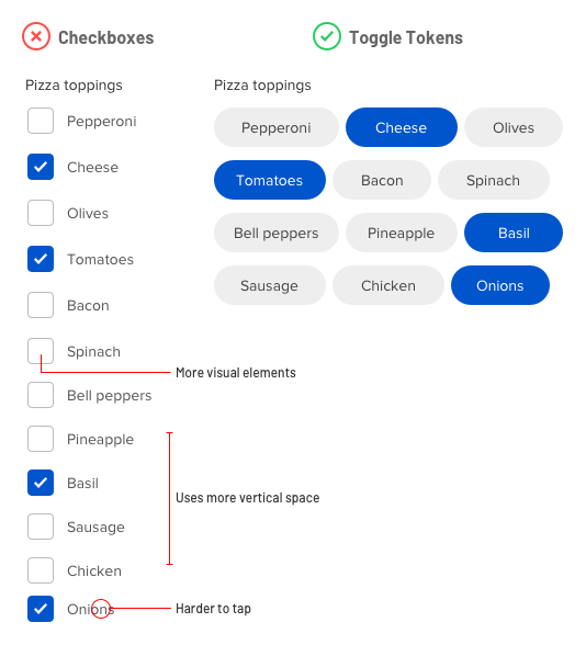
Not only that, but toggle tokens don’t require a checkbox or checkmark with the label. As a result, there are fewer elements on the screen competing for the user’s attention. Minimizing visual noise allows users to focus on the options.
The small tap targets of checkboxes can also cause tapping issues. Toggle tokens offer larger tap targets so users can make selections with less chance of mistapping.
All these benefits make toggle tokens a better component for selecting options than checkboxes. However, there is an exception when checkboxes fare better.
If your options have long text labels that wrap to multiple lines, you should use checkboxes. Checkbox labels aren’t horizontally constrained and allow enough space for more text. On the other hand, toggle tokens are constrained by its shape and should only be used when your option labels are single text lines.

The name “toggle token” is as intuitive as the name “checkbox.” It comes from its token-like shape and toggle functionality. Next time you’re thinking about using checkboxes for option selection, consider toggle tokens instead. You’ll conserve screen space, simplify the interface, and prevent users from abandoning your form.
Book

Affiliate

Anthony has this been researched?
I see your points and I agree with them, but for a lot of people structure is very important and toggle tokens are not always designed to be structured.
I would argue that depending on the target group you might be better off with other types of selection such as drop lists, radio button and so on. Not because they are visually superior or easier to use, but because they are the expected pattern and because the target group prefer structured data?
It would be interesting to make a study for this because I think there are use cases where toogle tokens might not be the best choice, even if it sounds strange…
Agree. So this is just an alternative I guess. Not a replacement.
This is a terrible idea for those with color vision disorders. Changing the entire color of the pill instead of displaying a simple check mark to mark an item as selected leads to user confusion (Which color is selected, and which color means the option is not selected…). Furthermore, if a checkbox is configured and styled correctly there shouldn’t be an issue with a user tapping the label to toggle the checkbox.
Sean, Would color disorder be an issue or would it still register as some sort of color change for a person with a color disorder? Meaning, even if the have one of the many known color (limitations) variations they would still register a change thus making the action still functional. The larger issue might be how accessible it is for none sighted user and assistive reader technology. I’ll get back to you as I do more research.
They are accessible to the color blind. Stop perpetuating color contrast accessibility myths.
https://uxmovement.com/buttons/the-myths-of-color-contrast-accessibility/
I think there’s also an argument to be made for checkboxes over toggle tokens in certain contexts. We’ve all been trained to understand the “checkbox” UI element to indicate the “state” of the item’s label. On|Off, Y|N, True|False, etc. When presented with a set of UI elements that appear to be buttons (no selections made), the user needs to think through what it means in this context, since buttons have been associated with taking an action, not indicating a state.
Even if some toggles were “pre-selected”, then the user is still trying to figure out “Is the vendor trying to highlight which elements I should select???”.
I like the visual simplicity of the toggles, and it is an easily learnable interface element, but I fear it may cause confusion in certain contexts. Also, there’s no reason why you can’t flow checkboxes the same way you did the toggles, though it would look more cluttered than the toggles tokens.
You have some valid points but there is one major flaw with this. When all or none are selected, the selected status is not clear. Checkboxes are still better. Why not design them as check-tokens? Similar savings in screen real estate but less confusing.
If any accessibility issues arise from colour vision deficiency, paired with a poorly thought-out colour palette, each state might not be obvious. It might be a good idea to have a stronger visual indication that an item is toggled “on” with the presence of a checkmark next to the text label. It doesn’t have to take up a lot of room, and it can be very helpful to avoid any confusion.
Well, I find reading blogs like these a little waste of time to be fair, as it’s just Your idea of what’s better, it is Your opinion only, and as most comments here point out, there’s more flaws than advantages, so guess what, tokens aren’t better, they are just an alternative, end of.
This is the second article where I see you believing something is better “just because” and then writing an article claiming it as fact.
You have absolutely no research to back up these claims and as stated above by other commenters there’s a multitude of reasons why these are worse for UX than checkboxes. Scanability, accessibility for vision impaired people, lack of consistency are the least of your issues.
Stop posting articles where you claim things you like are somehow better for UX
As others mentioned already, this pattern has a few accessibility issues and is not as intuitive as the standard checkbox pattern. One thing I want to add, as far as usability goes, it is a lot easier to scan a vertical stacked list than an horizontal one.
With all articles of this nature, it’s never a case of it being absolutely 100% correct for all situations, and it’s more a case of “well, it depends”.
Even on single-words / single-lines, there are flaws in your arguments…
The statement that checkboxes provide smaller tap targets is incorrect, as, if set up correctly, both the word AND the checkbox are the target, not just the checkbox itself. So actually, if the text sizes are the same, a checklist has larger tap targets.
The statement that a compact arrangement is less intimidating for users is incorrect, as an aligned ordered checklist is easier to scan and find what you’re looking for, compared to a cluster of tokens.
The statement that tokens create less visual noise is incorrect, for several reasons:
• Each of them has a large surrounding border, whereas the words in the checklist do not.
• The tokens are all different sizes, whereas the checkboxes are the same size.
• The tokens do not line up in a neat ordered grid, whereas the checklist items do.
There are also points that you have failed to take into account…
With toggle tokens, when all or none are selected, the selected status is not clear.
What about accessibility issues? colours? Colour-blindness? Screen-readers?
Do toggle tokens require some sort of instructions for less web-savvy users?
Can I ask where your research comes from?
The toggles in this example fail WCAG accessibility requirement for Level A.
Success Criterion 1.4.1:
“Color is not used as the only visual means of conveying information, indicating an action, prompting a response, or distinguishing a visual element.” – https://webaim.org/articles/contrast/#sc141
Could this article be reworked to show accessible content?
As others have pointed out, this is an accessibility fail and can generally be confusing.
I’d also point out that the stacked checkboxes are much easier to visually scan then a scattered pile of buttons.
I agree to what has been said above, and isn’t the second (correct) example actually wrong? Shouldn’t it be radio buttons? Unless the user wants greek AND mexican toppings, which would outrage any true pizza lovers!
Right, the example with pizza styles is totally missed, only trying to prove a point against multiple lines in a toggle token.
One more unsubstantiated post by Anthony. I unsubscribe. Too much wrong recommendations…
Hmmm. Harder to scan at times if you have a lot. Also the iconography is a very useful strategy for accessibility. The toggle token should include a visual cue other than colour for accessibility.
This is utter crap. There are so many things wrong here that I’m not going to waste my time.
Comments like this are completely unconstructive. What’s the point of leaving this comment other than to be negative and hateful? Next time leave something more thoughtful with constructive criticism so this writer and community can learn.
I’m surprised at some of the outright negative reaction. Anthony is providing an alternative opinion. I don’t believe this is a call to totally abandon checkboxes and jump on to the token bandwagon. This becomes another device that I now have in my tool box IF and WHEN I find the need to use. As with any part of our designs, it is up to us to pick and choose what would be the most appropriate for the specific context that we are designing for.
I see the point with scannability and depending solely on colours being issues. That is the same issue I face with buttons, so I try to also have borders, shadows, etc to add signifiers to indicate change in state.
I do appreciate the comments that have taken the time to drop in some specific issues and suggestions. That makes for educational reading, as opposed to the “I don’t like this, and that’s it” which wastes our time.
Totally disagree with this post. Need visual cues besides color. At least put a check mark in the button so someone can tell it’s actually checked. Also, it’s incredibly messy compared to a checkbox list, which looks great on a mobile device.
The tap targets of checkboxes are only small if the developer doesn’t know what they’re doing. Use an inline block or just a block as the click area and you’re fine.
I can also guarantee you after studies I’ve done at my job that senior citizens will not know what to do with your toggle buttons compared to a checkbox.
If you’re not going to make something better, don’t waste your time trying to fix it.
Wow, this crew is resistant to change – not a fantastic quality for UX work. I did see a few people tackle this correctly, which is to see if you can improve upon the proposed idea instead of just swatting at it. A couple mentioned inserting a checkbox or an icon into it that indicates the state of the token, and this stops the accessibility argument. The variability in width and the stacking order aren’t great arguments, because one could organize the tokens on screen using any logic you like even that used for checkboxes.
What this does bring to the table is an element where we can see entire clickable bounding box instead of guessing how precise I have to be, and that is pretty cool. It also gives us a chance to add additional visual interest to a page. That said, it is easy to imagine situations where this component is not going to fit the bill. Still, this is an element that we have all seen used successfully plenty of times, especially in phone apps, so not sure why this group is so grim.
Anthony, thanks for this good idea that might come in handy one day. Forget all the nee Sayers. there is no “one” rule that fits all (that would be boring), and research will be contradicted by the next research, keep up the ideas.
Thank you for the optimism, encouragement, and advocacy for innovation.
I think most people here are simply repeating something they have heard without thinking about the context at all.
I have red-green color blindness and I don’t have any difficulty with telling apart the different states apart because there is sufficient contrast between the items. In fact, if you put this image in any color blindness simulator, you can see that it’s still easy to tell the states apart.
I’m not saying this UI is perfect or you should always use it but I can see it useful in some cases. You can see a lot of mobile apps using similar patterns.
For people saying that why not just use a checkbox, I think it’s a good thing that people come up with new UI ideas, for example, we would not have pinch-to-zoom or pull-to-refresh if everyone would have just stuck with the UI elements we have had for decades.
Thanks for sharing this, but consider changing the title to “Why, in my personal opinion, toggle tokens are a better alternative to checkboxes”. Or “Toggle tokens are an alternative to checkboxes”.
The moment you use the word ‘better’ you need to substantiate your claim, and I could not read any.
That makes you fall victim of the curse of experience design: unsubstantiated opinions.
If you do have research confirming your hypothesis I encourage you to provide links to it.
Change and improvement is good if there is a rationale and if the hypothesis is tested (successfully). Also called ‘the scientific method’ (see G.Galilei or F.Bacon).
Thanks for your suggestion. However, we disagree with your writing philosophy and approach. Our beliefs are substantiated with our experience and reasoning, and clearly articulated in the article. If you’re not able to deduce them in the article, perhaps take a class in logic to help you better identify rationale. If you’re desperate for formal research, test it out yourself. Our role is to provide our experience and reason-based insights and beliefs. You can take it or leave it.
Inaccessible design is never “better”! I also have a problem with the comments that refer to the necessity of “visual cues”. What about “non-visual cues”? Believe it or not, many people, including myself, using computers and mobile devices cannot see at all. Please include us in all aspects of web/app design/development, or advice on element choice. We are NOT a Special group, and should be included, from the beginning, in all target audience considerations! Many devs do not correctly identify the state of checkboxes, which makes it impossible to know what has been selected. A horizontal structure would be difficult to navigate, in a mobile UI, unless it was structured so that each left-to-right swipe would go to a new choice. Even this, would be complicated unless there was a way to indicate that a vertical change had not been made.
I would like to emphasize to ALL UI and UX developers the crucial importance of including people with non-visual expertise, especially users, in all aspects of design and development, not just final testing. Accessibility is not a design choice, but, a requirement!
The checkboxes which are vertically-stacked can be ordered. The toggle tokens cannot, expecially as viewport width changes. They’re horrible to scan through trying to find the one you want.