Masking passwords is a common age-old practice that’s found on sign up and login forms. It’s used to prevent over-the-shoulder snoopers from catching a glance of the user’s password.
While masking passwords is a good security practice, there’s a chance it could jeopardize the user experience of your sign up form. When users sign up on a website, they expect a no-hassle, worry-free form to fill out. But masking their password could prevent that.
Good for Logging in, Bad for Signing Up
Login forms are used more often than sign up forms. Users only need to sign up once to create an account. But they need to log in multiple times to get access to their account. Because users use login forms so often, there’s a strong chance that users will end up typing their password in front of other people.
Sometimes users might want to show their friends or colleagues something on a particular website, and they would need to log in to do so. Therefore, masking passwords on login forms is good because it keeps passwords hidden every time a user logs in to a website.

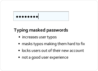
However, password masking on sign up forms is different. Password masking generally causes users to make more typing errors because they can’t see what they’re typing and can’t tell whether they made a mistake. The consequences of making a typing error when logging in is not as serious as making one on signing up.
If the user fails to type in the right password when logging in, they simply try again. If they type in the wrong password when signing up, they’ll get locked out of their account when they try to log in, and will have to reset their password.
The user isn’t to blame when this happens. It’s the designer’s fault for not making it easy for the user to see what they’re typing in the password field.
Killing Confirmation Fields on Sign Up Forms
A big hurdle that password masking creates for users is the password confirmation field commonly found on sign up forms. This field requires users to retype their password and checks that both match so that the wrong password doesn’t go through the form.
The reason password confirmation fields exist is because users can make typos when they type their password with masking on. Password confirmation fields catch those typos so that a wrongly typed password doesn’t get submitted.
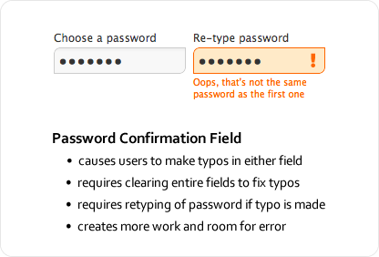
Password confirmation fields might exist for good intentions, but they have a downside. They cause users to make even more typos because they have to type their password twice in separate fields with masking on. What’s worse is the extra work they have to do to correct their typos.
Since they can’t see where their typos are to fix them on the spot, users have to clear the fields entirely and retype their password. The password confirmation field not only causes more typos, but forces users to do more work to fix them, slowing them down and making sign ups more of a pain.
Unmasking Passwords Temporarily Decreases Typos
Password masking on sign up forms gives users more trouble than it’s worth. It not only masks the password, but any typos the user makes. The security it provides is often less than helpful because most people usually sign up for websites in private, with no one looking over their shoulder.
Signing up is usually a one-time deal. Once they’ve done it, they don’t need to do it again. Displaying their password in plain text that one time when they are alone is not as big of a security risk as most think. The chances of a snooper catching the user’s password is slim to none, even if the user is signing up in public because most snoopers aren’t random strangers, but rather somebody the user knows.
The solution to all these issues is to temporarily unmask the password so that the user can fill out the field quickly and accurately. Temporarily unmasking means only unmasking the password for a moment so that the user can see what they’ve typed.
Temporarily unmasking decreases password typos, and makes it easy for users to catch and fix any typos they make. And the user doesn’t have to worry about snoopers stealing their password because the unmasking is quick. Snoopers would have to memorize a string of random, alphanumeric characters on a screen in a matter of seconds, which is very hard to do.
A lot of the password snooping paranoia is blown out of proportion. Password snooping is not as big of an issue as most think. The bigger issue is users getting locked out of their account because of typos caused by masked passwords. Below are a couple of simple techniques you can use on your sign up form to prevent that from happening.
Unmasking on Field Focus
You can make the password field easy for users to fill out and secure at the same time by unmasking the password when the keyboard focus is on the field, and then automatically masking it when the focus is off the field.
This allows users to see the characters they’re typing only when the password field is selected, decreasing the risk of password typos, and preventing others from sneaking a peek of their password when the user has moved on to other fields.

Another small security measure you could add is to display the user’s password in small, light gray, italicized text. This makes your password hard to make out from a distance. Making out each character would require moving close to the screen. The only person that has a clear view of the password is the one sitting right in front of the screen.
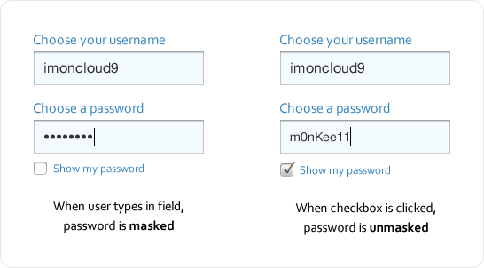
Unmasking with a Checkbox
Another approach is to provide a checkbox for unmasking. When the user types their password, it’s masked. But when they check the box, their password gets unmasked, allowing them to see whether they’ve made a typo.
Users have to make a little more effort with this approach by clicking to unmask and mask their password. However, this is far better than a password confirmation field because it allows users to see and fix their typos with ease.
Balancing Security and User Experience
Following design conventions is generally recommended, but when a convention slows users down, complicates a task or increases the chances of user error, it needs serious reconsideration. Security should be balanced with user experience.
Favor security too much over the user experience, and you’ll make your site a pain to use. Favor the user experience too much over security, and you’ll make users feel nervous about using your site. But once you find that balance, users won’t have any trouble using your website, even if it doesn’t follow every design convention.
Book

Affiliate

I mostly agree with the conclusion of the author but the first example (when focusing on the password field the text is alphanumerically visible) may cause frustration when the user types his/her password. He/She expects the password to be hidden and making it visible, even if it’s just for a fraction of a second may lead to mistrust of the website’s security (even if it doesn’t have to do anything with it).
I think that the last method is the best one, but useless: The effort taken to click the checkbox to make the password field visible is too much.
I agree with Cat on this one – I think a lot of people would get confused and be suspicious, mistaking this feature for a lack of security on the website itself.
I like the 1 password signup, and also the checkmark for showing pw. I think i will implement this.
Changing type attribute of password fields goes against the security model in browsers. jQuery doesn’t allow it:
Error: type property can’t be changed
I found a way around it.
$(“input[type=password]”).focus(function(e){
this.type = ‘text’;
});
$(“input[type=password]”).blur(function(e){
this.type = ‘password’;
});
That’s a good solution. Typically using jquery people switch the password field with a hidden text field.
Which is probably why it can’t be switched directly.
Good points with decent solutions.
Many (all?) masked password fields in Android temporarily show the last letter type for a brief interval before masking it, giving the user a clue as to what they are entering – which is even more important on a smartphone where you have a “soft” keyboard and fat fingers.
I find it interesting you don’t mention Google’s Android’s method – masking all but the most immediately typed character. Personally I find this works pretty well for me (though those who hunt&peck may not even notice)
That’s precisely why I didn’t mention that method – the hunt and peck users (those who look down at the keyboard while they type) may not even notice. It isn’t enough to combat password usability issues.
Website vistiors are used to passwords being hidden. If you plan to implement the visible password field in a sign up form it is best that you warn the visitor that the password will be visible in the sign up form.
I appreciate the idea, the issue will be with the implementation. As someone has already suggested a non-technical visitor might consider this is a ‘broken’ security feature.
Ideal place to use this is in Mobile Apps and Mobile versions of websites. That is where I generally see the need to view my password.
The fact is that, with the roll-out of Windows 8, text boxes in browsers now have the capability to be shown briefly, which means that you don’t need to programmatically add it.
Another way to enhance the password selection with the confirmation password field would be a tweak of your ‘unmasking with a checkbox’ solution. The user could choose between either those two fields with masked input and confirmation (to be used in an ‘adverse’ environment), or one password field only in plain text (to be used in a ‘safe’ environment, say, at home).
Another common re-type pattern is the input of an email address, which most of the users (well, at least myself) bypass by copy/pasting the first field input into the second one.
Makes sense but it goes against the norm. The checkbox to show password works but people could mistake that for the “remember password” function.
As far as I know, the only way to “unmask” a password field in HTML is to give it a type of “text”.
One factor to bear in mind is that by default many user agents will store the contents of a “text” form field but not of a field with the type of “password”. So entering a password into a “text” field could allow a subsequent user on that computer to discover what password has been entered by using autocompletion. It should be possible to prevent this by setting the autocomplete attribute of the text field to “off”.
It would be better if the password field in HTML had some attribute to control whether and how it was masked.
My first thought when reading this article was that a popup similar to what Android does with the single letter may be a good solution.
Registration form redesign isn’t something I’ve thought of before, however, this was the first solution that came to my mind.
Something like a
$(‘#firstbox’).keyup(function(e){
//show tiny div with entered key in it
});
wonder if this would freak people out just as much though as it still displays their password.
I completely agree that typing a password when registering is something that doesn’t really need to be hidden. When was the last time you registered to a site with your friend looking over your shoulder that you couldn’t just say “hey, can you look away for a sec?”
I’m still not sure it’s such a good idea to display the password when it’s being typed – I think most people are so used to password fields working like this that they would instantly trust the website less.
It wouldn’t hurt to also set your password boxes to display three characters instead of one so as to obscure the length of the password.
I agree that the best solution is a checkbox. Typical user expectations are met yet the user is given full control to modify behavior if they like. The effort to check the checkbox is trivial and even if people mistake the checkbox for “remember password” no harm will be done and all but the most daft of users will still be confused after the see the immediate results of toggling the checkbox. For the rest, well you can’t make anything 100% idiot proof, just be sure to minimize the harm they cause.
I’ve noticed Windows 8 uses a solution to this where an icon is displayed at the end of the password field. Hovering the icon displays the password.
I appreciate the well thought out article, but I think the focus is wrong. You’re looking at the reality of security with signups. Instead, you should focus on the perception of security experienced by the users you are trying to help. What user segment is so crippled by typos that they can’t handle typing their password twice? I could stereotype a dozen things about these users, but one critical question is this: are they the user who has no idea what they’re doing and trusts anything? Are they skittish and ready to bolt from a website if they feel uncomfortable at all? I think a significant portion fall into the latter. “Why is my password showing up?!?” to me is far more likely to cause a registrant to bolt than “Wow it’s so difficult to type my password that I use for everything twice in a row.”
However, Oscar’s point about waving the mouse over an (oversize) icon that reveals the password momentarily is decent. But now we’re using a single field. How often will the user ignore this feature, end up with a password that is wrong, and now have to fight with the “retrieve my password” functionality which is FAR more difficult than typing a password twice in a row.
Overall, I’m going to give one thumb up for the article, but still going to give a thumbs down to showing passwords. The “last key pressed” on mobile is great and is as far as I’m willing to go. Thanks for writing!
Agreed. We get all crazy about email address masking and verifying yet when we ask for a credit card in a cart, it’s always unmasked and we (users and designers) don’t think twice about it.
Generally, masked paswords is a standard on which people are used to. So why fix something that works. I think people would just feel strange when their password is shown, they may think their password is insecure, etc…
Many of the above responses are missing several important points that are at the heart of why the current standards for authentication need to change — and why making a correlation between authentication and credit card information is invalid. Bear in mind that when users encounter sign in, they are already bracing themselves for a frustrating experience. These days, users are inundated with dozens, if not hundreds, of separate instances of authentication throughout the year. More often than not, each authentication experience follows its own set of rules for cryptic combinations of capitals, numbers, and special characters. Users have to contend with more user IDs and cryptic passwords than they can remember. Even worse, they are forced into changing passwords on a regular basis without repeating old ones and then given only three attempts to get it right! Otherwise, they lose even more time calling the help desk to get their application unlocked! The result is that users write down passwords to avoid the frustration, a far worse security breach then temporarily showing a password. These conditional restrictions do not exist with credit card entry. The LEAST applications can do is offer users a means of seeing their passwords! The consequences the current standard to the user experience is clear. Assist the user with this process and they will be receptive to the application. Make the experience frustrating (as it is now), and they will be angry before they execute their first action. And if that’s not enough, look at what Nielsen says: http://www.nngroup.com/articles/stop-password-masking/
If you want to cut down on password typos, one of the better things to do is to allow pass-phrases rather than requiring gobblty-gook passwords. I’ve seen way too many password entries that require some mess like: 1) at least one lowercase letter, and 2) at least one uppercase letter, and 3) at least one number, and 4) at least one special character, but 5) you can’t use space. Of *course* you’re going to have trouble typing ‘Tr0ub4dor&3’ accurately. Whereas you’re *much* more apt to type ‘correct horse battery staple’ correctly (Obligatory xkcd reference: Password Strength: http://xkcd.com/936/)
@WRSomsky — I love this comic and have shared the link to it with our UX Team! It makes so much sense. If only your message could get through.
Hello Anthony,
I have never thought about the pain of masked passwords. But reading this post has become clear to me what is this all about.
Another pain for the user is the Captcha security. I am waiting for a “killer” post to check for some alternatives. Hope to read it on this blog sometime sooner.
Heya,
There are some good points here, but i am not completely sold on removing the second password field. Although you can simplify the experience and keep the security by masking the password, making the user retype the password ensures that they can remember the password.
The way this currently happens is that i see there is a mistake and i fix it, and if i am not matching the password numerous times then it gives me a clue that the password may not be memorable enough or to complex to type comfortably.
It would be interesting to see the correlation between masked single field password entry and the amount of “Forgot Password” requests.
All the best,
Nick
I would only use the last option due to the lack of control the user may have over the password being revealed when the field is in focus. For example what if the user was in an busy office environment where people could possibl make out thier password whether in one go or over a period of time.
I DO agree with your paragraph: “A lot of the password snooping paranoia is blown out of proportion. Password snooping is not as big of an issue as most think. The bigger issue is users getting locked out of their account because of typos caused by masked passwords. Below are a couple of simple techniques you can use on your sign up form to prevent that from happening.”
You’re 100% correct about the “perceived” threat level. It’s no where NEAR as high as most people imagine it to be.
As a solution, why don’t site owners incorporate a button beside the password field that alternates between “Show what I typed” and “Hide what I typed”.
That way, a person who MAY be on a screen that requires more time to fill in other details can at least decide for themselves whether or not…..and for how long…..the new password may be revealed.
Just my 2 cents.
I agree! I just tried to sign up at a site a minute ago and Both fields were obfuscated, ALL I could see were asterisks .
SO like usual I opened a text file and wrote my password there to see if i was writing it correctly then pasted it to ascertain then went Back to the Fool sign up form and pasted it in. I was so aggravated that I typed into Google WHY do fool websites hide your passwords!
And I found this page! lol, but seriously.
And I think that if people aren’t intelligent enough to, understand the Show password field and they think the site security is bogus..
I assume they would eventually catch on if times EVER change like they for sure need to.
I work from home on computer and if anyone is ever standing behind me I wouldn’t type in a password at that moment, i’d deal with them then go back to business. But I love alone and have never had a visitor so for me that’s not a concern anyway.
I HATE masked passwords! I always type them on a notepad and paste them in and the rare times I’m on mobile i usually give up on it. As an example earlier tonight I started to sigh up for real estate search thing , and it was masked, curse.. So I typed the password on a notepad so I would KNOW what I had entered as password the next time I log in and copied and pasted that onto the field and then it said please” use only numbers and letters for password” I don’t like insecure passwords, so I left their website after already being irritated already by opening a notepad to do all that.
although I needed to search for a property for my sister I did Not creat an account.
And for People who think that humans aren’t adaptable to new things and so wouldn’t ever get used to seeing unmasked password, why not have the option to click to show your password? Simple to implement!