Every website today places their search field before their search button. It’s done this way because the user enters a search word first before clicking the button. Placing the search field before the button might make sense, but it isn’t user-friendly for many reasons.
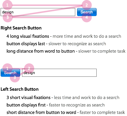
Research shows that right search buttons slow users down because they create more and longer visual fixations. Placing the search button on the left of the text field reduces visual fixations and the time it takes to do a search. Because we read from left to right, left search buttons help users spot the search label quicker. You don’t need any other labels except the button label. This makes the search bar easier to find.
The visual fixations are not only fewer, but shorter because of how close the text field and button label is. This reassures users that the field they’re typing in is for search.
With right search buttons, the visual distance from the search word to the button is longer. Users will fixate on the text field first before they see the search button. This means they have to move their eyes a long distance to make sure the field they’re about to type in is for search.
When users finish typing in their search word, they have to look all the way to the right yet again to click the search button. This also means that they have to move their mouse farther to click the search button. But most users will press the ‘enter’ key after typing instead of clicking the button. The button is just there for novice users who tend to use search buttons.
If you care about your users and want them to have the best search experience on your site, consider using left search buttons. Almost all websites on the web today use right search buttons. Just because it’s popular doesn’t mean it’s the best thing to do. Sometimes doing the opposite of what everyone else is doing works better.
Book

Affiliate

Doesn’t this button placement argument make the assumption that the user is mouse-driven rather than keyboard? I guess I’m too old school – I use the TAB key, and putting the button to the right puts it next in the tab order. Going from keyboard to mouse is far slower than eye-tracking for the next action!
BTW, one of my pet peeves is placing “other text” before the action button in the tab order…
Yes, there are people who don’t use the mouse and just hit enter, such as myself, but there are also users who use the mouse to click the search button.
I agree that going from keyboard to mouse is far slower, but some people still do it and you have to design for that. Left search buttons make it easier and efficient on those users and that’s the truth, even if there isn’t one that exists on the web today.
By using CSS you can have the button on the left and still keep the tab key working as usual. Example: http://jsbin.com/owela4/2/
Zeke, thank you for creating that example. That is awesome. Left search buttons really are faster. I challenge anyone to test left search buttons versus right search buttons.
Using CSS float doesn’t seem quite right to me. What about using the HTML attribute “taborder”?
We have tried the the button on the left, albeit briefly. Our usability studies found users tended to obediently click the search button before entering text. Those users said they were expecting some sort of a search tool to appear.
That could be influenced by our more common search controls. We do have either “Search:” labels or a light blue italic line in the field hinting “Type a few letters of the item you want to find.” That triggers our faceted search.
In older apps that don’t support that control, we have a magnifying glass icon at the right of the input field that triggers the search.
How about having no search button at all?
I do this on my sites. With auto-completers there is no need to have a search button any more. (Example: http://cl.ly/0l223q3k0Q2o2z2F423O)
In my mind search field placement is more important than the button configuration. As long as it’s top and center people can assume it’s a search field. The minute you move it to the right or left people have to hunt it down. It’s also why I prefer dark backgrounds for headers, so that the text field stands out.
Hear, hear! A return triggers the search, or get ajaxy and have the search results update as you type in the field ( Google as of late ).
And if you are still button happy, change the search button’s function ( and label ) to clear the search field.
Hi,
While your logic seems to make sense, I think the reason why the search button is on the right is that it gives the user a visual cue on the order in which the action is suppose to be performed, as what you pointed out too, most of us read from left to right on seeing the text field first and then the button, it visually maps out the order of the action for us, that is first we need to type into the field and then press search.
Robert Hsu
I understand, and that is what I mention in the beginning of the article. However, the visual cue for recognizing the text field as search is the search label, and that’s on the search button. Because the label and button are one, the button needs to come first for faster recognition.
The visual cue for performing the search action is the button. Because you see it first before you type your search word, you already know where the button is and you can see it in close proximity to your search word, so getting to it is much faster.
I agree.
Forget about fixations. We are talking milli seconds here. If 80% of user population is used to have a right button to commit action, that is what we should provide. Anything new even it is efficient is counter productive. Would you trade your QWERTY keyboard to DVORAK keyboard because it is more efficient? No, Right?
What you’re basically suggesting is because we’ve always used right search buttons, we should always use right search buttons assuming that people will have trouble using left search buttons. This is not the case at all. Research actually shows novice users have trouble using right search buttons.
If users have trouble with something, it’s the designer’s job to come up with a better solution, not do the same thing just because it’s always been done. Anything new is not counterproductive if it is an efficient and effective solution to a current problem.
Very sensical – always question everyone.
nice artilce, as a thought,…instead we can use a small icon inside the text box and mention “type and press enter”, that would remove the usage of the button,
Seems this would be the logical step. Get people who are use to picking the mouse back up and clicking “search” into a new more efficient behavior that will shave more time off in the long run than simply presenting the information in a different order. The time it takes is minimal compared to the time it takes to get your mouse back under control.
It’s good to implement the new idea, but user always see from left to right then why to show him the second task first.
1. User’s first task here is to type the keywords
2. Second task is to click on the search button.
In this case user will move back to click on the search button. I don’t think it’s a good approach. User’s task should be streamlined.
Gopal Juneja
Love to see users time and reactions from a focus group, but I disagree. Being right handed my hand tends to drift right. True the eye movement will go from the search button on the right back to the text box on the left. I will first click on the text input, type, then moving right to the search is convenient. I feel its hassle to move the mouse back to the left such as on your site. Again this could be training, or the fact Im right handed.
It’s not really about our preference. It’s about what works best for users. Left search buttons are clearly faster and easier to use. Right search buttons have been tested before and users visually fixate longer because they have to check and see if the text field is associated with the search button.
you’re kidding, right?
1. it’s one thing to view the search (and it’s exactly how you described: 4 fixations for right button and two for left one), but you’re trying to interchange fixations with mouse movements, clicks. keep in mint fixations are way way faster and sometimes involuntary.
2. it’s about consistency and how the user is used to see the search forms. i haven’t seen one like yours before.
The consistency for users is in the use of text fields and buttons for search. The order in which they are placed, however, is not a problem if the new order is faster, easier and more efficient. This is the case with left search buttons. Just because there is not a single left search button that exists on the web today, does not make this untrue. People just need to open their minds to new ideas and possibilities.
While this article raises some interesting points, I think it would be best to stick with search buttons on the right. First, putting the search button on the left violates what users are used to, which may confuse them. Second, it may be less visual distance for the users to scan to understand what the search form is, but it seems sort of bad for usability that the order of the search form is backwards from the order in which it will be used. Perhaps a compromise would be good; starting the search field with a visual label, such as a magnifying glass, on the left, while keeping the action button on the right.
Interesting points, but at this point it’s convention over configuration.
Interesting theory. You should consider testing it. The linked study doesn’t seem closely related. I’m guessing the eye tracking examples above aren’t actual test results? In the second example the user seems to have filled out the search field and clicked submit without actually looking at the submit button.
You have to read the research to get the most out of it. You can’t just look at the pictures and make assumptions. Go down to where it talks about the search box for useit.com.
I’m not sure how to reply to that. Maybe you thought I was being sarcastic. I did read the study. Rereading that section again isn’t helping me link the study to your assertions. The section testing the useit site noted that simply putting the form in the upper right corner of the screen isn’t enough to excuse the designer from correctly labeling the form. Nowhere in the study did they test using the search button as a form title. I honestly think you make some good points, but without doing a study which actually compares your new form to several common ones, this is just a hypothesis. It still needs to be proven.
The study specifically says, “in Figure 5, the absence of a label forced the rookie users to double-check the input button on the far right, in order to reassure themselves of the form’s purpose.” It’s clear that right search buttons slow users down. It’s even slower for users when the text field is really long. The label needs to come first before the text field. By doing this, you remove the need to double-check the button on the far right.
While it’s great to challenge the conventional wisdom, I’m going to agree with Bryan. You have an interesting hypothesis, but you’ve jumped
directly to a conclusion that isn’t supported by this research. They didn’t test a search button to the left of the input field (and as far as I can tell you didn’t test this either), so I’m not sure why you would claim that it’s faster (or clearer to users).
They found that there was a problem with right search buttons among novice users. Left search buttons solves that problem. Anyone who is willing to read the article and understand the logic and rationale behind it can see this, regardless of any research specifically saying this. You can’t always expect there to be research to dictate exactly how you should think about everything. Sometimes you have to not only be able to think for yourself, but trust and use your reasoning abilities.
The conversation has made one thing clear, generalizations and research studies are only as good as the testing done on one’s site.
Since it is relatively easy to test on a site with moderate traffic.
The community will continue to go round and round on topics like this if the goal is to search for the “one correct answer.”
I’m confused about the top diagram, what are the 1st and 2nd fixations and why don’t they exist in the second diagram?
I guess this wasn’t made clear in the article, but research has shown that novice users look at the text field first before they look at the button. After they see that the text field corresponds with search, they begin inputting their search word. There is another visual fixation again to complete the task. This is very slow and ineffective for novice users. Left search buttons are the solution to this.
Also, wouldn’t making the search box right aligned and keeping the button where it is be a better solution?
I think the issue you’ve identified stems from using a button as a label for the form. It may be fine for pro users, by newbies would benefit from an explicit label in close proximity to the start of the field.
Yes, in fact, excluding the button entirely may be fine for pro users. Most of what I’m talking about pertains to novice users. They need an explicit label to come before the text field. Since most sites use the button for the label, which I think is very efficient, the button needs to come first.
Nielsen’s theory: most users spend their time in other people’s websites.
While this is makes sense, people are not used to it. And this will be confusing.
What about Google’s approach? Centrally aligning the search button, rather than on the left or right. If you then aligned the text centrally in the text field as well, you’d have a pretty limited movement of the mouse and your vision.
I wouldn’t do it personally, but something else to consider.
The study I link to shows that Google’s centered search button performs poorly too.
I tried using the search box (right corner) but heck the ‘search button’ doesn’t work :).
If you want your users to get through your search form as quickly as possible this research seams sensible but the point of search is to help users get to the correct search results.
In the book Web Form Design (http://www.lukew.com/resources/web_form_design.asp) Luke W says that the distance of the button from the input field has a direct relationship with the accuracy of the data gathered.
However, possibly the only thing that the user would pick up in this case is a misspelling which should be handled by the search engine.
I guess its a case of what works for your users.
Anthony you kidding right,
positioning the Search button before the Text field indicates user to click on it even before writing anything in the text field, as users we decide and mention what to search and then trigger te event.
and if you are thinking about the distance between search label and search button, well there might be a scenario where users write more then 1 word in a search field then the button is much closer right. 🙂
And again to justify why do we need Search Field 1st and the button next is 86% of users use keyboard while filling in search field so its intuitive to click enter or hit tab and enter, while your fingers are still on keyboard, few users/entrants use mouse to copy paste and click the Go or search button,
Lately on few sites Ive noticed they just have search icon and text field no button to click only use of keyboard a little confusing though.
You’re making a false assumption. You’re assuming that because the button comes first users will click on that before they use the text field. This is the exact opposite of the user’s mental model. When users are looking to search they already have in their minds what they’re looking for and will be looking for a place to input their search word. Yes, they will see the button first, but that doesn’t mean they’ll click it first. In fact, most users don’t even click the button, they just press enter.
Hi anthony, you’ve got the right idea but I think you’ve stopped short. Please examine http://i1082.photobucket.com/albums/j370/fora1/uxmovement_search.gif and see where I’ve reduced the total visual fixations by 33%. Two visual fixations will almost always be more efficient than three. Also, in this case the distance is shortened and will always be consistent no matter what the length of the entered text is. This is a very important point–don’t force the user’s eyes away as their text becomes longer (even 2 or 3 words will further remove them from the search button in the Left Search Button example above). It’s no mystery—see for yourself.
This is funny because I played around with the thought of right aligned typing before I arrived at my conclusion. 🙂
The reason right aligned typing doesn’t work is because:
– your cursor is stuck to the right side when you type, which means there is no visual cue for text progression – this causes many problems for users when typing and breaks not only the left-to-right typing convention but the existing cursor convention.
– your ignoring the glaring fact that users need to see the label first (read the research in the article) – seeing the label first reduces the first two visual fixations
– your example is not actually 2 fixations, it’s 4 short ones – without having the label/button first users will look at the field first to check and see what the field is for before they start typing
I appreciate you thinking differently, but you really have to understand the fundamental flaws of the current design and the strong advantages of my solution before you jump to impractical conclusions.
No no, you’re not understanding the beauty of this. Right-aligned text is key here. If you’re presenting body copy such as instructional copy or a paragraph, of course left-aligned would make sense. But designers need to understand that isolated, individual elements shouldn’t be bound by the same rules if you truly want to make the user experience better. We left align within fields because that’s the status quo. Are you saying a field with right aligned text is more difficult to read? Did you know that most keywords fall in between 1 to 3 words, leaving all text visible within the field? Designing in context changes the game!
As for users needing to see the label first, I think you’re not understanding how users scan for information on the page. Think about it: users identify elements on a block level, such as images, blocks of text, etc. Depending on it’s layout within the page, the field can be one of these blocks (as is usually the case with a global search). You mistakenly assume the user is going to sit and stare at the left side of that field, but once he locates the field he will continue to break down that element into a smaller chunk, this time identifying the text within the field.
The fallacy in your design is that the user would then need to back up to take action, which is an unnatural progression. My suggestion continues the flow easily and more efficiently in this circumstance. It’s a rather sensible solution if you think about it, right? Thanks!
Like I said before, the right aligned text approach fails because it breaks the cursor and violates user typing conventions. It makes it difficult for users to type and correct typos. Users need to be able to see the cursor as they type and key back to a specific place in the text to correct or change any text.
And yet the solution suggestion above (left aligned search button) breaks user conventions that are stronger than the web, which is the left-to-right flow that is engrained in western culture. Buttons on the right imply forward action (log in, next, continue), buttons to the left have the opposite feel (cancel, back, undo). Having the action before the question breaks this flow and the disrupted natural sequence is likely to feel awkward. Just like that niggling feeling of turning a light on by flicking the switch down.
The main challenge with this whole discussion is actually twofold. First, we’re sticking to the idea of the search button itself being the field label, which is not necessarily the best approach. Secondly, there seems to be an assumption that for new internet users (which are becoming fewer every day), speed and efficiency are still the most important factors. Actually, in those cases, comfort and familiarity are far more significant. New users tend to be slow taking in a page before performing any action to begin with, so the advantage of fewer impressions is negligible in their case. Breaking convention and user expectations is like breaking their trust, and I’d venture to say that is far more significant in this case than a few fractions of a second.
Advanced users get annoyed by broken standards and will most likely be using the keyboard to tab through and hit enter to submit their search anyway. More efficient doesn’t always equate better, and to assume so ignores the emotional aspect of design.
I believe a more elegant approach which solves all of these problems (scanning for labels, convention, etc) would be to put the common magnifying glass symbol as a label in front of (or inside of the search button. Or perhaps even better, use “Search” as the hint text to function as a label within the box itself, with the magnifying glass icon as the action button. Also, rounded search boxes seem to have become an established standard (thanks to Apple marketing) and would help to immediate differentiate as being a special kind of input box different from the others.
The action sequence is – You type it and then search it. It is *NOT*, You search it, and then type it.
Though I see some logic in your argument, I bet, placing the button just below the input field would have been a more plausible explanation!!
I think I have to respectfully disagree with this article for a couple of reasons.
1.) You use the UXMatters article to support your argument, but that suggests field labels should be on the left, not the actions / buttons. My take is that it’s referring to textual labels, or “label” as in the HTML sense, not a button. The example that tested best in that article was Flickr, which has a right-aligned button.
2.) You say that ” Just because it’s pop u lar doesn’t mean it’s the best thing to do. In this case, doing the oppo site of what every one else is doing works better.”. I have to disagree. In many cases, users are more efficient using familiar interfaces than unique or unusual ones that are technically more efficient. If a user doesn’t recognise your form layout, they will likely be less confident in how to use it and it will require a greater cognitive load to use it.
Lee, your statement proves my point. The study suggested that field labels should be on the left, as you said, and in this case, the button is the label, so what I’m suggesting is not that far off.
The Flickr example performed best out of all the other badly designed right search buttons, and the reason it did is because the label came before the button and the text field was shorter and more compact than the others.
You say that left search buttons are “unique and unusual.” But they are not. There are no new elements. There is nothing the user has to relearn. It’s simply a better placement and arrangement that is easily recognizable, in fact even more so because the label and button come first before the long text field. You’re also making the false assumption that because this is different people will have trouble using it. Maybe what’s probably more accurate is that because this is different unimaginative designers will have trouble accepting it.
Sorry Anthony, I think you are way off here, to be honest! The conclusion of the UX matters research was that it was more efficient for visual scanning to have the field labels on the left of the field (rather than above) because since we read left to right, that makes for more effective scanning. Eye tracking data is great and something that can yield tremendous insights…but the efficiency of a scan path is only ONE factor in creating a good design. Making the case that a certain layout is “best” because it’s more efficient scanning may miss the mark. why? because there are other metrics that may be more important considerations:
*User Preference – what version do users prefer? (if they have a strong preference for one version, even if it is less efficient, that will be a major data point. For example, if we were conducting research w/mobile phones this week and had an iphone and a blackberry, and had people do a task that involved typing an email, i can guarantee you (based on industry data) that text input would be faster on the BB b/c it has a keyboard. Users would almost certainly be more efficient. And it’s also quite likely that most users would prefer the iPhone though….
*Task Completion Time – this is a good but incomplete metric. It will represent efficiency of the overall process to some extent.
At the end of the day, a lot of this discussion has to do with user expectations (aka “UI standards”) – in a given area, User Interface standards will emerge and those set expectations for users. And we have all used these websites or UI elements thousands and thousands of times. They ALWAYS work the same way – we 1. enter our search query, and 2. press the submit/enter/go button. This is a sequential process that is deeply ingrained in users. And that is why the UI follows that process..because it follows the users mental model, their expectations, and that’s why everyone continues to do it that way…
Disclaimer: my company does eye tracking, usability testing, etc. 🙂
I don’t mind your resistance to be honest. All great ideas are usually met with great resistance at first (I forgot who said that).
You made some good points about user preferences. You’re right that users will always enter a search query and press the button. This is a sequential process that is ingrained in users. HOWEVER, how can you know that a left search button disrupts this process? You can’t because you’re making an assumption. Your bias is that since the order is reversed, users will have trouble with it and won’t know how to use it. This is a BIASED ASSUMPTION and has no merit.
When it comes to completing a task, efficiency is extremely important. I would not downplay efficiency in this situation. User preference is important too. But there is no strong user preference for order here. The preference is for a clear button and text field.
If we were to follow your logic, that would mean that product pages that have their call-to-action button at the top of the page are completely wrong. Based on your logic, users consume content first and then click the button, so that means the button should be at the bottom of the page, not the top, and that reversing the order would throw users off. Sorry, but I don’t buy it.
You’re entitled to your opinion, but since your company does usability testing, you have the fortunate opportunity to see for yourself that left search buttons do perform better. When you do, share the results with me because I’d be interested.
A wise man once told me, “Always test your design, and if it’s a clever design, test twice.” Without convincing test results of what you are proposing, I’m not going to be changing any of my design patterns. I would absolutely be willing to consider the results of a soundly conducted A/B test, but it sounds like you have a notion and are so convinced that it’s obviously true that you are unable to hear the concerns of anybody else. Just test it.
Something to consider: when we encounter something that is clearly out of the norm, we wonder why it is so, and we assume it’s intentional. I can see some semi-expert users thinking for a brief second that it might be some kind of scoping mechanism.
I guarantee you that if you were to do an A/B test with a right search button vs. a left search button the left search button would perform faster. If you want evidence, test it yourself. Don’t expect me to do everything for you. There are people, such as yourself, who absolutely need testing in order for certain ideas to make sense to them.
Then there are people who don’t necessarily need testing to see the value of an idea because it simply makes sense. You are the one that is uncertain, not me. If you need testing, go do it. If I do it for you, which is basically what you are asking, then the value you would get from that is a lot less than if you did it yourself. Plus, you’d probably still be skeptical. If you want absolute certainty with evidence, you’re going to have to work for it.
Wait, who’s the one trying to convice the world to change? I was only suggesting that you were having a difficult time convincing people, and if you actually tested your hypothesis it might help you make your case, but that suggestion seems to have struck a nerve.
Your hypothesis may be right. I happen to think it’s not. But without evidence it’s just a hypothesis, and I have no obligation to test your hypothesis, and I certainly have no obligation to accept it as fact. Where do you possibly get the idea that I’m asking you to do my work for me? How is it my job to test your ideas? It’s hard to take you seriously when you say things like that.
Do you even know what you’re asking for? Your request for testing is a knee-jerk reaction to an idea you don’t understand. You don’t think my hypothesis may be right? Where are your reasons? I haven’t seen any reasons from you, nor any evidence or research contrary to my argument.
The data and testing you are asking for can easily be done by yourself if you wanted it. But you don’t really care or want testing, because if you did you would’ve done it by now. You just want information handed to you with a trust seal so that you don’t have to actually think. The rationale for the idea has already been provided. Yet, you refuse to use your intellect to engage in reasonable discussion. It’s okay to disagree as long as you offer reasons to your argument. But you have not.
Idea:
Why not place the search button *under* the box.
It’s more friendly to the sequence of actions (type, search) and people who use the tab key.
Besides that it’s scores even better on the distance detail.
The linked study demonstrates that novices have problems when they encounter an unlabeled input field followed by a button.
Your solution to this is to move the button in front of the input field, so that it serves a dual purpose: label, and button.
It seems entirely plausible to me that novices would have as much difficulty interpreting this dual-purpose element, as they would with the conventional layout. So it could be a case of “six of one, half dozen of the other”.
Hence your assertion, “Left Search Buttons Perform Faster Than Right”, is not really justifiable from the argument you’ve presented. You need more evidence, as other commenters have noted. Otherwise, it’s just your gut feeling.
antonio, I read the research article as well and first i have to say that this is good work! I love to see when good research takes on long standing assumptions and proves them false.
I do take minor issue with the recommendation in the support article that the form be compact. We have maintained that the search field should be large enough to enter the entire query without having horizontal scroll. Do you have any indication that a more compact form would be more accurate?
There isn’t any research to back up the claim at this point. It’s merely a theory that Anthony is proposing. While the article is worded to imply that he has data to back up the claim, his comments seem to reflect that he hasn’t tested this at all and at this point it is merely a theory.
I’d love to see some real testing and real data to back up this claim.
It’s interesting but your comments in reply to others here seem to suggest you haven’t actually tested this. Just because a search button on the right is not ideal does not make this a better solution.
Faster is not always better. Anyone who has accidentally clicked a ‘Reset’ button instead of a ‘Send’ button can tell you that.
I would be interested in seeing the results of an actual user test.
One-line field plus button at the right is immediately and univesally recognised as search, even if you can’t read the button for some reason (language, distance). On the other hand, your so-called best practice must be searched for (search is rarely the only element on a web page) and analysed. Also, anyone who cares about speed will use the enter key, so that’s a moot point.
If you really want to make search easy, make your control immediately recognisable and make them it the first form element of the page (and at the top) so it can be tabbed to in one step, typed in and started with enter.
Head to Macworld.com and tab throught the page for an example of what to avoid at all costs.
Just wanted to pass on my gratitude for a very thought provoking article and to congratulate you making the sight mobile friendly. I initially read this page on my iPhone and it looked great!
Hm.
So research shows people’s eyes do more fixations WHEN LABELS AREN’T USED and when only a button exists to give us a clue what the form does… so somehow the solution is to make the form order backwards (use another bad, illogical design that’s sure to wreck havoc with keyboard, text-browser and screen reader users)? The float-both-directions-in-css thing is cute until you need the input to stretch its length the page like Amazon.
If the research shows that clearly people need a label before the input field, that does not mean that the action button first and continuing to leave out a visible label makes more sense. It shows they need a label first, period.
I’m sure there’s a clever Latin term for this, but I’m uneducated.
Still, this article was a bit of a wakeup for me because I have been using hidden labels (so text-browser and screen-reader users got a label first), while this study clearly shows sighted users (possibly only newbs but, they’re important) need a label even for simple common things like search. I may make some changes (I’d love to see research with Joris’ idea, the submit *under* in those cases where space is very limited).
You forgot the search button in your header. LOL
Wow. Hadn’t read the comments.
Anthony, relax 🙂 All I see here is lots of people questioning your assumptions and you offering perfectly tailored rebuttals for each one of them. That isn’t going anywhere.
After all, we’re talking user experience. A proposed pattern *must* be user-tested to have any real value – there are dozens of unpredictable reasons why it could fail, you can’t be sure it works based on assumptions. This article’s title affirms that left search buttons “perform faster than right” – but where is the data to back that claim? Can you see why all the rage?
Now onto science. As others have pointed out, there is a simple strong reason for this pattern to fail: it doesn’t match reading order or document flow, simple as that. It breaks a very basic expectation and will make for convoluted code and weird keyboard navigation. The possible efficiency benefit might be overshadowed by these problems – but that we’ll only know by *testing* it.
I agree. The flow just doesn’t make sense having it on the left side. It may be quicker on the eyes and require less movement, but it is actually more confusing in the end. And, why not just set the input value to “Search” so that the user doesn’t even need to look at the button until after they enter their search query. This would make the submit button on the right a 2 step process then.
Good discussion. It’s good to look at this type of stuff a little closer.
Who’s clicking? My studies show that over 50% people use the “Enter” button to submit a form entry.
Well, then according to your own research, 50% are clicking.
I would argue the button on the right is only 2 steps because I assume the search button is there. Some sites are even leaving off the search button all together in favor of having the user hit return/enter which is just 1 step.
The article by uxmatters states that rookie users expect “labels” to be at the left of the inputfield and your conclusion is that a searchform without a label would be best of having the submitbutton on the left side?
My conclusion would be that placing said button on the left side would confuse novice users even more, because they might think the button is actually a label and that there is no label present at all.
The only thing that was tested in the article by uxmatters was the eye movement and the time it took for users to take in the while situation. No tests were done to see if a button placed on the left would actually be faster to use.
The article also mentions that “consistent placement” is an important factor. Placing the button on the left is not consistent placement since most users will expect it to be at the right of the bottom of a form.
Using your ideas of whole visual fixations thing your wrong.. You seem to have completely forgotten that once a user starts typing their query in, their “fixation” will have moved to near the end of the search box. yes that’s it, nearer the button.
You also need to do a little research of how the human eyes react to reading horizontal information. The eyes and brain scan across taking in the whole scene rather than the small fixation points you describe.
This relates well to the debate over phonics versus whole language in reading education. Both have a place, but once reading proficiency is reached, the human brain tends to kick into “whole language” shape-based parsing, or more specifically parallel letter recognition (http://www.microsoft.com/typography/ctfonts/WordRecognition.aspx). Remember that “Aoccdrnig to rscheearch” meme? This is especially true in cases of silent speed reading and skimming where efficiency would be severely impacted by subvocalizations. (www.youtube.com/watch?v=8-KbyqRVrzw)
Rather than breaking down the search box into discrete fixation points, designing it to be universally recognized as a whole unit could improve efficiency by allowing the eye to scan it as a single object.
I don’t have any real data to back this up, but it is something to think about: When filling out a field, the mouse often finds it’s way to the right anyway.
I think it has something to do with the mouse being to the right of the keyboard, and the cursor getting in the way of typing. It’s very hard to casually and intentionally knock the mouse to the left.
Think about it, when you’re typing and the mouse gets in the way, do you just wave your hand out and knock it to the right, or do you reach past it, grab it, pull it towards you, let go, and then go back to typing?
Same thing works if you’re in the habit of moving the mouse out of the way before you let go of it after clicking in the field. It’s a lot easier to push the mouse to the right with your thumb as you let go than it is to carry the mouse with you to the left a little then let go.
And then when you’re done typing you’re likely to knock it right in the process of grabbing it just because of the momentum of your hand coming from the left.
Next time you fill out a form, look where your cursor ends up. It would seriously surprise me if the travel time back over to a search button placed to the left is less than the time it takes to glance at it a second time on the right.
>”I think it has something to do with the mouse being to the right of the keyboard,”
Not everyone is right-handed : )
Interesting idea, I think I need to try it to know how I feel about it.
Since the search label for this site is already on the left, why not make it a button?
This debate is great. I feel I must add that ANY design, new or old should be tested with the audience for which it is intended.
Left, right, central or no button at all, as user experience profesionals, Should we not remain agnostic until such a time that we have evidence to say what our audience prefer?
If we dont have time or money to test, I would argue it may be better to stick with convention.
Lets say you are trying to get this implemented on a major retail site turning over millions a day, one of the main use cases involves visitors searching the site using the search box… would you sign it off based on the evidence you have here?
Anthony, you write:
“If you want evidence, test it your self”.
Then, you proceed to rail against people who disagree with your conclusions. I see above that you are also making various assumptions about your critics’ motives, mental competence and reading comprehension.
That’s not how this works.
You’ve mounted a hypothesis, which you propose might solve a problem that you have identified in the literature. Good start. There is no shame in simply mounting a good hypothesis, especially when it’s backed by theory as yours is.
The problem is with your claim that your solution is correct. You assert it, you might be right, but you have not tested it. And indeed you don’t have to test it, but if you don’t then you are in no position to make grand claims for it.
Having proposed a hypothesis, the burden of proof is now on you. Especially when your hypothesis goes against conventional wisdom.
Of course, conventional wisdom is often wrong. Nonetheless, grand claims require grand evidence. Calling everyone with a reasonable objection to your hypothesis stupid is not going to win this argument for you.
Rather than move the button to the left, we’ve started to use placeholders on the search field. So the input field appears to contain ‘Search …’ eg
(Search ….)
That way you you end up with the familiarity of sites like google, but you know immediately what the input is for.
Why wouldn’t you just have a search button on the right of the text field that says “search” on it. And either a field label aligned left on top of the field or a watermark that reads “search” in the field itself. You would look at the field with the watermark and know it was search without having to look at the Search button. Just as you can fill out a form, of many fields, without having to look at the bottom of the form to the Save button.
This is a pretty simple and fairly well documented approach.
Excellent discussion point!
IMO I think the button on the left makes understanding what the text field is for quicker.
You read ‘search’ before you see the field, however the consistency of field then button does feel more at home with the rest of the web.
Maybe you should have the button on the right to force the user to think more about what to type?
I have a text box with a magnifying glass image as the background with no button. As the text box gains focus it expands similar to the search box on Apple’s website. Its probably the worst design of the lot but it look nice!
After all of this discussion I just ran across another post on this site that presents solid reasoning completely contrary to the conclusion proposed in this one.
http://uxmovement.com/navigation/why-the-contact-us-page-always-goes-last/
This post asserts something I have always recommended, that contact details should be last on a menu. The explanation for this is that the information should come first, then the action. In this application, placing the search button to preceding the input field goes against the argument regarding “contact” location.
What a trivial thing to argue over.
> Just because it’s popular doesn’t mean it’s the best thing to do.
Familiarity has it’s own value that needs to be accounted for. Conventions like these become de facto standards. I would think twice about deviating from the standard for something trivial.
Great discussion. I agree that it does seem trivial, but I’ve learned that even the smallest issues (confusion, taking too long to load, not being able to find the search box) on a site can lead to abandonment.
Does anyone know if A/B testing has been done on this particular item? I would be interested to know the results. And thanks for including the link to the eye-tracking study that gives more info on the subject.
It’s one thing to pretend that left search buttons perform faster because there are less fixation points. I’d like to see a proper time performance analysis and also i’d like to get some qualitative feedback from users on this.
Moreover, if it does perform faster, what are we talking about? 0.5 sec? Does that take into account the fact that users may spend an extra 1s looking for the button, given that, logically, users browse a page from left to right…?
Unless a proper study proves me wrong, i’m very dubious about the suggestion in this article.
I think placing the button on the right is not intuitive because it doesn’t follow the way we perform the actions. First we type what we are looking for, THEN we press the button. What about placing a magnifying glass icon on the right to let users know that that is a search box and leave the button on the left side of the text search box?
Why not just testing it!!
Nice idea no doubt, but after reading all the comments, don’t you think if you provided some worthy test to your approach, you could have proved the point?
I myself am thinking of testing it…
This is an old article and user attitudes towards search have changed. Search buttons aren’t offered as often anymore because users are so used to pressing enter after they type. But I still think it’s necessary to include for the user who copies + pastes their words instead of type.
There was a lot of friction in the comments, but ultimately this article claim was correct. Left search buttons do perform faster. But more specifically it’s not because of the placement of the button, but the placement of the label. User scan patterns lean left so a label placed on the left of a search field will have higher visibility which leads to quicker completions.
Just bumped on this today, and surprised that no one raised an a11y alert – users with learning disabilities will find the placement of the action button before the actual input, very confusing and might not be able to perform a search. Adopting something that performs faster for some users while making it worse for others is, imho, bad UX.
Wow! I came up with UX Movement by searching about buttons and now I am trapped in. So many useful, concise, and to-the-point articles about anything in UX. love it.
I can understand a LABEL (text only) being on the left of the search box, but the activation button should be on the right (in my opinion, no research done) as its the natural progression from reading/typing from left to right. Also the actual placement on the web page is another issue I find. I’m right handed so I want all my selection boxes/menu’s on the right as that’s where my hand drifts to (I know that seems crazy since I was talking about left to right above). I’m not a web designer but this has been a fascinating read and I will be researching any real quantifiable research so when I do talk my web designer I am well informed to get traffic to my web site.