Many designers tend to mark optional fields by placing “(optional)” after the field label. This approach makes the field label longer and wordier than it really is. While it gets the message across, there’s a more optimal way to mark optional fields.
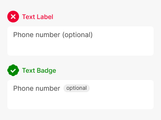
Using a text badge, you can help users distinguish the label from the “optional” text better. A text badge is the “optional” text placed in a rounded shape.
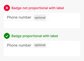
The shape shouldn’t look like a clickable button. Instead, it should be small, and the border should be tight to the text’s edges. The background color of the shape shouldn’t attract too much attention to signify a button. If users are clicking it expecting something to happen, it looks too much like a button.
The text badge should be proportional in size with the field label. When you align it with the field label, its height shouldn’t surpass the label element’s height. The “optional” text should also be centered inside the badge.
Access Full Article
Access the full article to learn more details and insights. Your subscription gets you full access to this article and all future articles.
Book

Affiliate

I’m not a frontend dev, but it seems to me that such badges can be a pain in the ass for developers. One line text fields is for text only and to put styled elements (like badge) in there, you will have to use absolute positioning in css, in which case it is better to place the badge not right after the text but in the upper right corner of the field. Alternatively, devs may not use standard text field (and mimic div element as a text field), but for me it’s not worth it and I would put those badges next to the labels.
Are you good at css and html?
Olga,
Please view this Codepen I’ve created to see how to this can be achieved (roughly speaking) without absolute positioning.
https://codepen.io/taldanan/pen/qBPrRGP?editors=0110
I think the UX principle is sound and aesthetically pleasing.