The most common interface component used to request information from users on forms is a text field. They come in various sizes, shapes, and styles. With so many options to choose from, what’s the best way to display them for optimal usability?
Strong Visual Cues
The best way signifies a text field’s function and how users should interact with it. In other words, a text field needs strong visual cues that signify what users should do.
Text fields are for entering text into the interface. Therefore, they must appear empty and clickable so users can take action as soon as they spot them. Text fields that don’t appear this way have weak visual cues that cause users to overlook them.
Having weak visual cues doesn’t mean users won’t interact with a text field. It means it’ll take them longer to do so, especially for elderly users. User research has shown that stronger visual cues lead to faster task performance.
Clickability + Empty Space
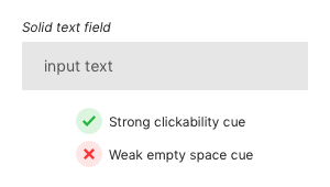
There are a few text field styles that have suboptimal usability. The first one is the solid text field that has a strong cue for clickability, but a weak cue for empty space. It looks more like a solid button than an empty text field because it’s filled with gray.

Users associate white space with emptiness. Text fields need to have white space inside them for users recognize that their input goes there. It’s important to have this cue so that text fields stand out because there are other elements on the page competing for the user’s attention.
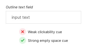
Another common style is the outline text field. These have a strong cue for empty space due to their inner white space, but have a weak cue for clickability. Only a 1-pixel outline is used to signify it’s clickability, which makes it easy for users to miss when it’s placed on a white background.

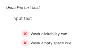
Underline text fields are worse. They have weak clickability and empty space cues. A 1-pixel horizontal line is not only easy to miss, but users can mistake it for a line separator used for separating content. Lacking both visual cues increases the time it takes for users to interact with the text field. This may be a few seconds more, but when it comes to form completion every second counts.

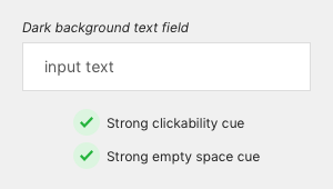
Placing it on a dark background and filling it with white space is the best way to display a text field. This strengthens both its clickability and empty space cue, giving it the utmost clarity. When users see it, it’s clear how the component functions and what it’s for. This visual clarity allows them to immediately interact with the text field without hesitation.

Rounded Corners
Once your text fields have strong visual cues you can start to think about rounded corners. Rounded corners don’t act as a visual cue, but they do influence the user’s attitude toward the object.
A research study discovered that sharp contours on visual objects convey a sense of threat and trigger negative biases. Another study found that curved contours are preferred over sharp angled ones across cultures. In other words, rounded corners on text fields could cause users to view your form as more user-friendly. But it’s questionable to what degree.

It’s important to note that if a user views your form as user-friendly, it does not mean it has optimal usability. The effect is only on the user’s initial perception of your form. It’s possible for them to view your form as not user-friendly if they have trouble filling it out despite the rounded corners on your text fields.
You can adjust the border radius to how round you want the corners to be. A higher border radius is neither good or bad, but rather an aesthetic preference. Adding enough border radius to round out the sharp corners is all you need.
Select States
Users need an additional visual cue when a text field is selected. The select state indicates the active text field so that users know where they are typing their input. The visual cue helps users focus on the active text field so that they don’t mistake nearby text fields for the active one.

The visual cue for the select state needs to have more than a change of border color. Only changing the border color would make the select state indistinguishable for visually impaired and color blind users.
Research on visual cues has shown that relying on color alone runs the risk of failing color blind users. Using both a color and shape differentiation increases the chance users will notice the cue and complete their task faster.
Along with changing the border color, you should also increase the border thickness from 1 pixel to 2. This will give the text field a distinct change in both color and shape to signify a clear state change for all users.
Usage Example
The ecommerce platform, Shopify, displays their text fields with clarity. They have a white text field on a dark background with a 2-pixel border select state and rounded corners. The color of the select state matches their brand color and gives it appeal.

Form Ever Follows Function
Clear visual cues are what give text fields optimal usability. You may look at a text field and think it’s clear, but not all users see what you see. Make sure your text fields are clear to all users, including those with visual disabilities.
To give clarity to all users, you need to have a primary and secondary visual cue. The visual cues for text fields are clickability and empty space. But with other interface components the visual cues could be different.
An interface component’s function is what determines which visual cues to use. Let function guide how your interface components should look. As the 20th century maxim by the famous architect Louis Sullivan goes, “form ever follows function”.


Funny, but this very website doesn’t use the :focus attribute on the comments form properly as described above 😉
It does now. I’m fallible so don’t follow the advice based on whether I do it or not, follow it because it makes sense.
“Don’t follow the advice based on whether I do it or not, follow it because it makes sense” this is gold.
So… The reply form has sharp angles and focused field is indistinguishable from unfocused one right here in your blog. Looks a bit hypocritical 🙂
This is extremely helpful information! I really appreciate the examples and forward explanations. Keep up the great work!
~Joslyn