Form field label alignment has evolved over time. It’s been five years since I first introduced infield top-aligned labels. Due to its advantages over both top-aligned and infield labels, many have adopted them. However, it seems many have also adopted its counterpart, floating labels.
This is unfortunate for users because infield top-aligned labels have far better usability and accessibility than floating labels. The standard for label alignment should have a high level of usability and accessibility, or it’s not the best practice everyone should follow.
In this article, I’ll break down why and how infield top-aligned labels are more usable and accessible than its counterpart based on key form criteria. If you’re using floating labels, here are the reasons you should reconsider.
Active Field State
Floating Labels: Animation Woes
First, there’s the animation issue on floating labels. When users select a text field, the label transitions from a placeholder position to a top-aligned one with the animation. While this effect for the active state might look cool, it poses a problem for users with motion sensitivity.

Users with vestibular disorders need control over movement triggered by interactions. Non-essential animations can cause vestibular disorder reactions, such as distraction, dizziness, headaches and nausea (source).
If the floating animation only occurs on a few fields (short forms), it shouldn’t pose a problem. But when it occurs on many fields consecutively (long forms), the effects can compound and trigger unpleasant reactions on motion-sensitive users.
For non-disabled users, it poses a distraction problem during their task. It’s hard to predict whether the label will float or not float when they first encounter a field. When it does float, some users may be taken aback by the behavior. They may even play around with it, which takes time away from completing their task.
IFTA Labels: Simple Highlight
With infield top aligned labels, there are no unpredictable animations that surprise users. What you see is what you get. This static approach may not be as fancy, but fanciness isn’t needed as it adds little to no benefit for users.

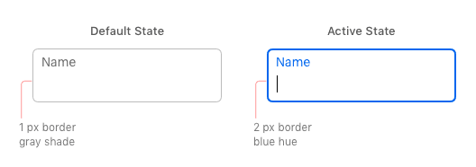
Instead of using an animation to indicate the active state, it highlights the label and border with a color hue. The border also increases from 1 to 2 pixels for greater contrast. Any extra features would only distract users from filling out the form.
Label Readability
Floating Labels: Tiny Text Labels
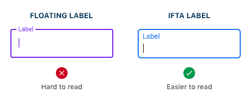
When floating labels transition from the placeholder to top-aligned position, the text label typically shrinks and becomes tiny. This is standard behavior for floating labels because the label isn’t treated with importance after active field selection. The tiny label size makes the text hard to read when users need to check or correct their input. Low vision users will struggle the most to read the tiny text labels.
IFTA Labels: Readable from Start to Finish
Infield top-aligned labels don’t shrink on field activation. They stay at the same readable size as it started with. The label is treated with importance before and after active field selection. By not manipulating the text size, the readability remains consistent and there aren’t any sudden surprises to confuse users.
Recognizing Incomplete Fields
Floating labels: Placeholder Conflict
Floating labels start in the placeholder position of the field, which is the same place the user’s input goes. This placeholder conflict can cause users to mistake incomplete fields as complete because the fields are filled-in in both cases. It’s likely they could submit the form thinking every field is filled out and receive unexpected errors. Not only that, but any fields they skip or miss are hard to spot when they go back through the form.
IFTA labels: Filled-In States
There are no placeholder conflicts with infield top-aligned labels. The highlighted label displayed in the active state doubles as a filled-in state for recognizing incomplete fields faster. It does this by remaining highlighted after the user enters their input and leaves the field. If users need to find any fields they skipped or missed, all they have to do is scan the form for fields that don’t have a highlighted label.
Placeholder Hints
Floating Labels: No Room for Hints
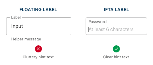
An informative hint can help users out when they’re unsure of the proper input. Floating labels don’t leave much room for hints because the label occupies the placeholder space. Instead, the hint text has to go outside the field, which users can easily overlook. Not only that, but multiple hints would clutter up the form. The extra text would clash with the label and input text and make it harder for users to focus.
IFTA Labels: Room for Hints
Any fields that need hints have placeholder space on infield top-aligned labels. The hints are placed in a position where users can easily see them. They can read the label with the hint at the same time for faster processing. The hint text also won’t clash with the input text since it goes away after the user types in the field.
Distinguishing Input from Label
Floating Labels: Crammed Spacing for Two
Floating labels often make it hard to distinguish the input from label due to the lack of margin space separating them. The label and input are crammed so close that they tend to run together. Instead of reading it as two distinct lines of text, users see it as a blob of text.
The reason this happens is because the initial label and input are given prime spacing and vertically centered inside the field. As the label floats to the top on field selection, it becomes an afterthought and doesn’t get the spacing it needs. Not much attention is given to how the label would look when it floats.
IFTA Labels: Fitted Spacing for Two
Instead of cramming the label with the input, infield top-aligned labels require you to give equal attention to both texts from the start. When you design, you have to think about how the label and input will look together. This causes you to make sufficient room to fit both of them instead of one over the other. With fitted spacing, it’s easier to distinguish the input from label when users check over the form.
Infield Top-Aligned Labels Win

Infield top-aligned labels succeed in areas where floating labels fail. They may seem similar, but there are key differences that set them apart. Once you understand them, you’ll know why you should adopt infield top-aligned labels over floating labels.
There’s one reason you may want to use floating labels, though. Floating labels are fancy and fashionable due to its animation and Material Design’s adoption of them. So, when you’re designing a form, you got to ask yourself a question. Which is more important: a usable form or a trendy one? Trends tend to fade over time, but a true standard lasts a lifetime.


Hi Anthony
Thank you for your great article on Infield Top-Aligned Labels – you make a great point. How would you suggest to position the error messages it the validation of the users input fails?
Below the field: https://uxmovement.com/forms/the-best-place-for-error-messages-on-forms/
Why would you not use the same location for the hint text as the error text?
One of the original advantages of IFTA labels (in the original article) was less vertical whitespace between fields, so that the vertical length of the form gets reduced. But in this article, all your examples show a lot of whitespace between fields. What gives?
That’s the paper form style. You can use either. The point is that you can use the paper form style to reduce length with IFTA labels, but it wouldn’t work with top-aligned labels.
How does this design pattern accommodate for longer field labels? A left-aligned label placed ABOVE the field itself can extend beyond the width of the field or wrap to a second line. What options do you have with infield top-aligned labels other than truncation?
If this happens, either your fields are not wide enough or your label is too long. Usually it’s the latter. Your label shouldn’t look like description text. Keep them as concise as possible. If you need to provide more info to the user, use placeholder hints or help tips.
I think it is complicated especially for passwords to keep the placeholder in the box. In case of a complex password, user can forget the recommended characters.
Placeholder hints are for short, concise hints. If you have more than one password requirement, use help tips.
In that case of many requirements, you may want to use a callout bubble instead (make sure it doesn’t cover any other part of the form and see the “Validate Fields with Multiple Requirements Before Submission” section in https://uxmovement.com/forms/how-to-make-your-form-error-messages-more-reassuring/ for more details).
You’ve convinced me! Much fewer moving pieces. Great write up.
You make some really good points although i may have some counter thoughts on some of them.
– For the animation point, I haven’t done an extensive research but I think it’s a very minor movement to cause problem with sensitivity. Moreover I think the simple animation give the user a very clear visual cue of the field being active, especially on desktop where there is no keyboard activation to indicate that.
– For the label size issue, the counter point could be that having the labels in the form of placeholder text which are of a larger text size than the label makes it clearer for the user to read. And after the field is active it can simply moves aside to a smaller font but by then the user is already aware of what it says. For the user to check them before submission I think the content that they have filled itself is enough for them to verify. I do agree it may cause a confusion in the sense that they might feel like the field is already filled, but that could be taken care of by a lighter colored text.
But I do agree that IFTA are great for easily spotting incomplete fields for long forms and for cases like password which might require a more descriptive placeholder text!
Hello,
I would like to ask you how many pixels do you think should be the cell (width and height)?
Thank you!
Good question. In my opinion, the optimal height for IFTA text fields is 60 CSS pixels. This allows enough spacing to fit the label and input comfortably, while making the field easy to tap. This also mirrors the optimal size of mobile buttons: https://uxmovement.com/mobile/optimal-size-and-spacing-for-mobile-buttons/
The width will be an adaptive value based on the viewport of the device. But on average, 300 CSS pixels minimum.
Hi, where is best place to set help tips (for IFTA) ?
How to Display Tooltips on Mobile Forms
Keep spreading knowledge bruh! you did a gread job ignore the hater…
Great article, Anthony.
Any place I could find a sample implementation with code?
Hey Gerry, I mocked up an example in CodePen (forked from another user who had set up the initial structure).
This version doesn’t use any javascript, but does rely on some funky negative margin for the labels which may/may not be desirable.
https://codepen.io/alanvitek/pen/PoZPvRp
This solution relieves most of my issues with floating labels. How do you propose this works for selects?
To reduce clutter, I wouldn’t mention a password’s requirements if they are simple (“at least 6 characters”). Most people know a password shouldn’t be too simple.
How survey forms will be use in this IFTA model? Question labels and radio buttons and check boxes ..
How would you counter the point that the IFTA labels are comparatively very small font size compared to their floating or above-the-field counterparts?
After the article, there’s a “Subscribe” widget for signing up for newsletter emails. Its input field does not have a label, just placeholder text. It would be nice if you would redesign the widget to follow the approach shown in the article.
Thanks for this helpful article. What about multi-column, and radio or checkbox fields?