There are many reasons why toasts are an effective way to express interface states. But if you don’t design them the right way, they can end up working against you. Some designers think toasts have poor usability and accessibility.
However, toasts themselves don’t cause these issues. Designers who don’t design them properly do. By following these best practices, you can resolve all the usability and accessibility issues that can occur on toasts.
Make Your Toasts Small and Unobtrusive
Some believe toasts can disrupt the user’s task because they block elements. However, viewing the toast is part of the user’s task. Although toasts can block elements, this is necessary to keep users informed about system events. Users need to know which states are occurring as they perform actions. Ignoring contextual states can lead to interaction errors.
Also, toasts will typically display for 2-5 seconds. A time frame of 3 seconds is ideal for most users. However, you can adjust the toast’s exit timing to make it disappear quicker, so users don’t have to wait. You can also make the toast dismissible through a swipe or click. This way, if the toast lingers too long, users have control over it.
If you design your toasts as small, thin, unobtrusive rectangles, they won’t block much. They’re not like modal dialogs that block the entire screen. Toasts are placed along the edges and corners so that they don’t block the center.
Make Your Toast Messages as Brief as Possible
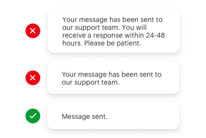
Most users can’t read a paragraph in a few seconds. So if your toasts are disappearing before users can finish reading them, you’re probably displaying too much text. Your toasts should contain no more than 1-2 lines of text. They should also be between 240-360 pixels wide.
Displaying too much text is a common mistake. It’s important to keep your toast messages brief. The messages do not need to be full sentences. Instead, they need to make sense using the fewest words possible. For example, instead of saying “Your message has been sent to our support team,” you should say “Message sent.” The extra words aren’t necessary because users already understand the context.
Read the full article to learn more…
If you want to learn all the best practices for designing toasts, subscribe to read the full article. Your subscription gets you unlimited access to our entire archive of premium UX articles.

