Are you thinking about using modal windows on your interface? Modal windows prompt users to choose an action to take before they can return to the main window.
When they’re used right, they can ease user effort during a task. When they’re used wrong, they can get in the way of the user’s task. Here are some best practices that will help you design user-friendly modal windows.
Modal Windows
A modal window is a secondary window that opens on top of the main one. Users have to interact with it before they can carry out their task and return to the main window.
You should use modal windows when there are steps the user needs to do before the task can be completed. Using a modal window instead of a full page allows users to maintain the context of their task.
Include a clear, visible title that matches the clicked button
When a modal window opens, it’s important for users to know where it’s coming from. Your modal window should include a title that matches the button they clicked to open it. This shows consistent behavior and tells them what task they’re doing.

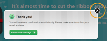
Offer a high contrast close button in the top corner
Closing the modal window when they need to. Use the conventional ‘X’ icon for your close button. A high contrast close button will allow users to see their exit better. Your close button should stand in shape and color.

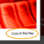
Allow users to close the window with the ESC key
For accessibility reasons, your modal window should close when users press the ESC key. You should also allow users to tab through controls in the modal window if you have them. This will allow users who use screen readers and keyboards to navigate your interface.

Close the window when users click outside it
In case users can’t find your close button, allow them to close the window by clicking outside of it. This makes exiting easy and intuitive because users will often click on the main window to go back to it. But you don’t want to allow users to exit this way if they’re entering information on a form, otherwise they could lose it.

Use ‘Cancel’ buttons when necessary
Your modal window will need a ‘Cancel’ button if the user is doing a task where they’re entering information. If there’s a form in your modal, it’s important that the user doesn’t click outside of the window to close it. To prevent this, offer users a ‘Cancel’ button as the only way the user can close the window.

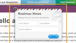
Put a Shadow or Transparent Overlay Behind It
When a modal window opens, users need to know that it’s a secondary window overlaid on the main one. Make it easy for users to recognize that they are in a mode by using a shadow or transparent overlay behind your window.

Make sure the transparent sheet is not too opaque so that users can still see the main window. If it’s too dark, then users could make the mistake of thinking they have left the main window.

Don’t make the window size too tall or wide
If your modal window is taller or wider than the user’s screen, they’ll have to scroll to see all of it. This makes it especially frustrating for mobile users. Make your modal windows the right size for the user’s screen, so that they don’t have to scroll.
 Modeless Windows
A modeless window is also a secondary window that opens inside the main one. However, the difference is that users don’t have to interact with it before returning to the main window. Users can continue working with the modeless window opened. It doesn’t require their immediate attention.
Use when users need to refer to main window information
When users need to compare or refer to information in the main window, a modal window will not work. A modeless window what you should use in this situation because it takes up a small part of the screen and allows users to view and work in the main window when it opens. Users can interact with both the modeless and modal window at the same time.

Make it as small as possible
Modeless windows should take up a very small amount of space on the main window. Make your modeless window as small and understated as possible, so that users can still interact with the main window. The main window is always the primary focus of the user’s task.

Attach it to the main window edge
A modeless window should display until the user has closed it. Attaching it to the side edge of the main window keeps it visible to users. They can scroll and still interact with the modeless window when they need to.

Use an ‘X’ for the close button.
A modeless window doesn’t need as many exits as a modal window. A simple ‘X’ icon button should close it. Make the button visible and place it at the at the top-right corner.
Final Thoughts
Modal windows are an effective interface element when you design and use them right. They can help user’s complete tasks faster and easier. But they can also frustrate them when they’re done wrong.
Knowing how to design modal windows will allow you to use them in a way that doesn’t annoy you. Keep these best practices in mind so that the modal windows you design will bring users a step closer to success.
 Modeless Windows


Great advice on Modal windows, but I don’t agree that modeless windows should be attached to the top, bottom, or side of the main window – this works on a smaller monitor, but when you are using a large monitor (as more and more of us are) and the modeless window appears on the other side of the screen (eg form element is at the bottom, but the modeless window appears at the top), it is VERY easy to simply not notice it!
Instead, I think modeless windows should appear within the page, like tooltips or other non-modal popups.
I don’t agree with “A modeless window should display until the user has closed it.” User off course should have the option to close it, but in most of the cases it should be close itself after some seconds or minutes.
Situation one:
>halfway through filling out form
>closes randomly
Situation two:
>open page, modal window displays
>grab coffee
>completely miss it
Terrible idea. Everything on a website should be done with the consent of the user. Same thing as having autoplaying videos.
Dude was talking about modeless (not modal) windows.
But there should be a further distinction for “notifications” which are a special kind of modeless element that has even more behavioral nuances. For instance, you don’t want to display a bunch of notifications in an inactive browser tab…
A nice post – Thought most UI Desig practitioners would know about this, it is always nice to know that the fact is documented and presented well… Thanks for sharing!
What are people’s thoughts on having a modal window in a modal window? Good or bad?
Bad
Terribly bad. A modal should ideally avoid having any sort of navigation in it: no scroll bars, no tabs, etc. If you need those extra elements then you probably shouldn’t be using a modal in the first place.
Defeats the definition of putting the user into a mode in order for them to complete an action and exit that mode.
Actually this can be done effectively with some different styling of the secondary modal. Mac OS does this well. I’m filling out a form in a modal dialog window, then when a secondary modal is needed it slides down from the top of the window in a lightweight format. Now a THIRD step would be a no-no. I have spoken, thus it is so.
I think modal windows are often overused and produce more bad UX than good.
Even examples in the article demonstrate this:
1. Facebook compose message – GMail does it better, because often people need to look something up while composing a message and there is no way to do that because modal window blocks everyting.
2. Thank you message – does it really need to block everything and require user to click ok? This seems to feed the developer’s/company pride more than serve the user’s goals.
3. welcome to Groupon requires user to notice the X on the top right without providing clear “Continue to the website” button under the text.
4. In cases like creating “new class”, or “newsletter signup” there is often little reason why those forms should be modal and could not be embedded in the page (or be a separate page) as edit-in-place.
Modal windows are rude and disruptive way to force the user to do what you want one step at a time, which is often conflicts with how users think and interact with the information…
Def agree with you.
http://ihatepopupmodals.tumblr.com/
How (or where) would you add a Help button to a modal window?
Do you “have to” have an explicit means to close a modal?
I’m thinking of a simple image display, which opens modally when you click on a thumbnail. In this instance, is ESC or click outside enough, or is an X required?
You need the X unless the modal is part of a process that provides a ‘Cancel’ button. This is because pressing ESC or clicking outside has no visual cue. An X icon is a visual cue that gives users a clear and visible exit.
I currently work for a software company in healthcare and we have multiple scenarios of using a modal with tabs. I vomit every time I see them. Has anyone seen a great way of getting away from a modal with tabs that doesn’t take you to another screen to do the tasks at hand? This particular scenario is being used for creating a multi-user, multi-stepped, tons of data scheduled event.
Open to suggestions and ideas. Thanks. Great posting.
So… your tips didn’t mention anything about keyboard usage and where in the code this modal window should be in relation to the text… I’d suggest you add a section that highlights the modal window placement should be in logical order in the DOM, so that a keyboard-only user who doesn’t use a mouse will be able to interact with the modal when it’s relevant, and not after scrolling through unseen text behind the window. A web user who is blind or low vision will also appreciate this very much.
What should ideally happen when you press back-space on your keyboard? What does a person using a screenreader expect in this case?