A login form is like the entrance to a house. It should be welcoming, easy to enter, and never mistaken for a different door. When your logins are like this, you’ll encourage users to log in more frequently. Unfortunately, most login forms today aren’t user-friendly entrances.
The rise of social logins and tightened security have made logins more challenging. Users often mistake them for signup forms and have trouble logging in. Not only that, but they’re often cluttered with distracting elements. The following UX practices will clear up the confusion and simplify your login.
1. Don’t mix “Sign in” with “Sign up.” Differentiate the button labels.
When users see two buttons with the label “Sign in” and “Sign up,” they can get confused and click the wrong one. It takes extra cognitive effort to tell the buttons apart because the labels are too similar.
Make each of them distinct by differentiating the labels. If you’re using “Sign up,” pair it with “Log in.” Pair “Sign in” with “Create account” or “Join” (source).
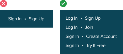
Even better is for the label to describe what the user is doing in the context of their task. For example, “Try it free” tells users that they are signing up for a free trial. This label is more descriptive and will get more clicks than a generic “Sign up” label.
2. Don’t make login and sign up forms look the same. Differentiate them with contextual cues.
Did you know that some users will accidentally type in their login credentials on a signup form? This mistake occurs because the signup form looks too similar to the login. Just like with labels, the forms shouldn’t look similar either.
Even with different page titles, users can still make this mistake. This is because most users operate on habit and reaction when logging in. Once they see a text field, they begin typing.
The key to signify that users are on different forms is to use a variety of contextual cues. Use a colored theme for the signup form but a neutral one for the login. This will also help make your signup form more inviting and appealing. Logins don’t need the same visual treatment because users are already signed up.

You can also make the page titles bolder and reflective of the task with contextual messaging. For example, instead of “Log into your account,” the label “Welcome back” signifies that users have been here before. If they haven’t signed up yet, they can tell they’re on the wrong page.
Instead of “Sign up for an account,” the label “Tell us about yourself” signifies that users need to provide personal information. If they’re trying to log in, they’ll know they’re in the wrong context.
3. Don’t put “Forgot Password” near the field. Place it in the login footer.
Putting the “Forgot password” link next to the password field is like putting a fire extinguisher near the front door. It’s important to be safe, but help tools shouldn’t create distraction and clutter. It’s unnecessary to place a “Forgot password” next to the field when you can put it in the login footer. Users will see it when they need it, not when they don’t.

4. Don’t put “Sign up” near the top. Place it in the login footer.
The “Sign up” link is also considered a help tool when users land on the wrong form. Don’t place it near the top where it steals attention from more relevant elements. Place it in the login footer with the “Forgot password” link. When users need help, they’ll look toward the bottom and find those help links. The majority of the time, users won’t need help. Don’t shove help tools in front of their face when they don’t need them.

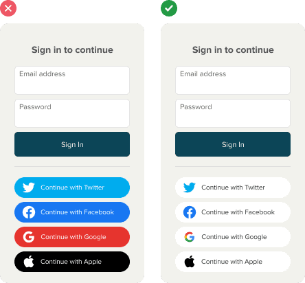
5. Don’t make social login buttons compete with each other. Use colored logos on white buttons.
Grouping multiple social login buttons together can make a specific one hard to perceive. This occurs when all the buttons are different colors and competing with each other. Instead of using a colored button background, minimize the noise by using a colored logo with a white background. This makes it easier for users to identify their preferred social login through a more recognizable cue.
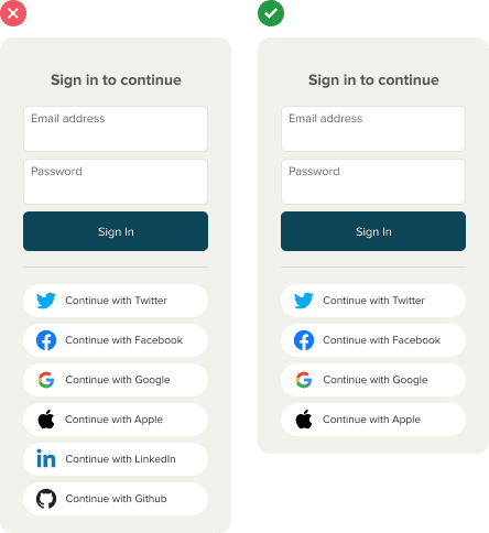
6. Don’t overdo the number of social logins. Allow for no more than four.
The problem with offering too many social logins is that users may not remember which one they used for your site. This can cause them to log in with the wrong option. Limiting the number of options allows them to figure it out easier if they forget.
Offering too many choices also makes it harder for them to decide which one to use. They have to spend time to evaluate which social media site they trust more.
7. Don’t overexpose social login buttons. Disclose them on click.
Is the primary way of logging in through social media or email? Figure out which method is preferred by your users and commit to it. If they prefer a social login, disclose the email login form on click. If most prefer an email login, disclose the social login buttons on click.

Don’t disclose both methods at the same time. Users have limited attentional resources. Displaying too many visual elements creates distraction, noise, and clutter. Use a progressive disclosure button to reveal the secondary login method when users click it (source). This keeps the focus on the primary login method to satisfy the majority of users.

8. Don’t use a “Remember me” checkbox. Use a “Log me out after” one.
Most users have trouble remembering to tick the “Remember me” checkbox. As a result, they have to enter their login credentials again after each visit. This can be costly in time-sensitive situations. By remembering the user’s credentials by default, you prevent the hassle of repetitive logins.

Users who log in from a public or shared computer can tick the “Log me out after” checkbox. This gives them certainty that their session will expire after they close the browser. These users are less likely to forget to tick the checkbox because they’re more conscious of their privacy (source).
Access Full Article
Get access to the full article to learn the best way to handle login lockouts and prevent user errors. Your subscription gets you access to this article and all future articles.
Book

Affiliate

I would have shared this article on social media, but the failed promise of the title (half the items are hidden behind a paywall – that is only disclosed at the end of the free portion of the article) leaves a bad taste and ironically is the type of UX issue you are writing about.
Sorry about that. Hosting and writing each article costs a lot of time and resources. By subscribing to premium, you make it possible for us to continue providing great content.
We offer free samples so you can get a taste. If you find them helpful, we hope you’ll subscribe to learn more. The full article goes into the design details that’ll take your UX skills to the next level. It’s a small investment for bigger career gains.
I find the number 8 is really confusing and I’ve never seen any systems use that “Log me out after” checkbox.
Number 8 might actually be illegal under some jurisdiction’s law (e.g. Euro area under GDPR).