What shape are your app’s profile pictures? Chances are they’re square. A square isn’t the best shape to use because it makes it hard to visually process faces. A circular profile picture works better because it accentuates faces.
Corner Brightness
One reason square profile pictures are harder to process is because of its sharp corners. Sharp corners make shapes appear brighter. This brightness can interfere with facial processing in profile pictures.
A circular profile picture would not have corner brightness because it has no corners. This allows users to view faces without visual noise.

Center Focus
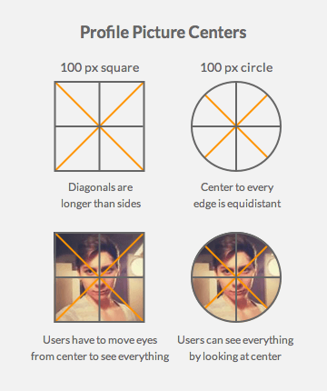
Most faces are at the center of a profile picture. When looking at a face in a square profile picture, users will spend longer focusing on it. This is because the distance from the center of a square to each corner is longer than the distance to the sides. Users have to move their eyes along the diagonals to see everything.

When looking at a face in a circular profile picture, users can see everything by looking at the center. This is because the distance from the center of a circle to every edge is equidistant. Users will spend less time focusing on it because they don’t need to move their eyes around.
Background Area
The most important part of a profile picture is the face. The less background area there is, the more users can focus on the face. A square profile picture displays more background area than a circular one. A circular profile picture cuts the background area at the corners.

Non-Facial Pictures
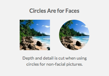
A circular shape for profile pictures work well because it accentuates the face. But it isn’t as effective for non-facial pictures. The background of a non-facial picture may contain content users want to see. Cutting the corners off could also cut depth and detail.

Shaping the Experience
Circular profile pictures accentuate faces more than square ones. Accentuating faces helps users identify their peers easier and distinguish usernames from content. If a simple change can shape the user experience this way, it’s a change worth making.


This makes a lot of sense, thanks for the brevity and clarity!
I wrote on this exact same topic recently, a more lengthy case study: https://medium.com/@ching_hsieh/the-geometry-of-profile-photos-b6c385367447#.kf18oy58f
I think circular profile image is still good for non facial image.
It depends on composition of the image that you use.
If focus point of non facial image is on center, then you should circular profile image.
Circular profile pictures are terrible. Human faces are the most recognizable things to humans. Large portions of our brains are dedicated to facial recognition and they do not need help by making profile pics circular. All devices in existence have square screens and round pictures look silly on them. Square pictures look far better and do not in inhibit the recognition of faces. It’s time to lose this silly trend and go back to the more professional looking square profile pictures.