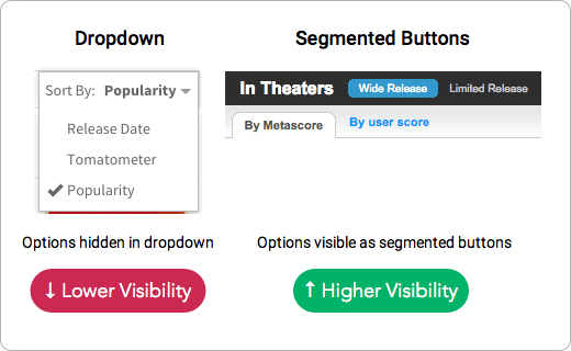
Content filters allow users to find what they want without going through an entire archive. But many make the mistake of hiding the options in a dropdown menu. This mistake causes user frustration, but you can easily prevent it.

Instead of using a dropdown menu, use segmented buttons (aka toggle buttons). Dropdown menus are useful for saving space when you have options that aren’t relevant to the user’s task. But when users are sorting, every option is needed for finding content. In the context of sorting, it doesn’t help to save space at the expense of losing visibility.
Segmented buttons allow users to see every sorting option available. It’s clear what the selected option is and what other options they can select. This visibility enables them to sort content faster and easier.
It only takes one click to select an option in segmented buttons. It takes two clicks and a scroll to choose an option from a dropdown. Users have to click to open the menu, scroll to the option, and then click to select.
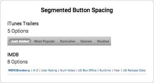
The more options, the more horizontal space segmented buttons take up. But don’t let the number of choices discourage you. You can still fit many of them within the limited space. The example shows an eight option segment, while another shows a five option one.
When the content filter is hard to find, users will resort to using the pagination to search through the archives. But paginations don’t order content by the criteria that users want. The content filter should always catch user attention so that they’re not forced to use the pagination.
Which user interface control you use can affect user experience. Dropdown menus save space but give users lower visibility. Segmented buttons give users higher visibility but limits space for options. In a given context, ask yourself what matters more to users, space or visibility?
Book

Affiliate

To add to that, the toggle buttons only require one click compared to two clicks for drop down lists.
I wouldn’t say dropdowns are bad and toggles are good just because they’re more visible. As with any other UI element, there’s pros and cons.
Dropdowns are standard since the beginning of the www. People are very used to them and therefore can automatically action them. They also engage better with OS UI (ie you can use Android/iOS own UI) and their behaviour is expected.
Toggles, on the contrary are more of a novelty. They are customised and therefore users are not 100% familiar with them. A toggle’s behaviour is harder to predict. What you win in visibility, you lose in terms of familiarity and standarisation (ie integration with OS).
I don’t have user research to support the following statement, but from a personal point of view, the toggle/tab in metacritic doesn’t look like a UI element that will filter the same content differently… it looks like a tab that will show different content.
I agree with you that normally toggles are a better solution and 100% visibility is preferred, but just thought the framing of your article in black and white terms was a bit extreme and wanted to challenge your point.
Best Regards,
Nestor
Nestor, I mostly disagree with your comments, but agree with some. In the Metacritic example the failure of the tab-like UI to filter is due to the lack of information which could have been made clearer to the user by a small label: “filter by”. The devil and usability is in the details. 🙂
I agree with following UX conventions in the interest of the user, however, when only a small space is needed to make choices visible I would opt for that vs. hiding options in a drop-down. For longer lists this may not be feasible.
I also think some people confuse “sort” and “filter”. A sort is not the same as a filter. “Sort” mean viewing the same data/content displayed on the screen, but sorted in some fashion to the user’s preference. A “filter” on the other hand is a display of “filtered” data/ content, usually reduced from the “view all”.
I think the RottenTomatoes example with the Metacritic may even be the wrong one because one is a sort by whereas the Metacritic is a “filter by”.
@Bernhard it’s not about the number of clicks, it’s about UX. 🙂
I find the top example (that is to say, the one marked as “Good”) still difficult to interpret. I think for me it would need a little more adjustment in order to sufficiently communicate it’s current state setting. Right now, I wouldn’t know if the “Top Comments” is the one that is selected, or the “Newest First” is selected.
Sorry. I’m the user in this case, and I must providing you feedback. I suppose that I’d not be the only one.
Oh, someone beat me to it. With two options, I think it needs a marker. Especially with those colours. Even if there are more than two options, I’d use a marker just to improve acquisition.
I agree with eeklipzz. The selected state isn’t always clear – especially if there are only two items in the toggle. Any suggestions on ways to make it more clear would be appreciated!
I agree with you guys – selected state is not always clear. We’ve done some informal testing of an app with this feature and some didn’t even know there was something they could change/do with it.
I’m also looking for other suggestions as I originally went to a dropdown, but not the best experience either when only two options.
I agree with you when you have 2 options maybe 3 but tabs are notoriously bad to convert to a useful mobile experience and additionally it relies on Javascript instead of HMTL (I don’t know if there’s a HTML control for tabs yet…)
Also, unless you are Google, new ways of doing sorting is not recommended in my opinion – drop-down sorting is a familiar behaviour in ecommerce.
My 2 cents…
Drop down boxes aren’t as modern – or as “sexy” as toggles but I agree that people know intuitively how to use them and therefore don’t have to hesitate to figure it out – they just look at the titles, pick one and click. With toggles or tabs there is usually a hesitation – especially with accordions where the title is sideways.
However, in the case where the drop down title contains different information than the categories under it (in your sorting example) toggles are best – or better yet have a different title with both choices under it. People don’t see the drop down title as a separate choice, but rather a category with all the information in the listings underneath it combined on one page.
IMO, the first example isn’t great when it comes to sorting content. When you use toggle tabs, it’s hard to tell which one is active/inactive because there are only 2 options and they are very flat. You may be able to get away with this buy adding more depth to the design.