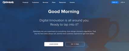
A ghost button is a button that has an outline but no solid fill. They’re a popular trend across the web, but many designers are misusing them. Misusing them can lead to users missing them when they visit your site.
Lower Click Through Rate
Ghost buttons are popular among designers because they exude a modern, minimalist look and feel. It’s not loud, dominant and doesn’t call out to the user. But that’s exactly the problem when you use them as a call to action.

A call to action button needs a strong visual cue that attracts the user’s attention and calls them to click it. A ghost button’s minimal appearance lacks a strong visual cue, which results in a lower click through rate.
A low click through rate means most users are overlooking ghost buttons, which leaves them less engaged with a site. Several different studies have found that users recognize solid buttons a lot quicker and easier than ghost buttons. This was concluded in an A/B test, click test, and visual attention test.
The click through rate difference between a solid and ghost button is significant. This company did a study and found an increase in the click through rate of their email newsletter by switching to solid buttons. For every email opened, the solid button outperformed the ghost button by 7%.
It’s foolish for designers to sacrifice their click through rate to follow a stylish trend. Users will get more utility from a site with clear visual cues than one without. And designers will get more user engagement that can lead to conversions.
When to Use Ghost Buttons
Ghost buttons are only a problem when they’re used in the wrong contexts. When used in the right context, they can clarify the priority of an action and increase task efficiency.

When users see two buttons together, they need to think about which button to click. They’ll read the text labels to decide, but putting visual cues on the buttons can help them decide quicker. A solid button for your main action and a ghost button for your secondary action will accelerate the user’s decision-making.
In the “bad” example above, you can see how the outline of a ghost button gets lost with the lines of text when it’s by itself. If you were scanning the page, you could easily miss the button.
In the “good” example, the solid button carries so much visual weight that it’s hard to miss it. Your attention is drawn to the main action even though its surrounded by text and another button. The secondary action is still visible by its close proximity, but it does not take attention away from the main action.

Don’t Lose Your Visual Cues
Designers are misusing ghost buttons without realizing the consequences it has on their users. They assume the outline around a ghost button is a strong enough cue for a call to action. They assume it’s okay to use ghost buttons for its style because other sites do the same. But studies show this is not the right approach to using them.
Visual cues are disappearing from buttons and users don’t appreciate that. Designers may like the minimalist style of a ghost button, but the function of a button is for action, not aesthetics. The context in which you use a ghost button matters. Use it in the wrong context and your button’s visual cue will disappear like a ghost.


Absolutely right! I agree with the article.
I agree with all of this, but you have inadvertently raised another separate issue in your “good” example of “When to Use a Ghost Button”, and that is having the Main button on the left and the Secondary button on the right.
This often comes down to which OS you were raised on, Mac or Windows, and it simply being what you are used to seeing.
But the web is cross-platform, and so there should be a standard. A “right way” and a “wrong way”, if you will, just like with all other aspects of good UX design.
Personally, I’m in favour of the Main action being on the right, and that’s not just because I am a Mac user. The reason for this is simple, and it’s similar to the back and forward buttons in your browser toolbar: left is go back, right is go forwards. And to put it in context of the Main and Secondary buttons, the Main / right button is to go forwards, to proceed forwards in your journey with your chosen action, whereas the Secondary / left button is often a Cancel button, which whilst not going backwards, is certainly to choose to NOT go forwards in the journey.
I’d like to see a more in-depth article on this on this site, detailing this in a better way than I can.
I agree with you. I used that placement in the example so that I wouldn’t cause confusion with the order as most people expect to see something that’s main come before something that’s secondary.
I’ve written a couple articles on that topic in the past:
http://uxmovement.com/buttons/why-users-click-right-call-to-actions-more-than-left-ones/
http://uxmovement.com/buttons/why-ok-buttons-in-dialog-boxes-work-best-on-the-right/
good article – thank you. (Conversion) button positioning and also styling should not be done by opinions, taste or experience from other projects only – it should always be subject of A/B-testing.
This is a great article. We see this UI being misused too often! 100% worth an A/B test as suggested by Oliver.
This is a classic case of favoring aesthetics over functionality. It just makes more sense to have your main CTA button prominently displayed and the easiest way to do that is by using color contrast. Really good post backed by some good research!
Great article. I had a digital designer tell me that they didn’t want to change from a ghost button to a filled button on a site homepage (after I proved it had a low CTR) because a filled button “didn’t look cool enough” for the brand. Sigh.