Have you ever clicked a wrong button by accident? Users make wrong decisions on modal windows when they’re not guided in the right direction. Many modals prompt users to act without making the different actions clear.
Clear color contrast between different buttons is what guides users to choose the right one. Not seeing a clear action to take causes uncertainty in users and slows down their task. It may even cause them to choose the wrong action that derails their task.
Positive, Neutral and Negative Actions
There are three types of actions that every button falls under:
- Positive – Changes, sends, or adds information
- Neutral – Makes no change or takes users back a screen (e.g. Cancel)
- Negative – Deletes, resets or blocks information
A modal window will often have a combination of these actions. In order for users to tell different actions apart, the color contrast of the buttons should reflect its role.
Positive Actions Need the Highest Contrast
Positive actions are the most common on modals. Users will need to know which actions allow them to complete their task. You should make that easy for them by giving positive actions the highest color contrast of all. Any neutral or negative actions placed next to it should have lower color contrast.

To get the highest contrast, give your positive action buttons a color fill with a cool color and white text. Cool colors like blue, green and violet are soothing to the user’s eyes and tend to move back in space. The white text is easy to see and stands out over normal black text.
A neutral or negative action placed next to a positive one should not have a color fill. Putting a color fill on it makes the color contrast too similar. Instead, the button should only have a border outline. This way it blends in with the background and doesn’t compete with the positive action for user attention.
When Negative Actions Have Highest Contrast
Negative actions shouldn’t have higher contrast than positive actions. Positive actions are used more often and safer, so it’s important users don’t mistake a negative action for a positive one. But when negative actions are placed with only neutral ones, they should have higher contrast.

In this case, you should give your negative action buttons a color fill with a warm color. Warm colors like red, orange and yellow stimulate the user’s eyes and tend to come forward in space. When user’s see it, they’ll know they should think twice before they click the button.
Neutral Actions Have the Lowest Contrast
A modal window never has a neutral action by itself. It’s always paired with a positive or negative action. It should have the lowest color contrast so that it doesn’t compete with other actions.
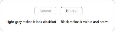
A black border outline of the button is enough to tell users that it’s a neutral action. There’s no color fill so it won’t take attention away from positive or negative actions.
Don’t make the button outline and text light gray otherwise users might mistake it for a disabled button. They need to contrast with the background so that it looks visible and active.
Final Thoughts
Positive, neutral and negative actions can co-exist if they’re color contrasted in a clear way. The more clear the contrast, the faster users can complete their tasks. Color plays an important role on the user interface. It’s not just for aesthetics, but also a tool to guide users to action.
Book

Affiliate

Interesting ideas well presented – as someone who has worked with accessibility for a long time now I would caution against the use of colour (alone) to convey information.
In your example where you have neutral, negative and positive, the only difference between neutral and negative is colour – while the words themselves will obviously add meaning, try to avoid using colour to convey meaning, it can make things unnecessarily difficult for colourblind users.
The difference in the examples is not only color, it’s also shape. A color filled button and an outline button are drastic in contrast compared to two color filled buttons of different color. Color blind users won’t see a visual clash because the outline button is the background color and the color filled one is the foreground.
Rather than saying Positive and Negative actions, I think it will be better if “Primary action” and “Secondary action”.
– I click on “Edit” – The modal box has Save changes – Primary and cancel – Secondary.
– I click on delete – The confirmation box has Delete – Primary and Cancel – Secondary.
When we use Positive and Negative, Then Delete may look like a negative action as such.
Since Action buttons are contextual, It will be better to decide the Primary actions(Result of Intended action) and the secondary actions (Escape route or Undo options).
You missed a key point in the article that you should go back and read. Recognizing which actions are positive, negative and neutral helps you decide which actions are primary and secondary.
As shown in the examples, positive actions are primary over negative and neutral. Negative actions are primary when positive ones are absent. Neutral actions are secondary in all cases. Your color contrast should indicate all this.
This is a principle you should follow to facilitate user decision-making on modal windows.
Interesting writeup..thanks for posting it.
What do you base the recommendations on? is there empirical data (A./B tests, usability studies, observational data) that you are basing it off of or just identifying what you think are “best design practices”?
What do you base your question on? I used my knowledge of universal design principles, design experience and rational thinking skills.
Before asking for studies we should be clear about on how we see human activities. Would it be easier to be focused on expected and positive behaviour of the system or do we want to mess around with (negative) alternatives? I prefer the first. GUI should force positive acting. That’s why I like this short article (expect of the button order ;-). I would prefer left to right….
Have you considered if there are two positive actions near each other? I am struggling with the contrast since both are to complete different tasks.
Its always different what we want it to be vs with what it actually is.
That said, what research or UX evaluations results are you relying on to suggest this conclusion?
(please share)
Well, that makes sense if we have neutral, negative and positive buttons … but what if we have 2 or 3 parallel buttons with positive impression?
I mean, if there are multiple options and it is a choice of a user to select its desired action … What to do then?
Actually, I am facing this situation, so looking for a better solution !!!
Contrast is tough one to judge alone, UI systems can seem logical to your product team but then appear to confuse new users.
Best to test it out if budget and capacity allows, good article all the same, agree on starting with principles.
Thanks
What about the surveys? For example, we have a question, where you need to answer “Yes” or “No”.
What will happen if I distinguish a positive answer from the negative one? Would it affect on survey result? Has the color an impact at user’s decision, or it just help them to distinguish them?
By reading the question, if you thought “No”, are you going to look for the negative/neutral button, or would it “force” you, to choose the positive one? Will you change your opinion, only because “No” is neutral, and “Yes” is blue?
Are there any a/b tests showing, that there is no danger in data manipulation, if you decide to distinguish positive from negative at surveys?
You have to look at the context. Out of context, ‘yes’ is positive and ‘no’ is negative. But in the context of surveys, both buttons are equal, meaning clicking one or the other yields the same result for the user.
Designing for the best user experience is not easy. So the call button action from the user is difficult when the mobile user more and more. Meanwhile, the mobile screen is smaller. The layout of the buttons will be very difficult. Thank you for your article!