It was another day at the office until we got a unique request from a new client.
We were used to clients asking for an “engaging” website. This was the first time a client has asked us for an “accessible” website.
This client was a California-based disability center. The challenge was that we had to follow certain web legislations passed in their state.
Web Accessibility Lawsuits
More designers are becoming conscious of how their designs can affect the disabled. But web accessibility is still struggling as more sites are adjusting to the rules. Since the start of 2015, there have been 61 lawsuits filed or removed to federal court with retail websites getting the most attention.

With our client’s site, we’re not only obligated to follow design principles, but we have to be aware of Section 508. It outlines “binding, enforceable standards that must be adhered to in order for E&IT products to be accessible to persons with disabilities.”
Our client emphasized that web accessibility was the main concern that he had on his site. There were several concerns we had in building his website:
- He started his site around the early 2000s, so the site is full of Flash applications.
- Website elements such as meta tags and image texts aren’t present.
- He has a lot of content on his website, particularly PDF guides and Videos.
- He has a big photo gallery of his center.
Our Approach to Accessibility
After running an audit, we salvaged the remains of his old site and did away with things he no longer needs. The site content was frequently updated with blog posts, PDF guides, and videos.
Before we proceed on redesigning the site as a whole, we referred to Section 508 Checklist. It’s not the official documentation, but a guide that extracts principles from it.
Here’s a step-by-step approach of how we dealt with the redesign.
SEO Audit
Redesigning and making a site accessible isn’t all Photoshop/Illustrator magic. We had to run an SEO audit on the site and found there were a lot to fix.

HTML helps screen readers read out text on a site. Aside from text, screen readers can also read graphics through the ALT text image attribute. It has been a common, lazy practice to write the filename as the ALT text of images. But reading out the filename isn’t descriptive for users.
Section 508 suggests that writing ALT texts should be accurate and succinct in describing photos. We wrote the ALT text as it is, describing what we see in the photo. To avoid confusion, decorative elements for visual appeal were given an empty ALT tag as recommended in Section 508.
Contrasting Button Shape
The design we used appealed to the eyes, but we did not only use color to convey important information. This way, users with color perception problems would not miss out.

One technique we implemented on the navigation menu is a contrasting button shape. Instead of mere color and an underline to guide users in selecting an item, we used a color-filled box to make it more obvious.
Screen Reader Testing
To ensure the site was screen-reader friendly, we tested it with NVDA (NonVisual Desktop Access). We made it possible to browse the site with the use of keyboard strokes.
There were instances where we needed to hide content from screen readers due to visual cues only applicable to sighted users. We included a Skip Navigation button so they can view the main content right away. Along with a Back to the Top button once they reach the bottom of a page.
Managing Media
Perhaps the most challenging part was managing our client’s PDF guides and video content. Although we reduced the materials to a workable amount, it was still a struggle.
Video Captioning
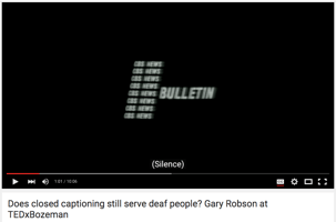
Working with videos requires caption synchronization and accuracy. Knowledge of technical jargons was necessary. There were medical terms mentioned that we had to double-check for correct spelling.

We also had to make sure that the captions were readable and evenly spaced in the video. It’s important to use a neutral background in creating video demos like the one above. It makes the subject matter easier to focus on, and easier for the video editor to place captions in.

Another way to aid the hearing disabled is to include descriptions of non-speech elements in the video. Closed captions help fill in the silence when there’s no one talking. They are the text for non-speech information such as the identity of speakers, their manner of speaking, along with music or sound effects.
Some media players offer captions that are color blind friendly. These captions highlight discussions between two speakers using distinct colors to avoid confusion on who’s currently speaking.
Transcriptions can also help you get your message across to the hearing impaired. Arrange it in an outline form to make presentable and easy to read. Not only does it make the video content accessible, it’s also good for search engine optimization.
PDF Files
The site used PDF files to disseminate documents for printing. Documents such as e-book guides were saved as a PDF.
We followed HHS.gov’s PDF File 508 Checklist and set these guidelines for the client before publishing another PDF guide.
One of the major struggles in re-creating these PDF files was restructuring the content. Most of the PDF files were saved without a hierarchical outline to make it accessible. We had to reformat them with a clickable outline so that users could locate content without traversing through many pages.
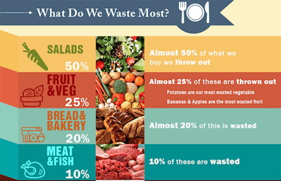
Images that accompany your text need subtitles underneath, so screen readers can read the description. If possible, you should translate images with heavy text into a table format.

Table 1.1 What Do We Waste Most?
| Foods | Statistics |
| Salads | Almost 50% of what we buy, we throw out |
| Fruit & Vegetables | Almost 25% of these are thrown out. Potatoes are the most wasted vegetable. Bananas and apples are the most wasted fruits. |
| Bread & Bakery | Almost 20% of these are wasted |
| Meat & Fish | 10% of these are wasted |
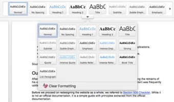
The easiest way to get a PDF accessible file is through Microsoft Word. Use the Styles and Formatting pane to titles, headings, quotes, etc. If you’re working on a long guide with section headers, it’s best to include a Table of Contents. Generate the table of contents via Word, don’t do it yourself.

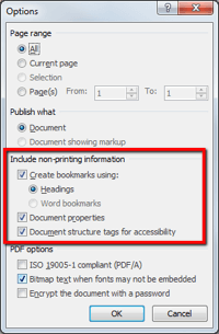
Afterward, save your file as a PDF. Before you click OK, make sure to click on Options, then tick all the options under “Include non-printing information”. This will include PDF structure tags within the document to make it accessible for all.

Tools We Used
We used the following tools to aid us in checking the accessibility of the site. Please note that most of the tools we used are related to visual impairment because of the nature of our client’s business:
A general evaluation tool that assesses how accessible your site is. You can browse the tab at the left for errors that need resolutions.
Tanaguru Contrast-Finder finds correct color contrasts for web accessibility. It can calculate the contrast between two colors, and check if it is high enough. It also tests for alternatives you can use.
This was used specifically to simulate different visual impairments. Since the target users of our client’s website were visually impaired, we needed to get a “feel” of what they saw. It was hard to find a proper color combination for the site’s theme, but it was an eye-opener for us designers who worked on this project.
This tool helped us with quick simulations of color vision deficiencies. it was easier to upload the image we were working on. Our goal was to use colors that didn’t fade together. We wanted to make it easy for users with any type of color blindness to navigate the site.
Final Thoughts
According to World Bank, one billion people (15 percent of world population) experience some form of disability. One-fifth of the estimated global total (110-190 million people) experience significant disabilities.
Due to technological innovations, we have the potential to make the web accessible to everybody. Web accessibility can help a billion people learn information that was once unavailable to them. By taking advantage of these accessibility tools and practices, we can make the web better for everyone.

