Have you ever spent too much time reading a web page? That might not have been caused by the amount of text. Research shows that margins and line lengths affect readability.
An ideal reading experience is when users can read at a fast pace and understand the information afterwards. If you want users to experience this on your site, you need to optimize your margins and line lengths.
Reading Speed
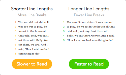
A research study found that line lengths had a significant effect on reading speed. They tested online articles with line lengths of 35, 55, 75 and 95 characters per line (CPL). Results showed that users read the fastest on articles with 95 CPL. They also found that line lengths do not have an effect on reading comprehension.
This suggests that the way to optimize for reading speed is to keep your line lengths around 95 CPL. Some users reported that they felt like they were reading faster at 35 CPL. But that condition actually resulted in the slowest reading speed.
In other words, shorter line lengths make users read slower. This is because there are more line breaks, which cause users to move their eyes from line to line more often.

Reading Comprehension
Reading fast without understanding the information isn’t much use to users. It’s not only important to optimize your text for reading speed, but also reading comprehension.
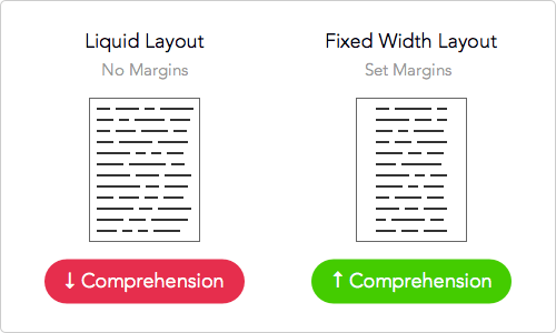
A research study found that reading text with margins increased comprehension than that of no margins. Results showed that users favored the margin condition. They reported lower levels of eyestrain and greater satisfaction with the layout.
This suggests that the way to optimize for reading comprehension is to use layouts with whitespace margins. You should choose a fixed width over a liquid layout for your website. Liquid layouts stretch the line lengths to the browser width giving you no margins. Fixed width layouts allow you to constrain the line lengths and set margins for your text.

Balancing Speed and Comprehension
Margin sizes and line lengths affect each other. Users need a balance of the two for ideal reading speed and comprehension. Spending a long time reading text isn’t efficient. Not understanding the text you read isn’t useful. Give users the best reading experience by optimizing your margins and line lengths.


Fixed layouts might add some value for reading speed but liquid layouts add HUGE value for people who need to increase text size without having to scroll left and right. If I had to choose between the two for max usability I’d go for liquid layout every time….
…concerned that this piece is based solely on a singular (smallish, 20 participants) study from ±2004. Possible to include additional evidence and/or further reading?
The statement “You should choose a fixed width over a liquid layout for your website.” doesn’t make any sense. Margins can easily exist on a fluid layout in the same way that margins could be left off of a fixed-width layout.
I agree.
body, section, p, … {
margin-left: 10%;
margin-right: 10%;
}
Handles the issue of comprehension pretty tersely in a fluid fashion. However, with maximum reading speed at 95 characters, I don’t see how that could be achieved. Nonetheless, I’d still prefer the fluid simple for accessibility reasons. Many people have poor vision, especially if targeting groups that particularly suffer from these issues.
Great article. I’d like to know how to implement something like this using css styling on the tag.
Interesting article. The margins study seems spot-on. My question about the reading-speed study is whether reading-speed is the important KPI?
Couldn’t you make an argument that regardless of a user’s actual reading-speed, if he or she perceives himself or herself as reading faster in the 35 CPL condition then he or she will be more likely to stick and complete the reading?
Even the introduction is more about whether it FEELS like it takes a long time to read a page rather than whether it does take a long time to read it. I’d be interested if you could elaborate on this study.
Thanks!
Not to mention the polarization in line-length preference…
Great article. Would have been cool to see some of the logistics on your site. I know I can go look at the “research” you linked to, but they just don’t have their stuff as easy to consume as you do on your site. Thanks again.
Why didn’t you test line lengths of greater than 95 characters?
I do not see why a liquid layout could not have a margin
I’m with Andras. In the CSS just add some left and right padding to the container element. This can be in relative units such as em or % and there’s fancier stuff we can do with responsive line lengths if desired. Liquid is not an issue. Lack of sufficient margin (or padding) will affect ease of reading.
Hi Anthony,
I beg to differ from your statement “You should choose a fixed width over a liquid layout for your website. ” for the reason that you mentioned. You say that margins are the reason why the fixed layout should be preferred. In my perception, it’s not the margins, it’s the “CPL” followed by “white space”.
When you have a liquid layout, the CPL increases than what is ideal for reading comfortably at a good speed. More CPL means, the eyes have to scan more of the single line at a go and if that line is followed by another line, then there are chances that the eye may jump from one line to the other abruptly. This can also happen unknowingly because the eye gets strained. Having line breaks helps the eye take a break from focusing and concentrating on the same line for an extended period thus avoiding strain.
Secondly, white space around the text, feels nice to read. Ample white-space around the text makes it look less noisy thus improving user concentration and hence, their overall satisfaction with the article presentation.
So the optimal way is to find out the maximum CPL for ideal reading and stick with it, regardless of the type of layout you choose. If you are really concerned about the width of the line in liquid layout, then one way of solving this problem is to split the text into multiple columns (ideally, I suggest two, but may differ based on the needs) and make sure that the CPL for each of those columns are not too less (to avoid unnecessary line-breaks) and at the same time, ensure that it contains the max CPL for comfortable reading.
All in all, I find this a very good article and I hope, others can learn from it. Good work, Anthony. Keep it up!
I’m a little disappointed that the reading speed study only looked at a maximum 95 CPL. There is something to be said about a line length that can be too long and cause the reader to lose its way to the next line, as well as make the text feel tedious.