Your resume only has six seconds to make an impression when you apply for a job. Eye-tracking research shows that this is the average time a recruiter spends reviewing each resume they get. If recruiters can’t scan the key data points of your resume within those six seconds, it isn’t going to get another look.
Recruiters experience higher cognitive loads and greater visual fixations when reviewing a cluttered resume. In the recruiter’s eyes, a resume that’s hard to read is not a professional one. It’s important to make a positive first impression and a clear, professional resume is how you do that.
![]()
Easy on the Eyes

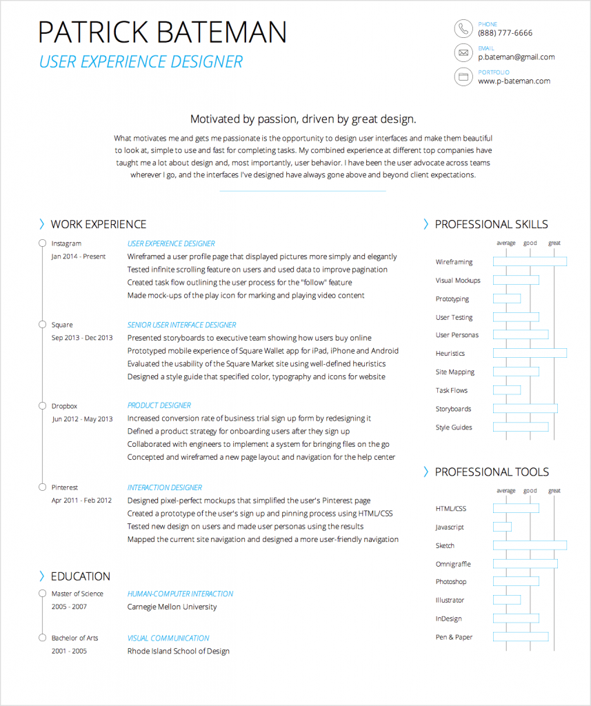
Light Resume is a professional resume template that allows recruiters to scan the key data points of a resume within six seconds. Recruiters spend 80% of their scanning time on your name, job title/company, position start/end dates and education. The remaining 20% of their scanning time is spent looking for keywords that match the open position.
The template highlights these key data points using a clear visual hierarchy, precise alignment, even spacing, geometric shapes, vibrant color and elegant typography. The layout places relevant information where recruiters expect it and uses a resume’s limited space efficiently.
Easy on Your Printer
It isn’t just easy to read, it’ll also save you printer ink. If you’re interviewing for several jobs, you’ll need to print out copies of your resume. Most people use up a lot of printer ink because their resumes use bold/regular font weights, full pixel lines and solid color fills.
Light Resume isn’t aggressive on your printer ink because it only uses light font weights and ¼ pixel lines with no solid color fills. The colors are CYMK ready so that your text will look clear and crisp when printed.
Easy to Customize
Customizing Light Resume is as easy as it to read. Open the resume template file with your vector tool of choice, click an element and start editing. Once you’re done, export or print it, and in minutes you’ll have a clear and professional resume. Separate yourself from the pack and revamp your resume to land your dream job.

Get it for only $10
Key Features of Light Resume
Light Resume only focuses on relevant and useful information that recruiters look for. This disciplines you to present yourself with minimal information, so that your value comes across strong and clear. Within a glance, they’ll know you’re the one to consider for the job. Here are a the key features of Light Resume that make it a template unlike the rest.
Light Font Weight & ¼ Pixel Lines
Light Resume doesn’t use any bold or regular font weights. It uses a light font weight which makes text easy on the eyes and your printer.

Work Experience & Education
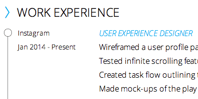
The work experience and education sections are designed with chronological circle outlines and highlighted headings to make them eye-catching and well-structured.
Professional Skills & Tools
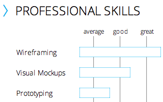
The professional skills and tools sections are designed as a horizontal histogram with outline bars that measure and display the strength of your expertise in various areas.
Self-Summary
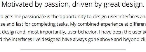
The self-summary section allows you to express what makes you unique in a simple and effective way using a headline and paragraph.
Name and Profession
Your name and profession is displayed boldly and proudly in the top left corner with even spacing and elegant typography.

Contact Info
Your contact information is displayed clearly and distinctly in the top right corner with outline icons and colorful headings.

A research study found that rewriting and redesigning your resume can make it easier to read by 60%. You should think about a redesign if your resume includes a picture of yourself. Recruiters spend an average 19% of their time looking at candidate pictures instead of reviewing other key information.
If recruiters can review more key information in less time, it’ll make it easier for them to say yes and grant you an interview. There’s no question that a recruiter’s review time is limited and resume readability plays an important role in getting the job. Light Resume is here to make your life easier and to help you win.


This is great, a shame it’s not available to a layperson who doesn’t use vector tools
What type of tools does the typical layperson use?
Errrrrr….. Microsoft Word. Google Docs.
^^^ This.
Word, Google Docs, Open Office (maybe)
PC/Apple standard word processing tools with minimal barrier to entry and may come standard with the system.
I have to agree, I was seriously considering buying this, but I don’t have any of those tools. I do have MS Publisher, but I’d suggest having it in at least Scribus or Inkscape which are both OpenSource so that anyone could purchase it.
Regardless, excellent design! I really need to spend some time making my resume “lighter”.
Wasn’t Patrick Bateman the chainsaw weilding nutcase in American Psycho?
I’d be a little wary of hiring that guy
Oh, but his resume is so charming!
–Yes, you’re completely right Chris.
Are these resumes parsable by ATS Resume Parsers?
Nowadays most ATS’s use resume parsers which try to scan the resumes before a recruiter even lays eyes on it.
If the parsers can’t make out the data correctly, that resume never makes it to a human being.
My concern is that these resumes run on multiple columns and use graphics, both of which are known to cause problems to parsers
I bought your template and love it. But for some reason I my computer converts the > symbol in front of the different section headers. It goes from >, to a japanese Kanji character with a pink background. How do I fix this? Or how do I insert > but with the style you show in the template picture?
Thanks for the help.
Also I’m using Adobe Indesign.
The glyph is from a font your system doesn’t have. You’ll need to find a similar glyph from your system fonts: https://indesignsecrets.com/find-font-glyph.php