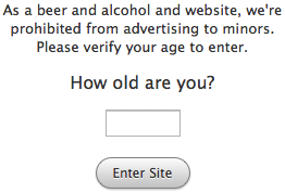
If you’ve ever visited a beer and alcohol website, it’s likely you’ve met an age verification page. Age verification pages ask users for their birth date to make sure they are of legal age to enter their site.
This way they aren’t directing their advertising to an underage audience. It’s safe to say that not all users will enter their correct birth dates. But at least, beer and alcohol websites are acting responsibly by asking.
If you’re a beer and alcohol website, acting responsibly is important. However, giving your users a good online experience when they enter your website is just as important. A lot of age restricted websites are losing visitors because their age verification page isn’t simple and friendly enough.
Lack of clarity
When users visit your website, they should know exactly why you’re asking them for their personal information. After all, is it their personal information and most people are sensitive with that.
If you’re acting responsibly, and don’t want to advertise to an underage audience, then say that. Don’t leave them confused and guessing. Make it clear from the beginning why you need the user’s information. This way they’re more likely to give you the right information, instead of the wrong information because they understand the reason you need it.

Too many text fields
Many age verification pages use multiple text fields to ask for the user’s information. The problem with this approach is that you’re asking them to sacrifice their privacy and give you their full birth date. Additionally, you’re asking them to spend their time and energy to fill out each text field just to enter your site.
Those requests together are enough to make any user pass on entering your website. The least you could do to make their experience more friendly is make it simple and easy for users to tell you how old they are.

Too many dropdown boxes
Another approach seen on age verification pages is the use of multiple dropdown boxes. Dropdown boxes aren’t that much better because when the menus open, too many options show up. This not only makes it harder for users to choose, but it takes them longer. Most users don’t want to go through all that time and effort just to enter a website.

Too many buttons
An age verification page with two buttons is one button too many. Although this approach is a lot easier to get through than the earlier ones, users still have to carefully click the right button. For some users, the right button is the one that lets them in the site, even if they’re underage. Asking them if they’re of the legal age is not an effective age verification because it makes it too easy for users to lie. It doesn’t hold users accountable enough.

One text field. One button. That’s it
A great way to make your age verification page more friendly is to include brief text that explains why you’re asking for their age. Then ask the simple question, “How old are you?” It’s a lot easier for users to tell you how old they are than to tell you the day, month and year they were born using multiple text fields and dropdown boxes.

Asking too much and forcing users to do too many tasks to enter your site will not only turn users away, but users are more likely to give you false information when you do. Most users are more open to giving out their age, than their full birth date.
Giving out their full birth date is too personal and specific. Because of social media and social networking, it’s common for most users to give out their age, sex and location. Giving out their age at an age verification page is not something most users will oppose.
All users have to do is type their age in a text field and click a button to enter your site. This approach at age verification is simpler and friendlier because you’re only asking one easy question. It’s a simple task that requires little to no thought.
This change will not only improve the user experience of your age verification page, but it’ll get those users who don’t like giving out personal information to enter your site without thinking twice.


I’ve never understood the point of age verification using information supplied by the visitor herself. Anyone below 18 years old would put something above 18 as their age obviously to gain access. Totally and utterly pointless feature.
I don’t really see how the “Are you 21 years of age” option is a problem.
The textfield-button approach is nice, but not nearly as simple as the previous one.
In the yes/no option I’m asking a simple and concise yes or no question. Most people know by now why they are being asked something like that.
With the Yes/No approach, a user can easily say they accidentally clicked the wrong button because the buttons were too close or the button language wasn’t clear enough. By making them enter their age, there is absolutely no ambiguity about how old a user claims he/she is. If a user lies about their age, the responsibility is on the user, not the website.
The only problem I see for me is that I’m 25 so I should click ‘No, I’m not 21 ears of age’ ?? 🙂
YYYYUP
This is no different than someone simply clicking on a check box that says that they’re old enough. While it may be “friendlier,” it really doesn’t address the underlying problems.
People can still easily lie about their age. A 16 year old can buy a pre-paid credit card and still purchase knives, alcohol, tobacco, and whatever else online by simply lying. Same goes for kids under the age of thirteen in the USA who lie about their age in order to circumvent COPPA restrictions.
Really pointless, and the only reason why these “age check points” exist is so that the companies behind them can legally cover their asses by saying that they “didn’t knowingly sell or advertise to a minor.”
There’s no absolute way to make sure that everyone who enters a website is of a certain age. It would be pointless if this article focused on that. If age verification pages are used for companies to “cover their asses” as you say, then it’s not really that pointless, is it? Like with all things in life, there are no absolute ways that yield absolute results.
The text box doesn’t Really overcome the problem of users who are reluctant to enter personal data. Some may still resent being asked to enter the actual age (it’s just one detail but age is often sometimes people are sensitive about).
I suggest a single drop down list with age brackets would solve the problem without complicating the task.
I think you’re forgetting the 2 more buttons on keyboard.
I’d really love to know if there are any documented actual cases of where it has ever successfully covered an ass or not covered one. I find them on game sites mostly, if they have mature content or whatever. Fortunately they tend to have January 1 already selected, I just grab the year box and scroll down far enough. I think most the time I’m 60+ (I’m actually 33). It seems completely pointless, just get rid of them all together I say. Heh, maybe they should just get changed to: “Did your parents raise you properly?” Yes / No
“I’ve never understood the point of age verification using information supplied by the visitor herself. Anyone below 18 years old would put something above 18 as their age obviously to gain access. Totally and utterly pointless feature.”
For gambling sites, date of birth data is checked against the national register as part of verification processes before someone can open an account.
But yes, just a compliance formality in lots of cases to be sure.
Anybody know if it’s required by law for beverages sites to have age verification?
For mobile devices, I would image the yes/no option would be slightly easier for users.
Have you ran any tests between the varying solutions?
@Samantha – it is law that pushes drinks companies, at least in most parts of the world.
I think most people would agree that they are keeping anyone out, but some of the examples in existence currently can put off casual browsers from continuing – even if they meet the age requirement.
My suggestion is to treat it in the same way we’ve been treating terms & conditions and privacy policy’s where required. A checkbox beside a statement saying they are over the legal age in their part of the world. And a continue button. Nothing more is needed to ‘cover asses’.
🙂
@Samantha and @Chris,
It turns out it’s not a law, but a recommendation from the Federal Trade Commission issued in 2008. Here’s the link to the document “Self Regulation in the Alcohol Industry” that started it all:
http://www.ftc.gov/os/2008/06/080626alcoholreport.pdf.
And here’s a link to a great web commentary about the issue (that ultimately led me to this site) titled, “Age Verification for Alcohol Websites… Is it Required by Law?”:
http://www.geirman.com/2013/03/age-verification-for-alcohol-websites-is-it-required-by-law/#comment-8517