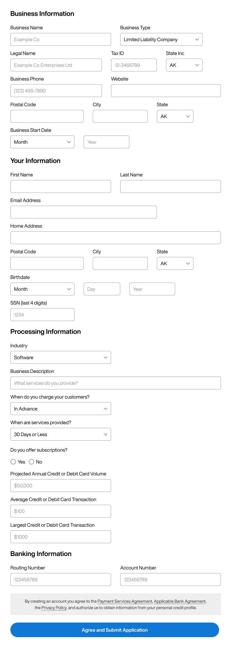
Long and complex forms are plaguing the web. Most designers don’t know how to handle so many data fields. The typical approach is to arrange them down a page in multiple sections. However, this results in a low form completion rate and high cognitive load. In other words, most users will find the form too overwhelming to fill out.
What makes a long form overwhelming isn’t just the numerous fields. The lack of vertical rhythm and focus also contributes to the visual complexity. For example, here’s a form with thirty-three fields grouped in multiple sections. One look at it makes you think twice about starting it.

Subscribe to read the full article
Become a paying subscriber of UX Movement Newsletter to get exclusive access to this article and other subscriber-only content.

