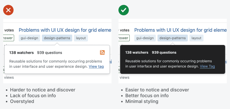
Tooltips are useful components that offer contextual information users need for their tasks. However, a common problem is that they often get overlooked because they blend into the background too easily.
Most backgrounds contain lots of content. Overlaying a tooltip on top of a busy background will make it hard to notice. The design solution is displaying the tooltip in dark mode.

Subscribe to read the full article
Become a paying subscriber of UX Movement Newsletter to get exclusive access to this article and other subscriber-only content.

