How fast can you find the three of diamonds in a deck of playing cards? The answer is not very fast because you have to sift through so many irrelevant cards to get to the right one. This is what you’re asking users to do when you use a mega menu for your navigation.
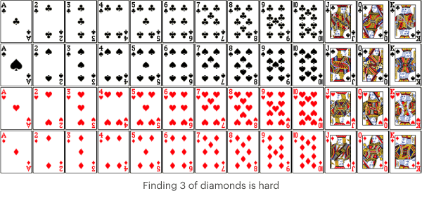
When users open a mega menu, they experience a megaton explosion of navigation links in their face. After they select a parent category, every single child item related to that category is displayed simultaneously. This might work for menus with only a few child items, but not for menus with a megaton.
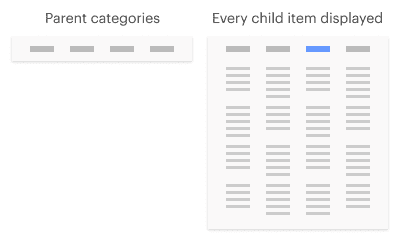
It’s not only disorienting to look at, but it’s frustrating to use. First, users have to scan and process the organized whole to get a sense of the structure. Then they have to scan and process each part of the whole to find their item. It’s no wonder why they struggle with them, and why companies who use them lose revenue.
A much easier way to find the three of diamonds is by searching through a stack of diamond cards only instead of every card from every suit.

It would be even easier if they could search through a stack of cards that have the number three only. The more you break down the classification, the easier it is to search. Not only are there fewer cards to view, but you can view them in a sensible order.
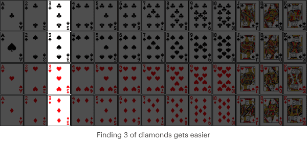
Your navigation menu should work the same way. By only displaying items from a relevant classification, users don’t have to sift through irrelevant items. This allows them to find their item faster with fewer visual distractions. Unfortunately, mega menus don’t work this way. They display too many irrelevant items at once, which creates a lot of visual distractions.
The Two-Parent Menu
The way to remove these visual distractions is to use a two-parent menu. A two-parent menu has a secondary parent category that conceals irrelevant child items. As a result, the user only sees items from the relevant classification they choose.
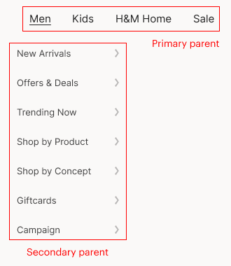
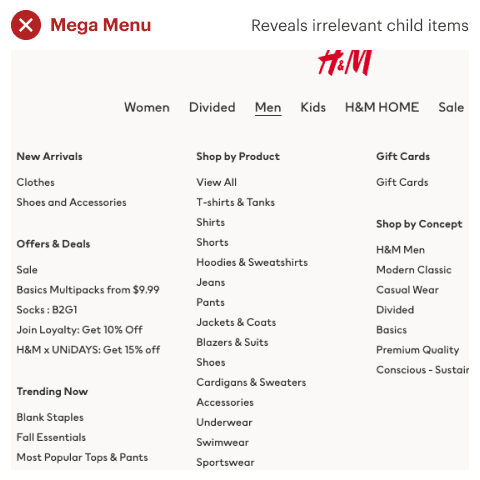
To illustrate this, let’s add a secondary parent to H&M’s mega menu. As you can see, the mega menu goes from the primary parent to revealing too many irrelevant child items.
When a secondary parent is added, it conceals irrelevant child items and saves users from scanning and processing extra information. Relevant child items are only displayed after users choose from the secondary menu, allowing them to focus on finding their item with fewer distractions.

This particular design technique is called progressive disclosure and is effective for managing information complexity. Mega menus fail to use progressive disclosure, while two-parent menus use it correctly.
Limited Attentional Resources
Fewer visual distractions mean users have more attentional resources to allocate toward tasks, giving them more focus to find their item. You may have experienced directed attention fatigue if you’ve ever scanned through a large spreadsheet of data. Since human attentional resources are limited, it’s easier to lose focus when there’s more data to look at than fewer data. More data creates competing stimuli, which demands more attention and weakens focus.
Subscribe to access the full article
Read the full article to get tips on making the two-parent menu more intuitive, translating it to mobile, and caveats to using them.


I entered the h&m website, the Mega Menu, as you call it, is displayed on hover. If you click the main category it opens that category page, which makes navigation and discovery easier for the user . With your solution that will not be possible since you need the click interaction to open the menu (unless you wanna deal with multiple hover menus inside a hover menu…).
I am sure designers at h&m considered different alternatives and they decided to have visitors open the Men’s page directly was better for the business than having a perfectly organized menu; which being honest I do not believe you have accomplished with your design.
Instead of always criticizing other designer’s work, a better approach would be to try to figure out why did the design team arrived at that conclusion even if it seems at a first look that it might not seem like the best one.
Any design solution for the real world is a tradeoff. There’s no such thing as a perfect solution and most of the time it’s just about finding the best bad option.
This is brilliant!
This is my first foray into web design via Shopify (I’m a machinist by trade) and I’ve been on the fence about mega menus and this cleared it up. More is not always better and mega menus are no exception. Thanks for this.
Megamenus can be such a pain. Great explanation using the deck of cards. I will use this article to explain it to a client in the future.