Cancel buttons sometimes have different names. “Not Now” and “Maybe Later” are some dismissive labels one could use. But there’s one case when the Cancel button should not say “Cancel” nor use a dismissive label. This is when the main call to action is destructive.
Preventing Cancel Accidents
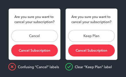
For example, a confirmation screen for canceling a subscription service has a destructive call to action button labeled “Cancel Subscription.” Placing this button next to a Cancel button is confusing and can cause users to cancel their subscription by accident.
Replacing “Cancel” with a dismissive label such as “Not Now” or “Maybe Later” is also confusing. These labels imply that users don’t want to cancel their subscription now, but will later. This isn’t clear and doesn’t feel safe to press.

To make users feel safe, the Cancel button should have a label that’s the opposite of canceling so users can tell them apart. Here, the opposite of canceling a subscription is keeping it.
A “Keep Plan” label communicates a clear action that feels safe to press. When users signed up, they had to choose a subscription plan. The word “Plan” reminds them of their beginnings they’re familiar with.
Labels Shouldn’t Compete
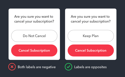
When thinking about a label that’s opposite to cancel, “Do Not Cancel” might come to mind. But this label isn’t a good choice because it competes by using the same word, “Cancel.” This is also why “Keep Subscription” isn’t the best choice. When the same words are used on both button labels, users can mistake one button for the other. Similar labels require users to read carefully, which they don’t always do.

Not only that, but “Do Not Cancel” isn’t the opposite of “Cancel” because it shares the same negative connotation. If both labels have a negative connotation, it causes users to read them as destructive actions and get confused.
The word “Cancel” in this context carries a negative connotation. Seeing it on both buttons makes users feel like they might lose something if they press either of them.
What makes users feel safe is a label with a positive connotation for the Cancel button, such as “Keep Plan.” It’s the best label to use because it creates a strong contrast between the safe and destructive action via look and feel.
Cancel Subscription Vs. Unsubscribe
Some may think it’s better to use “Unsubscribe” instead of “Cancel Subscription” for the label, but this is a mistake. “Subscription” and “subscribe” aren’t interchangeable labels because they imply different contexts.

The act of subscribing applies to publications where users receive content regularly through a feed or channel. For example, online magazines and video channels, such as Wall Street Journal and YouTube, ask users to subscribe because they publish their own content and deliver it to them on a regular basis.
Subscriptions apply to services that allow users access to their storage of licensed content. For example, Spotify and Netflix offer subscriptions to their users because they get exclusive access to licensed music, shows, and movies.
The difference between subscribe and subscription seems subtle, but paying attention to the subtleties is what will make your buttons intuitive.

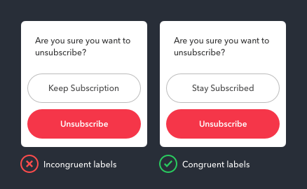
If you’re asking users if they want to unsubscribe, “Stay Subscribed” is the congruent label for this context. Don’t use the word “Subscription” with “Unsubscribe” in your labels to avoid confusing users.
It’s important to use button labels in congruence with the context of your app to give clarity to your actions. Incongruent labels confuse users and cause them to ponder decisions longer. But when the labels are congruent with the context, users decide faster because they’re more certain about what the buttons will do.
Less Similarity Breeds More Clarity
The goal of a label is to clearly communicate the action the system will do if users press the button. If they question what your button labels say, it could lead them to not trust your app, press the wrong button, or not press a button at all.
Remember to avoid using similar words and connotations on your button labels, and to keep the context in mind. Less similarity breeds more clarity. This not only applies to Cancel buttons, but whenever buttons are grouped together as siblings.


I don’t like having one button say “Subscription” when the other says “Plan”. This violates what I consider a primary rule of UX: don’t use two completely different words to describe the same thing. If a user has a binary choice then the labels have to be consistent with each other. You suggest that when the user signed up, they chose a “plan”. If so, then both these button labels should contain “plan” or, alternatively, it should be mentioned in the question text to which the buttons are a response.
Exactly my thoughts. Not to mention that to non native English speakers a “plan” could have a completely different meaning. Some will not be able to see the word “plan” beyond the meaning of “a detailed proposal for doing or achieving something.” If you mention “subscription” in the confirmation window then button should read “keep subscription” as well.
Wait, this article came out right after your “Why cancel buttons should never have a color” article! Ha. I get this scenario is different. Even though the word cancel is in the action, it is the just a description for the desired primary action. However, I do wonder if seeing the word “cancel” in general causes a user to pause and think about their choice.
I was totally following you right up until you said that the term for “subscription” has to be different between the labels because otherwise the user would have to “ponder the difference between them.” Huh? I don’t think anyone is a mind reader and I certainly am not, but when there are a total of 4 words split between two buttons, I don’t think it’s particularly difficult to see that one says “Keep” and the other says “Cancel.” Isn’t it more intuitive to use the same term when you’re talking about the same concept? Reminds me of those old grade school assessments where you had to spot the difference in a group of shapes — I think the difference here is easier to determine than those.
Thanks for letting me know. Rewrote that sentence for better clarity.
Keep in mind the context here. The words “Subscription” and “Plan” are often used together as “Subscription Plan” so they aren’t far off. You have to realize that most users don’t read because they’re in a hurry or multi-tasking and just want to get through it all, so they aren’t going to read carefully. We, the designers, are reading carefully because we’re designing it, so everything seems obvious to us.