Checkboxes and radio buttons are an essential element of forms. But most of the time, they’re not easy to click. This is because their click targets are small. The smaller a click target is, the more difficult it is to click. Here are three things you can do to make your checkboxes and radio buttons easier to click.
1. Use Label Tags
At the most basic level, your checkboxes and radio buttons should have label tags on them. This allows users to click the label to toggle the checkbox or radio button. This is easier for users to do because the label is usually a larger target to click than the checkbox or radio button itself. It also makes your checkboxes and radio buttons accessible to users who use screen readers.
2. Add Hover Effects to Them
A checkbox or radio button may have label tags, but most users won’t know that they can click the label unless there’s a visual affordance that tells them that. A hover effect is a clear visual affordance that lets users know they can simply click the labels to toggle the controls.
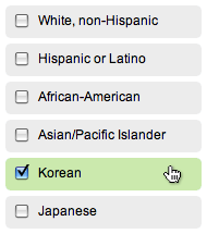
3. Place Them on a Button Zone
The last way to make your checkboxes and radio buttons easy to click is possibly the best way. Placing them on a button zone clearly tells users where they can click to toggle the controls. Not only can users click the label, but they can also click outside the label. This makes their click targets even bigger.
When users click on a checkbox or radio button, the button zone should highlight in color to tell users that it’s selected. This gives users the clear visual feedback they need when they’re looking at a dense area of checkboxes and radio buttons.
There’s a lot you can do to make your checkboxes and radio buttons more usable and accessible. If your form has a lot of them, try using these techniques to take the burden off your users. Making your checkboxes and radio buttons easier to click will increase the chances of users completing your form. They are an important part of forms, so there’s no reason users should have trouble clicking them.
Book

Affiliate

Thanks again Anthony.
What do you think of the G+ iPhone app in relation a touch UI and the process of adding people to circles? I keep seeing the circles on the left of a person’s name and want to touch that circle to select the person. The whole button zone is active (good) but the feedback comes on the right hand side in the form of a tick in a green circle, which is usually obscured by my finger having hovered over the line and is on the other side from where I thought I touched the check box. Minor point – but it presents a moment of cognitive dissonance which leaves me second guessing my actions for a moment.
Sounds like the visual feedback could be a lot clearer. Highlighting the whole button zone solves that.
Nice and very fast to implement advice. I did it for my ecommerce site on the checkout page just now. Took me 5 minutes and it looks great.
It would be helpful for the button zone to provide a how to tutorial, esp. one that would illustrate two solutions, one using css3 & one using javascript to enable an onclick event for the background zone.
I too, would love to see a tutorial, or at a minimum a link to some more detail on how to implement the button zone! Thanks!!
This is the closest thing I could find:
http://demos.jquerymobile.com/1.0a4.1/#docs/forms/
Here’s an idea of where to start:
http://travisalmand.net/css/checkBoxLabels.html
In this case you should be able to style the label tag however you wish to look like a clickable zone. Including the cursor and hover effects.
Far out. I love this blog so much. You’re always giving well thought out UI tips. This is something i’ve kind of known but never solved.
It makes sense, increase the clicking size.. might aswell make the entire thing a buttoN!
A quick note for anyone wanting to use labels that interact with the form inputs: In order for it to work correctly in Safari, you need to nest the input in the label
Label Text
Which looks a bit clunky to me, but is apprently the correct way to use labels now.
You have to place ID’s on the inputs, and use that same ID in the label’s FOR attribute to get it to work in Safari (actually, I’ve just been doing that for so long I didn’t even realize the other browsers worked with that now.
Nesting the input is not correct. I don’t even think the elements will validate without the FOR method in the near future – it’s essentially saying the input is part of the input’s label, and screenreaders will often muck it up.
If you ask me, there should have just been a label attribute for the input fields from the beginning. The whole “use a sibling element to identify the next element in the document” thing has always baffled me.
Thank-you for the ideas, I have used the button zone idea in the latest version of my Drupal theme project (has about 60 000 users) in an attempt to improve checkbox and radio UX in mobile, it seems to be working pretty good, certainly in Android its a vast improvement.
Another method I have implemented is to use an image to replace the label (using an accessible text image replacement method), which gives a huge touch target, this is kind of the same thing but only really useful when it makes sense (in this case users are setting the alignment of images in their posts).
Great article! We’re going to implement some of this on a site right now.
Seeing that JQueryUI does a lot of this out of the box, allowing you to style some of the fields a bit without inhibiting accessibility.
One thing that I found odd, not having read a UXMovement article in a while, is all the jumbled gobbledy gook at the end of the post. There’s a product section that doesn’t relate to the content of the post and doesn’t have much context, affiliates, related articles, social sharing options, and the author’s info. All of these seem to have the same visual hierarchy. Individually, the social items and author are normal and help the post, but combined with the other items the bottom of articles feel very confusing and disjointed. Just a quick observation! Felt odd to see this confusing mash-up on a UX site.