Filling out forms isn’t always an easy task. No matter how simple you make it, users will make mistakes. Do your form error messages give users a feeling of worry or comfort? Error messages that are too alarming can make users abandon the form to seek safety from the unknown.
Error messages that reassure users can make it easy for them to correct their mistakes and continue with the form. The design techniques below will help make your error messages more reassuring so that users feel comfortable completing your form.
Avoid Negative Words
Words that have a negative tone have no place in form error messages. Negative words can make users feel like they’ve made a huge mistake, leading them to think the situation is worse than it is.
When users feel fearful or anxious, it’s hard for them to think rationally to fix their mistakes. You don’t want to scare users to the point that they have to call on someone else for help when the issue is easily fixable. And you don’t want to scare them so bad that they leave your form.
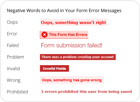
There are ways of telling users they’ve made a mistake without making them feel like they’ve made a mistake. Don’t put the user’s focus on themselves by emphasizing that they made a mistake. Instead, put their focus on the form by pointing out what they need to do to fix the errors.
The tone of your error messages should feel polite and professional. The choice of words you use in your error messages affect the user’s emotions. Choose to use reassuring words, not negative ones.
Highlight Error Fields in Orange or Yellow, Not Red
Red is the most common color used to highlight error fields. It’s effective in making them visible, but it can also overstimulate users and raise their pulse rate, making them feel like they’ve seriously screwed up on the form. Red is also associated with danger, which is not what you want users to feel when they make a mistake.
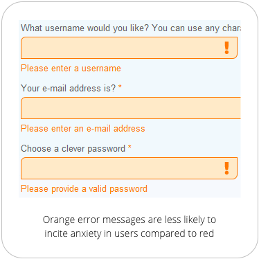
Orange and yellow are warm colors that not only make error fields visible, but they make users feel less alarmed when they see it. These colors do not have as long of a wavelength as red does, and is less intense. Users are less likely to panic when they see an error message in orange or yellow color because it’s not as physically stimulating as red.
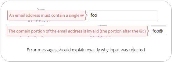
Specify Why Field Info Was Not Accepted
Sometimes it’s not enough for an error message to just tell users they made a mistake. Your error messages should tell users exactly why their information got rejected.
For example, an email field should tell users they need to include the ‘@’ symbol if the user leaves it off. It should also tell users to include the domain if they leave that off too. This is more helpful and specific than just telling users that the information they entered is not valid.
Avoid Error Summaries, Place Error Messages Next to Labels
Seeing a large summary of errors at the top of the page doesn’t make users feel comfortable about fixing them. It’s discouraging to read and forces users to have to recall those error messages when they go to the fields to correct their mistakes.
Error summaries magnify the seriousness of the mistakes when they’re grouped in a long bulleted list. When most users see that many errors at once, they’ll likely give up and forget about fixing them.

A less overwhelming approach is to place error messages next to the field labels. Disabled users will appreciate this because it allows their screen reader to read the error message and the field label together to correct their mistakes.
Showing them an error summary forces them to have to remember the errors when they get to the fields. And showing both the error summary and error messages next to fields forces too much work on the user.
Show Error Messages One Field at a Time
An even less overwhelming approach is to highlight the error fields and display error messages one at a time when the user selects an error field. This allows users to correct their mistakes faster due to less noise and distraction on the form.
Callout bubble error messages pointing to the fields are an effective way to do this. However, your callout bubble should not obscure the label for the selected field. When the user selects a new error field, the callout bubble for the previous one should disappear, and a new one should appear.

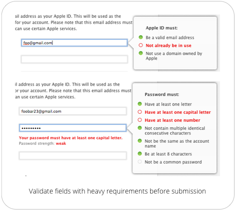
Validate Fields with Multiple Requirements Before Submission
Certain fields, such as username and password, have multiple input requirements for security reasons. Rather than giving users an error message with a long list of input requirements after submission, validate these fields beforehand. You can do this by placing a callout bubble next to the field. Each input requirement should light up green as the user’s input meets it.
Completing a form takes time and effort. Don’t make users spend more time and effort on your form by giving them alarming and overwhelming error messages. Reassure them that the mistakes they make are no big deal and easily correctable.
Error messages have a bigger impact on form completion rates than most think. Don’t make the mistake of ignoring your error messages, or you’ll find users leaving your website for another one.
Book

Affiliate

Whats your view on best practice for validation that at least one radio button or checkbox has been selected?
Love the idea of not terrifying the user with heavy-handed error warnings. I’m wondering about the accessibility of some of these approaches, though. In my experience, yellow text on a white background can’t meet minimum color-contrast guidelines, and orange only works if it’s a very dark orange at a fairly large point size.
I’m also not sure if putting error messages in popups works for screen readers. Have you tested this?
Agreed! I was thinking the same thing (about contrast and pop-ups). Though I can think of a couple solutions to the pop-up issue.
Question for you Sandra: do you like Earl grey tea?
Agree with Sandra. I would be very cautious of using of using orange / yellow for error messages. We had a similar setup to the orange used in the example screenshot and we had a lot of issues with users not seeing them. We switched to bright, ugly red and the issues reduced. I don’t have measurable data to provide but I can say that the change was significant.
There’s one more thing that forms can (but very few) do to help users: include instructions before an error happens. For example, if you require passwords to include a letter, a number, and a symbol but no spaces, make sure to include that help text near (or in) the “create a password” box. It decreases user error, but more importantly it decreases user frustration!
Love the article. Maybe you should apply your thoughts to the “Leave a Reply” form at the bottom of this page…?
It was a nice article for validating the controls, that works for the users in a way of not terrifying them and letting them know, that they have not committed a blunder mistake. Rightly said, Orange, yellow colors are far soothing than red.
Moreover, avoiding validation summaries in big forms can make the user leave that form and switch to another website, or may be a bit frustrated.
Proper validation messages help the user in understanding what wrong they have done in a better way.
Great Article !!!!!
Good article, but I wanted to mention that from an accessibility perspective, the error summaries, in addition to field level messages, make it much easier for screen reader users to understand at a glance which fields they need to fix. Without it, they are left to hunt for the problem fields.
Absolutely love this! I can’t tell you how many times I’ve scrutinized a form page for the red 8-point Arial asterisk that indicated I’d messed something up…
Timely, and very well done.