If your website sells products, it’s important that your product images appeal to users. Beauty of an image doesn’t just come from typography and color. It also comes from the way you arrange elements in space.
It’s much like decorating your house, where you don’t just think about what objects you need to make your house look beautiful, but you also think about how to arrange and where to place those objects.
The rule of thirds is an old technique that was first used on paintings during the Renaissance times. But you can apply it to product images on your website. A typical product image has the following elements:
- Product picture
- Product name
- Tagline or headline
- Call-to-action button
- Background graphic
The Wrong Way
A bad product image would not align with the rule of thirds. It would make users work to look at each element, and force them to move their eyes around the page. In HP’s product image, the only element that touches a grid intersection is the picture of the product. All the other elements are scattered to the edges, making the image less cohesive and appealing.

The Right Way
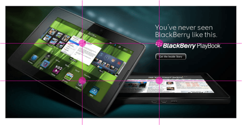
Applying the rule of thirds to your product images would arrange these elements in a way that gives users the best view of your product. Notice that Blackberry’s product image has a spatial balance between the elements.
No element gets ignored or overlooked because the elements all touch the intersecting lines of the grid. The elements are all arranged in a way that makes it easy to capture the beauty of the product in a single focal view.

Applying the Rule of Thirds
To apply the rule of thirds, divide your composition into thirds horizontally and vertically. This will create 9 rectangles and 4 intersections. Place 4 dots where the lines intersect.
Then place your most important elements on the grid intersections or where the dots are. If you have remaining elements, place them on one of the lines near an intersection. The closer to the dots the better.
The rule of thirds is an effective technique that can make your images more aesthetically pleasing. Not only that, but it makes users move their eyes less when they view your image. An image that uses the rule of thirds isn’t only compelling, but it can also help you sell more products.


Please post about golden ratio in webdesign too
thanks
THANK YOU! I’ve been making these 950×500 title cards, and haven’t been able to make them look right. This really helps.
Good post!
Indeed, please do one about Golden Ratio also.
If you’re using the rule of thirds in conjunction with web design are there any other rules you can use to further encourage action?
For example, I’m designing a page for a product that I want people to sign up for. For whatever reason, I feel compelled to put the “Free Trial” button on the top-right dot (or at least very close to it). I’m guessing this is just a typical design pattern…
If you have any suggestions or know of any good resources for this, I’d love to know!
Great website btw!
Thanks, Steve. The placement of the button is important, but what will encourage users to act and click the button is the main headline that supports the button. The article, “Headlines and Images Communicate Value Instantly” talks about the importance of a good headline. Headlines are what users will focus on when they enter your website, so your headline has to be extremely well-written. It has to communicate the single most important benefit or value proposition you offer in a simple and direct manner. For me, a good headline is by far much harder to write than designing a button.
Hi Anthony,
Great article, but I’ve got one question:
Do you think this would apply to the above-the-fold area of a website?
How does this law of thirds tie in with the F-scanning reading pattern?
– Will
Thanks, Will. I think the rule of thirds could be applied to the above-the-fold area if that area is a single piece. The rule of thirds is mainly used to arrange the micro elements of a composition in a balanced and symmetrical way that allows us to capture the gestalt. The rule of thirds focuses on the gestalt of design for aesthetic purposes, while the F-pattern focuses on the placement of individual elements for practical purposes.
Thank you for touching this very interesting topic!
Reintroducing the knowledge of those Renaissance masters into web design makes a website “beautiful” in a natural way.
Most users won’t understand why they are experiencing a website more beautiful than others. But they’ll feel it.
Same thing is happening when we are watching those Renaissance (and older) master pieces. They are “beautiful”. Because they are using proportions found in nature (and in mathematics 😉
Google for the proportions of the ancient Temple of Acropolis in Greece. These folks knew what they were doing (many modern web designers don’t 😉
I’m betting that a “natural” website has a lower bounce rate, than a page which ignores The Golden Proportions.
A “beautiful” website is inviting users to explore. Users feel better in contact with good (=natural) design. Good design builds trust on the unconscious level.
Ask Apple.
Old masters knowledge + modern usability guidelines = more success.
Enjoy!
Hans
.