All caps text is like a spice, you don’t want to overuse it. A little can go a long way when you use it on content and menu headings to contrast it from body text. But when your headings contain more than a few words, users need to make an effort to read them. This is because all caps text is easy to spot, but hard to read.
All Caps Letterspacing
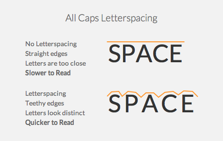
If you want to make your all caps headings easier to read, increase the letterspacing. All caps text with no letterspacing makes the letters tight and crowded. When the letters are too close, the words are harder to distinguish.

It makes the shape of each word look like a rectangle with straight edges. This means all letters have the same height and lose their ascenders and descenders. Ascenders and descenders increase the recognizability of words. Without them, users need to focus closer to recognize each word. This slows users down when they read.
Increasing the letterspacing gives the edges of each word a teeth shape instead of a straight line. The teethy edges give off a unique shape for each word. This allows users to perceive each word differently for faster word recognition. Users don’t need to focus as closely and can read words at a quick glance.

Avoid Too Much Letterspacing
Having no letterspacing can make all caps hard to read. But too much letterspacing can also hurt readability. When letters are too far apart, users can have trouble associating letters with words.
A good rule of thumb is to add between 5-12% letterspacing to your all caps text. In CSS, you would set the letterspacing property in the range of 0.05-0.12em. Use your designer’s judgment to know what works best for you.
Letterspacing Example
Apple Music’s app makes good use of letterspacing on their content and menu headings. Their all caps text is easy to read at a glance. This means they didn’t add too much letterspacing, but just enough.
They used all caps to contrast the headings from the body text. But they could’ve used a different font weight and size as well. Sometimes all caps isn’t necessary. For them, it was a stylistic choice to add appeal to their brand.

When All Caps Is Easy to Read
There are cases where all caps text is easy to read and don’t need letterspacing. But those come under certain circumstances. For instance, all caps at large sizes is always easy to read. This is because any text at a large size is easy to read in general.
Another case is when your all caps text only contains 1-2 words. With only a couple words, there’s not much to read as there is to scan. There’s no benefit on helping users read 1-2 words quicker. It’s on making those words easy to spot. This is where all caps text is useful.
Letterspacing works well on all caps headings that have many words. This makes all the difference when users need to read instead of scan. All caps do have a place on user interfaces. But designers need to use them in the right way so that they don’t compromise readability.


Thanks for this great practical advice for making ALL CAPS easier to read. I’m definitely putting this to work.
Can you comment on the accessibility aspects of this?
I generally regard all-caps as a major accessibility failure on any website – basing this on advice from Dyslexia organisations. Is altering the spacing actually sufficient to overcome the difficulties of this group, and if so can you point me to research / confirmation from appropriate specialist groups?
If not, your suggestion remains something which shouldn’t be adopted by any significant website, as it would leave the website owner open to challenge under disability / equality legislation.
Treating research like the law is dangerous. Research is helpful in educating your judgment. But when you’re looking for it to answer whether you should always or never use all caps, you’re looking for the law. It’s so binary that you blind yourself from considering the context in which it’s used.
The context in which you use something is huge. Compare a knife used to commit murder with a knife used for cooking. All knives aren’t bad, it’s the context in which it’s used.
You should be asking “In what context is all caps effective and in what context is it less?” That leads you to more questions like “why is all caps text so hard to read?” and “what can designers do to make all caps easier to read?”, which is what this article answers.
But your answer, as far as I can see, works only for those without dyslexia.
I can’t see that you’ve made the basic effort to ensure that it works for people with disabilities. If you haven’t, then you’re acting in a discriminatory fashion, and indeed encouraging others to do so. That’s not responsible design, whatever the context.
Dyslexics are a subset of a whole set of users. If you improve readability for the whole set of users, it affects the subset as well.
You acting as if letterspacing only helps normal users is silly. Letterspacing won’t cure effects of dyslexia, but it’ll make all caps easier to read for everyone. You should do more research on this and offer your insights here instead of acting self-righteous.