Every user who visits an eCommerce website is a potential customer. A successful online store is one that converts a high number of visitors into buyers. Everyone wants a high conversion rate. But getting there involves more than just optimizing a single page. Instead, you have to optimize the buying process. And that starts with your category page.
All eCommerce Sites Have a Conversion Funnel
Another way to describe the buying process is conversion funnel. This is a technical term used in the eCommerce field to describe a series of steps or actions a user must take before their visit is converted to a sale.
Most conversion funnels either start by someone coming to your site from the home page, or by someone landing on a category page from a search engine. Many eCommerce sites will get a lot of traffic from search engines. This is why it’s important to design your category pages in a way that’s easy for users to find the products they’re looking for and move closer to purchasing.
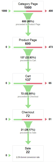
In the analytics graph, you’ll see how a conversion funnel works. 1000 people started at the category page, 600 made it to the product page, 137 to the cart, 72 to the checkout and 22 completed the sale.
Notice that not every user who sees a particular page will end up as a sale. The goal of each page is to move users along the conversion funnel. By improving any of the pages in the conversion funnel, you can increase your conversion rate.
The Goal of the Category Page
The conversion funnel starts with the category page. This is the page that most users will see. The goal of the category page is to get as many users who see this page to go to a product page that matches what they’re looking for. To do this, you need to optimize the category page so that users can view and browse products in an easy and intuitive way.
Your category page should not make users to have to go into a product page to check if it’s the particular product they want. Instead, the view and layout of the products on your category page should be clear enough so that users can spot what products they want without doing the extra work.
Grid View or List View
The first thing you need to decide on your category page is which method of viewing is going to work best for the products you’re selling. Is it a grid or list view?
Grids are good when an image explains most of the questions people have, and only a minimal amount of supporting text is needed. Lists are better when more information is needed for users to distinguish between products. Below is a comparison of grid versus list view.
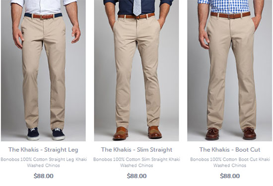
Grid Views
Benefits:
Images alone can give all the information people need to distinguish between products. You can fit and display more products per page so that users don’t have to navigate and browse as many pages saving them time and effort.
Disadvantages:
When poor images are used, it can hurt the user’s judgment of a product because they can only go off of what they see. With grid view, high quality images are crucial to sales.
Examples:
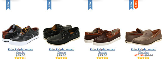
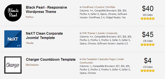
List View
Benefits:
When images are not enough to distinguish between products and more information is needed, a list view gives you room to display more details about a product. However, you still have room to show an image. A list view can also give users direction and flow when scanning.
Disadvantages:
You can’t show as many products per page, otherwise you’ll overwhelm users. Users generally have to filter and sort to find what they want. Creating detailed descriptions for your entire product catalog can take a lot of time.
Examples:
Sorting and Filtering Products
Users need pagination to navigate through products. However, you can’t rely on it as the only way for users to browse your products. The Nielsen Norman Group concluded through testing that users wouldn’t look further than the second or third page. This means if you have a lot of products, you need a way to either bring the products they are looking for to the top or help them filter out the ones they aren’t interested in.
Sorting
Sorting is rearranging the order in which a group of products is shown. For example, if you have a set of cars you’re looking at, you could sort them by price (low to high). When deciding what sorting order you should use, you can start with the defaults of:
– Alphabetical
– Price
– Date
– Most Popular
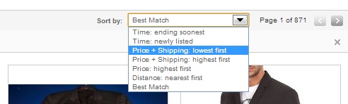
However, there are others you can use that are specific to your niche. For example, Ebay understands that people may want to find products that are ending soon or newly listed. This sorting order is specific to Ebay’s product auctions.
You also need to consider whether you are going to include a separate button to ascend and descend the results or are you going to include it as a choice for users to sort. For example, Ebay puts “Price + Shipping: lowest first” and “Price + Shipping: highest first” as two ascending and descending choices in the dropdown list.
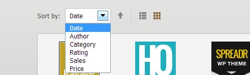
Whereas Themeforest chooses to put an arrow by “Date” to let the users choose an ascending or descending order by clicking the button. Both are good, but Ebay may have a better method because offering it as a choice in the dropdown list makes it clearer for users.
Filtering
Sorting isn’t the only way you can help users find the products the want. You can also help them narrow down their product choices by offering them filters. Filtering is when you want to only see products that meet your specific criteria. For example, choosing to see only red cars will filter out all the rest of the cars that aren’t red.
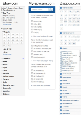
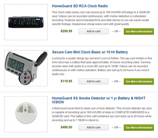
Myspycam filters their spy cameras by items such as a clock or smoke detector, by locations such as a home or office and by feature such as motion detection or sound recording. All the user needs to do is tick the checkbox or click the link.
You’ll also notice that the categories show how many products are inside each one. This allows the user to get an idea of how many they are going to get before they click it.
Remember the goal of the category page is to help users find what they are looking for without them wasting extra clicks to the product page to check if it’s what they want.
Your filter options are going to depend on the products you are selling. Both Ebay and Zappos are selling clothes, so their filters are things like size, color, styles and so on. When you analyze your own products, think about how people would look for them. Try giving users filters with specific product criteria that would help them move faster towards their purchase.
One case study shows that by adding product filters to the left-hand navigation you can increase your conversion rate. However, another case study shows that you should avoid placing filters in areas that interfere with product display because that can decrease your conversion rate.
Always Remember to Test Your Design
All of these are ways to help the user better, but you need to test that it actually does! There are two methods: split testing and usability testing. You can think of these as testing before and testing after. With usability testing you can test your new category page with real users.
The other is A/B Testing, in this case it is a lot harder because we would be split testing paths instead of a simple change on the website. Split testing will give you statistical proof that what you’ve done has increased the conversion rate of the page. If you are working on a client’s site, you want to be able to show them how your work has improved their site.
Moving From Category to Product Page
When you optimize your category page, you’ll help users find the products they’re looking for easier. This increases the chances of them moving to a product page where they can view details about the product. To increase your conversion rate, you have to optimize each page in the buying process. That’s how you can turn your eCommerce store into a successful one that gets sales.
Book

Affiliate

Thumbs up for some new tips and insights, thanks 🙂
Great Article. It’s amazing how getting a category page right can really help user flow through the site and increase conversions. It may not seem like a big thing to designers or marketers, but its one step that if done well can really help the users of the site and search engines too. Great Post!
Fantastic post – it’s great to see something that goes in depth about the category page. We wrote something similar on our blog but it covers conversion rate optimisation for ecommerce in a more general sense: http://jolora.co.uk/blog/7-ways-boost-ecommerce-conversion-rate/
Shopping online is going to improve like never before. People are increasingly getting online for shopping on everything.
Its crazy to see people opting e-com sites for their shopping requirements.
The web exp is increasing everyday with newer technology and design.
Great post and nice illustrations. It will definitely help us, thank you.