The usability standards for buttons are higher for mobile apps than desktop apps. With a smaller screen and finger navigation, mobile buttons must be easy to tap, read, and recognize. Most solid buttons meet this standard, but text buttons rarely do. Before you use text buttons on your app, here’s what you should know.
Text Buttons Are Harder to Tap
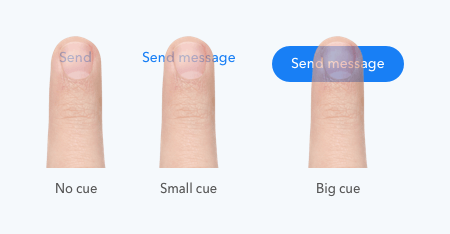
A finger is larger than a mouse cursor. Placing it over a smaller target feels awkward for users. Their finger covers the button’s text with no visual cue to confirm if the action registered. If the text label is long enough, users have a small visual cue but still not enough of one to assure them they’ve hit the target.

The small size of text buttons forces users to move their finger with precision to hit the target. More precision requires more effort from users. They have to keep their eye on their finger and the target to ensure they tap the text button.
The lack of straight edges makes the borders harder to distinguish and the button harder to target. Solid buttons don’t present this problem because they have a larger target and straighter edges.
All Caps Text Buttons Are Harder to Read
To combat the tapping problem of text buttons, some designers style their text buttons in all uppercase. Google’s Material Design system promotes this button style, but it has its flaws.
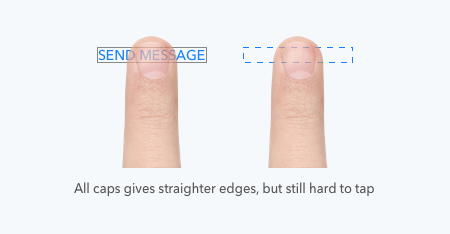
All caps does give the text button straighter edges and a larger target. But this isn’t much better because the target is only slightly larger and the text style reduces readability.

All caps text buttons are harder to read, especially for dyslexic users. Users rely on the shape of letters to identify words. Uppercase letters don’t have contrasting ascenders and descenders, making words harder to read at a glance.

Text Buttons Are Harder to Recognize
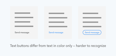
The only difference between text buttons and text is color. This similarity makes text buttons harder to recognize, especially for color-blind users. Without a distinct shape, users are more likely to overlook text buttons and miss the call to action.

What to Use Instead of Text Buttons
Many use text buttons for their secondary action to show that the button is the lower priority one. But there are better ways to do this that won’t hurt mobile usability.
Outlined Button
One way is to place an outline around the text label to make an outlined button. This makes the border of the button visible to give users a bigger and clearer target to hit. Their finger can land anywhere on or inside the outline for the action to register.

The lack of a solid background color prevents it from competing with the main call to action. A light yet visible outline is ideal, so it doesn’t clash with the text label.
Lightly Shaded Button
Another alternative to text buttons is to put the text label on a lightly shaded button. A lightly shaded button distinguishes the button borders and background without competing with the main call to action. The shade should almost blend into the background but still maintain enough contrast for visibility.

Which Has More Visual Weight
Both button styles work well as secondary actions. But the lightly shaded button has slightly more visual weight and feels better to press. The background gives the finger a solid target to hit instead of a thin outline.

When Text Buttons Make Sense
There are cases when text buttons make sense. Instead of using them for secondary actions, use them for tertiary actions. Tertiary actions don’t get as many taps and don’t need as much prominence. Primary and secondary actions are more important, so they need more visual weight.

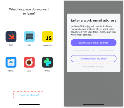
Another case when text buttons make sense is when users need help with taking action. Use text buttons when you need to provide users with contextual information to help them choose the best option. Text buttons prevent users from perceiving the help as a call to action because they don’t compete with the other buttons.

Don’t Abuse Text Buttons
It’s easy to plop down text buttons on your interface because they don’t take much effort to design. But the consequence of doing this are frustrated users who have trouble reading, recognizing, and tapping your buttons. Don’t take the lazy way out and abuse text buttons. Your call to actions may contain text, but they should always look and feel like buttons.


Thank for your useful article ^__^
Might another reason not to use text buttons is to keep them distinct from links?
Thank you for the great article on buttons and mobile usability. What are your thoughts on type size and hierarchy for text-only buttons? Should they be made larger, smaller or the same size as other calls to action?
Great article. Thank you 🙂
Precisely why I always disliked iOS design guidelines