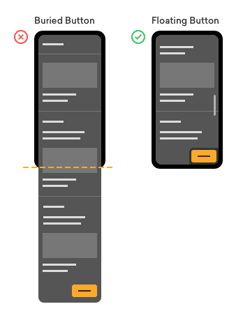
Flick, flick, flick, flick! That’s the sound of the user’s finger scrolling down your long mobile landing page. Eventually, they’re going to get flick fatigue and abandon your page if they don’t see the call-to-action button.
The user’s attention and energy are finite resources. Once it exceeds a certain point, they’ll call it quits and move on. If they can’t tap your call-to-action button when they’re ready, you could lose them as potential customers.
There’s nothing wrong with a long mobile landing page. It’s what naturally happens when you condense content to fit the width of a mobile viewport. The problem is the call-to-action button buried at the bottom of the page. When users are ready to act, it’s nowhere to be found.
Most designers assume that users scroll from the top to the bottom of the page and end their experience there. However, their scrolling behavior varies depending on the content they’re interested in. They may not always end up at the bottom of the page. Sometimes they’ll end up somewhere in the middle, which means your button needs to be visible at that moment for them to take action.

Instead of burying your button at the bottom, use a floating call-to-action button. This type of button sticks to the top or bottom of the screen and stays with users wherever they scroll. It allows them to take action whenever they’re ready.
Long landing pages that need a floating call-to-action button are those that have more than two full-screen scrolls. Avoid using them on short pages because it can block the content viewport with no benefit for the user. Also, try not to make the button and button bar too large to prevent too much content obstruction.
Most mobile landing pages already require a lot of scrolling. There’s no reason why you should add more effort to their task by burying your call-to-action button. Keep it visible and floating so that taking action is only a finger’s reach away.


Hi Anthony, you’re correct, this is a good solution BUT (yeah, there’s always a BUT ), it also depends on implementation and usability testing. It’s really annoying to try to scroll just to always touch that floating CTA. On those cases, most users will abandon the site, so it would be more or less the same as having the CTA on the bottom or no CTA whatsoever.
I know this is sometimes used as a dark pattern, but those genuinely interested in solutions like this should pay close attention to user testing
Not sure what you mean. You don’t need to scroll to touch the floating CTA. That’s the whole argument for a floating CTA. Are you saying users will accidentally hit the CTA when they scroll? If so, just don’t make your CTA so tall and wide so that there’s more screen space for scrolling. Before assuming that users will accidentally hit the CTA, you should follow your advice and usability test that assumption.
Arguably a better solution is to prioritize the CTA to earlier in the content. If explanatory text is needed, the CTA should immediately follow. If no explanatory text is needed, the design can prioritize it higher in the page.
From testing a floating control with users (for CTAs, for chat buttons, for other controls deemed important by site owners), the control often obstructs content, does not correspond with what the user wants, and gets mis-tapped.
When testing with users who have smaller viewports or who have font sizes scaled up, these features angered them (even in simple designs with very brief CTA text). It contributed to a smaller amount of readable text and forced more interaction and risk of a mis-tap (mis-taps climbed in all groups tested).
In testing with screen reader users or mobility-impaired users, the position in the DOM matters very much. It interfered with explore-by-touch and, when paired with smaller viewports or zoomed text, made avoidance even more difficult. It also made voice control problematic (as it obscured some controls).
In testing with sites that used any other fixed content (header, footer, navigation, cookies message, sign-up modals, etc). these additional fixed controls reduced the readable area even more and, were the tests not structured, would have caused the users to quit the task completely.
Obviously testing with users can help mitigate some of these challenges, but the best place to address it is in the design (and copywriting) portion of a project. Using a floating CTA approach should be a signal that the necessary work was not done up-front.
I believe what Fabio was saying is that often a FAB can get in the way of someone’s ability to scroll. If it’s omnipresent, and on the right side, that’s in a really easy to tap area and could be frustrating for some users if they constantly, by accident, tap it when really ally they’re wanting to do is read through the main content on the page