Are you displaying your modals optimally on mobile screens? A modal window on a desktop screen shouldn’t look the same on a mobile one.
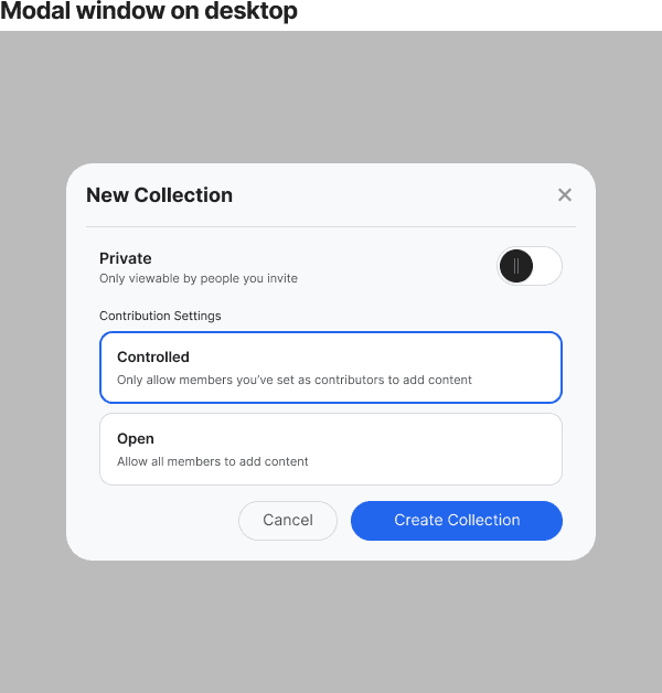
Desktop modal windows open in the center of the screen with a transparent backdrop. Users can see through the backdrop to the parent screen as the child window is overlaid on top. The window has ample room to display content, and the buttons are easy to click.
There’s no problem with this layout on a desktop screen, but it causes spacing and content issues on mobile. Not only that, but it makes the buttons harder to touch.
Subscribe to read the full article
Become a paying subscriber of UX Movement Newsletter to get exclusive access to this article and other subscriber-only content.
Book

Affiliate
