Form abandonment is like someone agreeing to meet up with you but then canceling last minute. Users who are interested in your site have no trouble starting the form. But when it comes to completing it, it’s easy to find reasons not to.
Select Menus Slow Users Down
One common reason is if your form contains multiple select menus. Research shows that forms with select menus often get abandoned because they take more time and effort to complete.
Flow Interruption
Most forms begin with text fields where users type in their input. But when a select menu appears, they have to move their hands from keyboard to mouse to select an option. This switching interrupts their typing flow and slows them down.

Hard to Read
Once they open the select menu, they have to scan through the options and select the right one. Doing this takes time and effort because the option text is hard to read. It looks like a lengthy list of items scrunched together with minimal line spacing.

Dexterous Mouse Maneuvering
To make a selection, the user has to point their mouse on the right option without straying off it. This action requires dexterous mouse maneuvering because it’s easy to land on the wrong one if they don’t go slow and steady. The menu is limited in size and has minimal padding between the options. Moving the mouse just a few pixels too far leads to a selection error.

After users make a selection, they have to check to see if they selected the right option. Then they have to move their hands back to their keyboard to prepare for the next text field. All these actions add up and make select menus a challenge to interact with. It’s no wonder why users abandon forms that have them.
Excessive Arrow Keying
Some users may use their keyboard to make a selection instead of their mouse. But this is an even slower experience. They have to press the down arrow key to scroll through each option. This task is tedious when there are many options.
![]()
Mobile Picker Flicking
Desktop users need extra dexterity when maneuvering through a menu. But mobile users also need dexterity when flicking through options in a picker.

When users open a mobile select menu, a picker wheel is displayed. They have to flick their finger slowly to land on the option they want. If they’re not careful, they can over flick and select the wrong one. The scrolling forces them to fiddle with the wheel to get it right, which wastes their time.
Not only that, but options with lengthy text get truncated with an ellipsis at the end. It’s hard for users to select the right option when they can’t read the entire label.
Better Alternatives to Select Menus
You should avoid using select menus on your form as much as possible. There are better alternatives that don’t slow users down and interrupt their task flow.
Radio Buttons
It’s far better to list out the options with radio buttons instead of cramming them in a select menu. Each option remains visible so that users can scan them without having to open the menu. They have more spacing to click each option and won’t get punished if they overshoot their target.
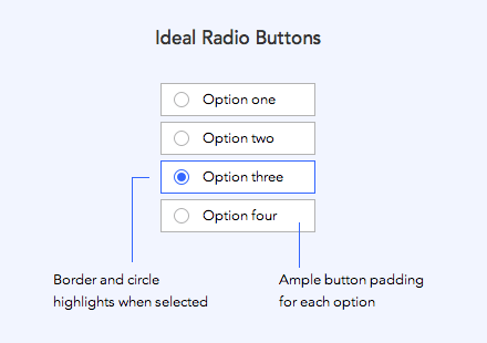
When users click a radio button, they get immediate visual feedback. They don’t have to scroll through the menu again if they click the wrong one. All they need to do is scan the options and click.
Radio buttons should look like buttons. They should have ample button padding and a clear border around it. When it’s clicked, activation should show through a change of color and shape.
Autocomplete Text Fields
When you have several options to display, use autocomplete text fields. These allow users to type in their input to get suggested choices that match it.

The more the user types, the more specific the suggested choices become. Users can save time by selecting a recommended option instead of typing out their entire input.
Autocomplete text fields should display the option that best matches the input first. You should distinguish the user’s typed input text in the suggested options. The option text that matches the input text should highlight with different color contrast.
When to Use a Select Menu
The only time to use a select menu is when users could give you a vague answer instead of a specific one you want. For example, if you’re asking users for their ethnicity, they could type in ‘Asian’ instead of ‘Chinese’ or ‘European’ instead of ‘German.’ To get specific answers, you have to provide those precise options in a select menu.
From Start to Finish
Users start forms more than they finish them. Don’t give them a reason to abandon your form by using the wrong control. The last thing they want to do with their time is maneuver and flick through a select menu.
Many sites work hard to get users to their form, but then lose them by making it hard to fill out. Think about saving your user’s time so more of them go from start to finish.
Book

Affiliate

Hi Anthony and thanks for the article.
Another major issue with the iOS mobile picker is that the list elements are centered instead of being left-aligned -or right-aligned for languages written RTL. Although the list looks nicer with equal spacing on the elements’ sides, this makes it quite hard to scan the list as the eye must travel more to locate the beginning of each item.
Cheers
Luca
Thank you for describing the problem in this article. I really enjoyed reading this article. The solution with radio buttons is really great and 100% better and effective.
Thanks for writing this piece! I am also not a fan of the select box when it can be avoided. Would you happen to have any supporting research?
What do you suggest for a long list of options. For example a selection of material, when the options are predefined. In my case I’m looking at well over 10 options – followed by a second group of 7 options.
In this case I think radio buttons would be a huge mess because there are just too many options.
I agree that mobile pickers can be fiddly – however, aren’t they what mobile users are most used to from date picking, setting alarms etc….