Did you know that pure black text can cause eye strain? A survey found that “58 percent of adults in the U.S.” have experienced eye strain from working on computers. Designers can do their part to reduce the likelihood of eye strain on their designs by paying attention to the color of black they use.
Pure Black Text on White Backgrounds
Pure black text on white backgrounds can cause eye strain when users read the text over an extended period. White has 100% color brightness, and black has 0% color brightness. Such a disparity in color brightness creates intense light levels that overstimulate the eyes when reading text. This causes the eyes to work harder to adapt to the brightness.
An example that illustrates this concept is when we turn on a bright light in a dark room. Such a drastic change in light conditions is harsh to our eyes. But if we turn on a dim light in a dark room, our eyes adapt to the change easier because our retina isn’t overstimulated by such a sharp increase in contrast.
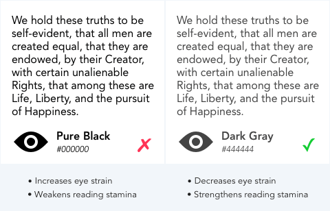
Instead of black text, use dark gray text on a white background, so the change in brightness isn’t as drastic. This prevents overstimulating the retina and allows users to read for a more extended period.
A research study found that “black text on a white background overstimulates the OFF ganglion cells while white text on black background overstimulates the ON ganglion cells.” This finding means that “white text from a black screen could inhibit myopia, while black text on white background may stimulate myopia.” The study advises against reading black text on a white background due to the striking effects of contrast polarity.
White Text on Pure Black Backgrounds
There’s also reasons why you shouldn’t use a pure black background with white text. A pure black background kills all light emitting from the screen. This makes eyes work harder and open wider since it needs to absorb more light. When this occurs, the white letters can bleed into the black background and cause the text to blur. This effect is known as “halation” and it affects users with astigmatism, which people of all ages could have.

Instead of a black background, use a dark gray background so that more light emits from it and the text doesn’t bleed. Doing this decreases eye strain and strengthens reading stamina.
High Contrast for Accessibility
Pure black isn’t harmful to all users. Low vision users, who are sight impaired but not blind, tend to read text better with pure black text or white text on a black background. When designing for them, you may need to use black for an accessibility mode. For normal-sighted users, stick with dark gray over black to prevent eye strain.
Balanced Contrast for Better Readability
High color contrast is useful for readability. Too high of color contrast, however, creates a significant disparity in light levels that affect the user’s eyes when they read. A balance of contrast between the text and the background color is an effective way to make your text safe for the user’s eyes.
If you’re unsure about your color contrast, you can use a color contrast checker to find an optimal range that works for you. It shows you when your color contrast is too low based on accessibility guidelines. However, it doesn’t indicate when your color contrast is too high. That decision is left for the designer’s careful eye to decide.
Text color isn’t limited to black and white, but it’s the most common color combination for text. Before designers use it, they need to think about how it affects the user’s eyes. Designing to reduce the pain of eye strain means users can spend more time reading and enjoying the content on your interface.
Book

Affiliate

My vision is a bit wonky as the result of a TBI I suffered as a child. (My advice? Don’t ever try to pick a fight with gravity.) I was cortically blind for a brief period of time, currently lack binocular vision as my left eye is almost as lazy as a scarecrow, and have a very bad case of light sensitivity. That said, I generally do better with darker colors in life. I prefer night to day as their is less color to “confuse” my eyes and brain. On electronic devices, I prefer red text on black background, but I rarely get to choose a preference. However, when I have designed web pages, for accessibility purposes, I have chosen black text 000000 on white background FFFFFF due to the desire for sharply contrasting color. Having said that, there should be a way to allow the user, rather than the UX designer, to choose a preferred color scheme. Has anybody thought about creating a “choose your own color scheme” script? If a website developer wants to be able to reach as many people as possible, why not insert a browser script in the website to change various color scheme settings. After all, I might like FF0000 for text color, but somebody else is going to prefer C32FAA, chosen at random since I have no way to know what somebody else might like. I don’t think this would be that difficult to do with a text field and a button using JavaScript, or whatever scripting language you prefer. The only colors you would need to control for would be text, unfollowed links, followed links, and background. You’d still have to make sure that your color schemes wouldn’t make any graphics you choose to include difficult to read, so having borders included in the creation of images, not an img or style sheet border addition, would be necessary. I haven’t actually tried to do this yet, but only because I hadn’t read this article yet. Like many, I am not a fan of some of the advice given here, but I’ve always been more solution oriented than just complaining about a problem, even if that is a necessary step to come up with better solutions.
I agree with Glenn, in that it’s important to let the user decide what is the best contrast for them: Pure black or Dark grey for text. I am a designer, transitioned to UX/UI design as of few years ago. When I was doing mostly graphic design work which involved print, for aesthetic reasons, and perhaps reducing harshness, I would use dark grey a lot. I even have done that in website design and digital documentation and still will do. But these days, I am working on a design system. When looking and comparing the grey text and black text (specially when altering the background) I can see visible declination of accessibility. This is regardless of theory and hypothesis. I am only talking based on my own vision experience. I only have been mild priscription glasses as of recent that include a bit of astigmatism. With or without glasses, I am finding the grey text harder to read, specially when put on none white backgrounds. This is just my real life observation, and not a theory. My hope is that we get an opportunity to test with a wide range of audiences – which is almost impossible, and when we can’t let’s allow the user to select between a soft, med, high contrast depending on their vision. A bit more work upfront, but perhaps more accessibility and desirability for users.
What a load of rubbish. The grey text is illegible snd hurts my eyes – cannot read articles now!
Another reason to avoid full black as the background or foreground is that most displays are less standard, (gamma 2.0 vs sRGB), and are calibrated most poorly near black. This causes the subtle levels used for smoothing fonts to be incorrect.
I think you are completely wrong about this, and this movement has done great harm to large numbers of people. You’re also guilty of significant ageism.
I’m reasonably certain that lighter text is fine for younger people. But once a person hits middle age and above, when the ability to accommodate (focus far to near and back again) and when the lens of the eye begins the long, slow process of hardening (which will eventually result in cataracts in the senior years), this is no longer the case. Reading gray text for extended periods causes people who are no longer young to get eyestrain, not the other way around.
Please, ignore this bad advice. Use black text on a white background!
The title of your article is simply hilarious .. and ironic .. and hypocritical.
‘Why You Should Never Use Pure Black for Text or Backgrounds’
in black text?
And it also depends on the person. My mum prefers white background with darker text and I prefer the other way round. That does indeed include white on black.
If you were to talk about bright yellow on white that would be one thing but you’re talking about something that is very common.
Why don’t you also start telling publishers to stop having white pages with black text? I know there are some technicalities here that make it a bit different on screen but not enough. You can’t say you used the title as a demonstration either as that came later. The title doesn’t need a demonstration. You flat out said to not use pure black text with black text.
And as for pure black this is asinine. Something is either black or not black. Black is the darkest colour from the absence of or complete absorption of light (skin colour is not relevant here). The dictionary will tell you this (in fact to simplify it I even included the definition right there) but so will other sources. As soon as you start adding some colour it’s technically not black.
Of course there is further irony: your title seems to be bold which makes it even brighter which is actually one of the problems. But still why don’t you follow your own advice?
At least as of Feb 2025, the header text you’re referring to is actually colored in Dark gray #222222, while the sub-headers later on are indeed in #000000 full black. For me personally (nearly 50 years old, working with screens all day) I much prefer the dark gray/white versions (or similar concepts like solarized color themes) over hard black/white.
appreciate this, toying with off-blacks/greys right now!
A lot of this depends on the quality of the user’s screen. The worst thing is that web designers usually have really expensive, perfectly colour-calibrated monitors – and most of the rest of us don’t. I suspect that a very slightly above black (e.g. #141414) is a good compromise. Incidentally, getting the antialiasing right really matters – find a font that is really well “hinted”, and use a high-DPI screen.
The only thing the author is guilty of is providing a poor example with #444. A better approach would be to use a shade closer to #222, which effectively balances reduced eye strain with a high contrast level. According to WCAG standards, this would achieve AAA contrast compliance. The other concerns mentioned seem to me to be edge cases. For applications or websites where the product owner considers accessibility a priority—especially for users with visual impairments—dedicated accessibility versions can be implemented to address those specific needs.
That #444444 really hurts my eyes, just looking at the sample! I think it also messes with users’ minds. We expect to see black, so our minds try to convince us that it should be black, but yet it’s not, so we strain our eyes, trying to see it as black, when it’s just this sort of faded off-black. Next to the true black sample, it painfully looks like black that was just left out in the sun too long and faded to this weird color that we have to adjust to.
It drives me completely crazy, and I just spent a lot of time having to fix a doctor’s website because, due to all the gray text, it was nowhere near ADA compliant. This is a lawsuit risk for anybody in the healthcare professions.
Now I know why so many sites add to my eye strain with gray text on a white background. I fail to see the logic in having light text on a glaring white screen. I keep my monitor brightness turned down to reduce eye strain. With brightness turned down, gray test is unreadable.