What your buttons say is as important as how they look. Using the wrong words on your button labels cause users confusion, more work, and slower task times. If you want to make it easy for users to take action on your app, you need to choose the right words on your button labels.
Here are five rules to help you choose the right words to make your buttons actionable. Follow these five rules, and your users will have no trouble taking the right action on your app whenever they see a button.
Rule 1: Use Action Verbs
Your button labels should inspire users to act with action verbs. When users read an action verb, they know what the button will do. They can take action without reading any supporting text such as confirmation dialog.
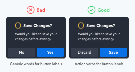
Compare that with generic “yes/no” button labels often used on confirmation screens. Users have to read the dialog before they can take action. If they skip or misread the dialog, they’ll press the wrong button. Passive labels not only make it riskier to take action, but it forces users to do more work.
To illustrate, the example below blocks out the dialog so that only the buttons are visible. The button labels with action verbs allow users to take action, but the buttons that use “Yes/No” labels don’t. Action verb button labels are more task-efficient.

Rule 2: Use Precise Diction
Each action verb you use has a specific connotation. If your diction isn’t precise, users can misinterpret what the button will do.
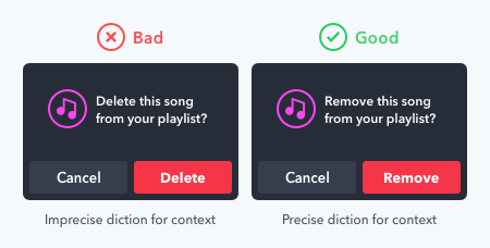
For example, the words “delete” and “remove” are similar in meaning, but different in connotation. “Delete” implies that the button will erase the item from the system. “Remove” implies that the button will separate the item from a group. Using these words in the wrong context can cause users concern when they press the button.
In a playlist, the “delete” label makes users think they’ll lose their song. This diction is wrong because that’s not what happens. The “remove” label is more precise because the action takes the song out of the playlist, but does not destroy it.
Rule 3: Use Task-Specific Language
A vague and generic button label causes uncertainty in users. They’re unsure what the button will do because the label doesn’t specify. Users need to know the result of their actions, and only task-specific language can do this.

To illustrate, the word “submit” is a technical term you can use for most buttons. But that would make the button labels vague and generic. When users read it, it’s unclear what happens because the label is not specific to the task.
In contrast, the word “publish” is specific to online publishing. As a result, users get the impression that the app will post their review to the public after they press the button. This button label is clearer and gives users certainty to act.
Rule 4: Use the Active Imperative Form
Too many words on a button label make users read more. When you use the imperative form in an active voice, you minimize the number of words and make the button label easier to scan.
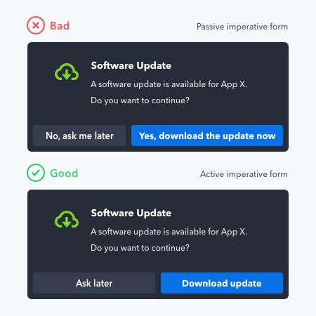
The active imperative form turns verb phrases into commands. This form allows you to drop the subject and unnecessary articles for a more concise button label. All you need to include on your button label is a verb with an adverb or direct object.
Users trust and understand commands on button labels more. It gives them certainty that the button will perform the intended action, which helps their decision-making.
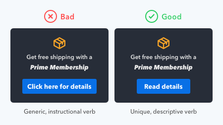
When using the active imperative form, avoid instructional terms that tell users how to use their device. A common mistake is to use “click here” in a button label. This term not only makes the label wordy, but it’s also redundant for the user. Instead, use verbs that are unique and describe the action to incentivize users to “click.”
Rule 5: Use Sentence-Style Capitalization
The capitalization style of your button label expresses your tone to users. The tone isn’t what you’re saying but how you’re saying it. This expression creates an emotional reaction in users that either engages or repels them.
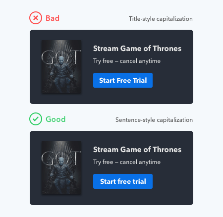
A sentence-style capitalization is best because it conveys a friendly tone that invites users to press the button. Most reading done by users is of sentences, which means they’re most familiar with sentence case. When they read it on your buttons, it feels like someone is speaking to them in a natural voice.
In contrast, title-style capitalization has a more formal tone. A formal tone feels impersonal and makes your buttons less inviting to press. It makes users feel like someone is speaking to them in a stilted voice. Title case breaks the natural reading flow and distracts users from the underlying message.

An all-uppercase style isn’t right because it conveys a loud tone. Users feel as if someone is yelling at them to press the button. Not only that, but it also has lower readability because of the lack of word shape. The lack of shape contrast makes it less accessible for users with dyslexia.
An all-lowercase style conveys a casual and lazy tone in a mumbling voice. It makes users feel as if no one put care or attention into the design. Users can sense a lack of professionalism and not trust the button.
Actions Speak as Loud as Words
The call to action speaks as loud as the words on your button label. If you choose the wrong words on your button labels, the call to action won’t matter.
The five rules will guarantee that your buttons get some action. No longer will users have uncertainty or confusion when they read your buttons. Instead, your button labels will give them clarity and motivation to take the right action.


By and large, I agree wholeheartedly with everything said here. I do just have a couple of quibbles though…
I have a slight problem with Rule 1. I don’t have a problem with the action verbs on the buttons. No, those are great. I have a problem with the question preceding them – and the question is just as important as the available answers. If you are asking the question “would you like to save your changes?”, then, grammatically-speaking, that question literally requires a yes or no answer. I would prefer to see the text preceding these buttons say something like “Your work is not saved. What would you like to do?”.
I know you say the buttons can be read and understood without even looking at the preceding question, but people will read it, and it needs to make sense.
I disagree with Rule 3, on two counts.
First, whilst I agree in principle to avoid technical jargon and to use everyday language, I do not think the word “Submit” is a technical term, as you say. I would say in the online world, it is a very common and well understood word. I would actually argue that the word “Post” is the one that is less common and more open to confusion. Posting something is what bloggers do, or when it comes to reviews, then at least people who post reviews often. The average Joe Bloggs who is being asked to write their first review will have encountered the word “Submit” way more often than the word “Post”.
The second issue is – and again it’s down to grammar – is the user actually posting a review that will immediately appear, or are they in fact submitting a review that will be vetted before it’s posted? Nine times out of ten, I’d say it’s going to be the latter, where the review will have to be submitted by the user, then approved, then posted by the approver. It is not the user who is doing the posting.
One last thing, re. Rule 5. I think it totally depends on who you (the website / product owner) are, and who your customer is.
Yes, it’s good to convey a friendly inviting tone with the title-case option, if you are Netflix asking casual browsers if they want a free trial.
But if you are a bank, and your customer is transferring $1000 into an account, you don’t want casual friendliness. You want authority, trust, gravitas… and in that case, an all-uppercase approach is a good thing. The boldness of it conveys that.
I agree with most of the suggestions here, and I appreciate the good/bad examples. I disagree with submit vs post. I think submit is well understood these days, so it’s probably not the best example of the usage of technical jargon. I also think the word “post” is used largely in a blogging or social media context and it frankly worries me when I see it on a button that is not found within the aforementioned context. I generally assume it is going to post my content somewhere that I don’t want it to.
“Submit” is understood and preferred by you because you’re technically savvy and work in a technical field, but the average user isn’t and does not. In other words, you are biased in your judgment. See my linked article on submit buttons.
@Anthony I would love to see your research behind the “Submit vs Post”. Or is that just your preference? As it stands, I profusely disagree, but I’m open-minded.
As I am working to improve my focus more on front end and developing the front end of my applications with purpose, I found this article tremendously helpful. Especially the note about all uppercase being distracting to users with dyslexia. I never would have thought of some of the considerations you talked about here.
I agree with all of these except for the ‘Sentence Style’ one. That is truly wrong. It is a recent aberration tried by Microsoft and failed miserably in testing. Title Case is much better because the key is not to read the text faster, but to pick it out faster. If you test people on an app the _first_ time they use it, Title Case will slow you down, just as it probably did just now. However, it is much easier to see the shape of Title Case text in buttons than sentence case buttons. I have gone to the mat on this one and am saddened to see it proliferated once again. Testing will bear me out on this, but remember, you are testing on multiple occasions, not just the first one. Test for the right thing.
Can you post your test results? Interestingly enough, a recent email we did with an a/b test produced an amazing 68% more clicks with sentence case. I’m torn because you’re not the first person who believes in title case. But, the proof is in the puddin’.
A great article (as usual). Very instructive.
I invite ou to read the Medium article on UX writing by Google.
I illustrate kind of the same problems with good examples.
Overall, this is a great article, and I agree with the advice.
I have a grammar complaint about the *example* used on Rule 4: Use the active imperative form.
You example of “passive imperative form” is not passive. It is, in fact, the exact same sentence with adjectives and adverbs. If you diagram or parse the sentence you get:
Version 1: (Yes,) download [imperative verb] (the) update [direct object] (now).
Version 2: Download [imperative verb] update [direct object].
Version 2 is better because of the “be succinct” rule, not because of the verb form.
Passive imperatives are rare, but they do exist. Take a passive verb (to be + past participle) and use the imperative mood for “to be.” So “you are fired” has a passive imperative of “be fired.”
Please note:
The presence of “to be” does not make automatically make a verb passive: it must have a past participle after it. “Be first on your block” or “Be great” are imperative forms of “to be”, but they are not passive voice.
don’t you think you should add validation to your website’s search functionality?