Where you place your mobile form buttons can affect task completion and efficiency. If they’re not in a place where users expect to find them, they could abandon their task and your form.
Even spending a few extra seconds looking for the button can frustrate them and cause them to hit the back button. As soon as they finish filling out the form, you should have the button right in front of them.
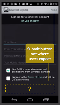
Many mobile sites get this wrong when they place their form buttons in the action bar (i.e. navigation bar). Research shows that users often miss submit buttons placed in the action bar (source). It also shows that they miss save buttons in the action bar and exit forms without saving their settings.
Unexpected Submit Buttons
The reason users miss action bar submit buttons is due to where they fixate their eyes when they complete the form. As they fill out the form, their eyes move from the top of the page to the bottom.

When they complete it, their eyes are at the bottom of the page. The absence of a submit button leaves them confused and uncertain of how to complete the form.
Most users don’t expect to find the submit button in the action bar. It’s an inconvenient place because it forces them to move their eyes all the way back up to the top-right corner of the page.
It feels counterintuitive because users were progressing in a top to bottom direction to complete the form. Moving back up to the action bar feels like going in reverse. It’s not what users expect, and it’s not where you should put the submit button.
Fixing Your Submit Button
Users expect to find the submit button at the bottom of the page when they finish filling out the form. But placing the button there could cause them to lose sight of it if they scroll through the form.

Users might scroll back up to check or change their field input. When they do, they’ll lose visibility of the button and have to scroll all the way down to look for it.
To prevent the extra work, place your submit button in a fixed footer so that it is has persistent visibility. This allows users to submit the form as soon as they’re ready.
Don’t give users extra work when they finish filling out a form. If they have to move their eyes or finger to find or scroll to the submit button, your mobile form isn’t efficient enough.
Unclear Save Buttons
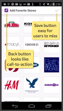
What causes users to exit forms without saving their settings are the unclear action bar buttons. The action bar contains the back button, page title and save button. But the save button is the hardest to distinguish.

After users select their settings, they tend to tap the back button because they don’t realize they have to save. The save button is the primary action of the task, but it’s hidden as a gray check icon in the corner.
Users assume they saved their settings on selection because nothing else tells them otherwise. Not only that, but the page title also looks like the call-to-action when placed next to the back button. The lack of clarity in the action bar is what causes user error.
Fixing Your Save Buttons
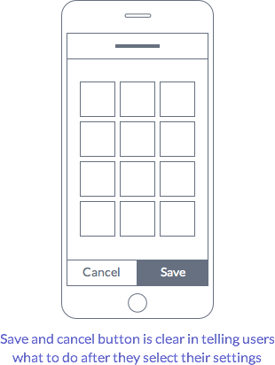
Instead of using the action bar for your save buttons, use a fixed modal form. This gives users a clear save and cancel button without the confusing back button.

The cancel button functions as a back button. But the difference is that it tells users that they need to save their settings before they exit, or they’ll lose them. The save button has a label and is much more visible in size and color.
The only thing that should remain in the action bar is the page title describing the task. The save and cancel button should move to a fixed footer. This gives them persistent visibility so that users can complete the form quick and easy.
Final Thoughts
The action bar is a good place for buttons that navigate pages, but not for ones that complete tasks. Placing your mobile form buttons in a fixed footer makes them hard to miss and meets user expectations.
Form button placement has a big impact on how users complete tasks. Don’t stuff every button in the action bar just because you’re designing a mobile site. Think about task completion and efficiency, and put your form buttons where they belong.


Any concerns about the fact that a tap at the bottom of the screen in safari (on an iPhone) brings up the app tool bar? SO if your on an iPhone, any stickied button really means the user has to tap twice. Really, they have to tap, figure out what happened, move their finger, and then tap again.
Also, on an android phone a sticky bottom bar is very close to the system function buttons. So that concerns me too.
@ray
I was thinking the same thing. I’ve noticed that espn.go.com works around that iOS issue by placing a fixed button approximately 15px from the top of the mobile browser. This offset would feel too floaty on some interfaces, but it does solve the double-tap issue.
That “double-tap” issue in Safari could be a problem in a mobile website, but I think this article is more focused on native apps where this wouldn’t be an issue. That said, Medium’s mobile site has a bottom toolbar UI, and it has that “double-tap” problem… I am curious to see if Medium will change their design in the future.
yeah, except if you loaded up 10,000 apps they mostly all function identically because that is the default apple UIKit standard for view controllers.
The problem here is that a user might have seen 10,000,000,000 websites where they do not work that way, and do not care that “website standards != UIKit standards.”
On a native app there are plenty of reasons to not put buttons at the bottom of the screen, and it isn’t difficult to have your submits at the bottom. It is simply not the default.
The logistical reasons for this new paradigm is to keep navigational elements in the top. NEXT is to the right, BACK is to the left.
NEXT = SUBMIT when there is a form.
It isn’t difficult to get used to at all, and is a minor bit of friction. I would assert that it is less friction that having a button at the bottom that is interfered with by device actions.
Not only that but I’m concerned that people would not scroll the page if necessary. How would they know that there are more questions below?
i AGREE WITH YOU, I MYSELF MISSES THESE A LOT
Nice succinct article! One thing that wasn’t addressed is that when a user is filling a form the keyboard is showing. If the Submit button is at the bottom, the keyboard will be covering it which could lead to (this has happened to me) a user filling in the last entry and looking around for submit not realizing it’s hidden beneath the keyboard.
Any thoughts on how to deal with that? If you keep the footer panel always visible (e.g. right above the keyboard when it’s showing) you might be leaving the user with very little space to see the actual form.
Very hard to make the chyron (“footer panel” you called it) do things like stay above the keyboard, so that’s sadly moot.
First, I use as little typing as possible so it doesn’t come up that much. And if I can mess with the order of the form, I do make sure the last field is not typing so the keyboard goes away.
Then, just make sure there’s white space. People seem pretty reliably inclined to blur fields to see what is next or commit the field. They will click the next one when they can, but if there’s nothing else to click /seem/ to usually “click away” which will also dismiss the keyboard and they can see the whole page again.
Regardless of how, I never see enormous numbers of missed clicks as a result of this tactic.
Ray: No. No concerns at all. I have done lots of user studies and many, many observations specifically of people touching various parts of the screen. I use the chyron a lot (had to come up with a name for a docked bottom bar, so borrowed this from TV production) and have never had an issue.
It is plenty far from the bottom buttons on modern Android devices, and I have never seen a mistaken tap here.
I’ll be clear: Never. Zero instances. Looked up some of my data to make sure I wasn’t forgetful.
On browsers, just make it big enough. The tap area for the Mobile Safari tools is fairly small, so the size I’d suggest still gives you 1/2-2/3 of the area to tap without activating the bottom toolbar. Worst case is that comes up and the user re-orients, since it’s not destructive. (And this is the only browser like this. With 80%+ of users on android, I barely care as most of my clients do iOS specific design second anymore).
Thanks for sharing these examples from my talk. I think it is important to note in the title that this is about Android- not iOS. It looks some of of the readers are trying to apply this article to iOS, and getting confused.
Also Android design guidelines for KitKet and Lollipop prescribe action buttons should be placed in the action bar. In the book I talk about how we struggled with this in user testing with the Silvercar prototype. Should we follow the platform convention, or change it based on some users being stumped? We decided to follow the Android design guide.
The fixed footer might make sense in forms, but not everywhere in app where actions are offered on a screen. Add in the new Floating Action Button control, FAB, and things get really hairy.
So often, next buttons at the bottom require dismissing the onscreen keyboard (brought up by input fields). You can complete a page of forms and not know whether or not there’s a submit button under the keyboard. Therefore, I actually look to the top before taking the effort to dismiss the keyboard.
I’d echo what Ray said and although testing (curious on the sample set) may reveal that it’s not a problem, I’d argue it’s another step in the process to reorientate and another tap (sometimes surgical if they accidentally scrolled in the process). However, if you can determine (analytics) your users are prominetently Android, the sticky CTA at the bottom makes more sense.
What if, the Submit CTA was still inline and at the bottom but, once you’ve determined all (required) fields have been properly entered (use AJAX for validation), you tastefully reveal the Submit CTA (i.e. CSS transitions, auto-slides/scrolls down to make sure the CTA is in view, maybe a sticky/receding bar from the top with the CTA – depending on the size of your form).
I’m also curious if your native keyboard is another option for showing the CTA. For example: to leave this comment, name, email, comment are required. If I went in that order, could you surface a Submit button within the native keyboard?
Just some food for thought as other options.
I totally agree, and actually there’s a whole other part this UX problem of a pattern, and its clash with iOS notifications. I wrote an article about it: “Why iOS notifications are ruining my marriage” -http://hackingui.com/design/why-ios-notifications-are-ruining-my-marriage/
I think that we as UX designers should work to ditch the top right CTA buttons and place more CTA items at the bottom of screens