When users are on the go, the best mobile app experience is a fast one. Although the device’s connection speed is out of your control, you can make your app appear like it loads lightning fast. Here are a few tricks to give users the impression that your app always loads fast even under a slow connection.
Instant & Steady Progress Bars
Progress bars tell users how long an action is taking, but they’re not always correct. You can disguise small delays in your progress bar by moving it instant and steady. The progress bar should never stop otherwise users will think the app froze.
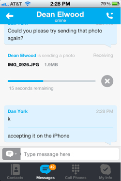
Moving the progress bar fast in the beginning and slowing it down as it ends gives users optimistic expectations. Messaging apps are a good example of this. When a user sends a message, the blue progress bar moves instantly but slows down as it finishes.

Background Operations
Another speed trick you can use is background operations. This works by giving users other things to focus on as a process is going on in the background. A good example of this is uploading pictures on Instagram. As soon as the user chooses a picture to share, it starts uploading.
The app invites the user to add tags, title and description as the picture uploads in the background. When they’re ready to press the share button, they’re unaware of the upload time and can share their picture instantly.

Dummy Wireframe Content
If the user’s connection is slow, It can take a while for an app to populate content on the screen. Making the user stare at a loading bar or spinning wheel can increase bounce rates. To keep users engaged, use dummy wireframe content as text and image placeholders.
For example, the Facebook mobile app shows users gray blocks and lines to represent images and text as the app loads. Once it finishes loading, the images and text appear in place of the dummy wireframe content. This is no faster than having a loading screen, but in the user’s mind, it feels like it is.

How fast your app loads is in the mind of the user. When connection speeds are slow, you can still give users a fast mobile app experience by using these tricks. Users don’t want to wait for content. But if you make it seem like they’re never waiting, they’ll always enjoy your app under any connection speed.


Very interesting way to engage users and trick them about loading time. Good one!
Well , it’s not as if we’re actually being fooled. We’re being CONFORTED. The worst case is when we don’t have any indicator that content is being loaded, so we’re not sure if the process is actually stuck. So progressbars help us feel safe. And they’re telling us something is going on. Yes, I’d rather have a realistic progressbar (with a reliable time indicator if possible) but if this can’t be achieved, Let’s have the fake fallback. As long as it makes us feel better, we’re having a better experience, and that counts.
I’ve never been a fan of trying to trick the end user. While users as a group follow trends, individual users are smart and don’t like being treated like fools.
The first technique really is a trick and it’s a dangerous one at that because it’s relaying false data.
The second technique is an engineering technique and has nothing to do with guile.
The third technique is an old web UX/UI trick from the days of HTML4, when tables would collapse around unloaded images if you didn’t hard-code a size into them. That’s not a trick at all, it’s a layout technique.
Very informative, thanks for the article
Very useful. I have a problem with the “loading bar”, though.
When using Instagram, for instance (but not exclusively), when the loading bar slows down in the end of the process, I can say by experience that 90% of the times the connection is poor and the photo won’t upload. “Oh, here we go again”.
I think in some cases there should be a connection pre-check (if possible). It would be way better if the app said “I can’t upload because your connection is sh**” than make me wait for nearly a minute, watching an “illusion bar” to just tell me that. It makes you feel fooled.
Thanks for your suggestion Andy, I liked your instruction and I would like to share one more article have step by step guide to make feel faster your website. Let’s consider them in details: https://www.promotionworld.com/se/articles/article/180413-how-make-website-feel-faster
Well, these are nice techniques to relax the end-user when the slow speed might up their anxiety. It is always better to keep the users engaged in the scenarios where the speed of internet is not on your side.
The first trick is quite a solution that can literally trick the users into believing that the application is responding fast. But, it is using false information to do so.
The second trick actually engages the user and distracts their mind from the loading speed and is thus a wonderful technique.
The third trick gives the users a feeling of “happening”when they open the application. However, it might fail to retain the attention of the users if the page fails to load within 5 seconds.
If you want to add these tricks to your application while incorporating many other features there are many IT firms to do that. A friend of mine who has an online application for his business spoke highly about Sparx IT Solutions who had embedded these features in his application. You can avail their help if you need to.