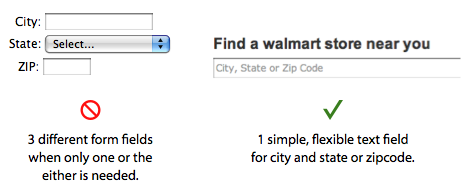
Users use forms to do many things. Finding a local store to shop at is one thing that should take them little time and effort to do. However, most store locator forms are hard to use and take up too much time. This is because they contain too many form fields. At the least, a store locator form will typically have two text fields and a dropdown box.
Why are there so many fields to do such a simple task? When users are looking for a store to go to, they want to find a nearby store quickly and walk out the door. A complicated store locator form slows them down. However, by simplifying the form to one text field, users can find their local store quickly and be on their way.

It’s better to combine all the fields into one because the user only needs to give their city and state, or zipcode to get back adequate results. If you offer all three fields to users, they will naturally try to fill in all three. This is a waste of time when all they need to fill in is one. What’s needed is a flexible text field that can take in different types of information the user chooses enter.
Users can easily enter their zipcode to finish their task. However, it’s necessary to allow users to enter their city and state for when they don’t know their zipcode. Most users are more likely to know their city and state than their zipcode (i.e. a person traveling a lot can easiiy forget their zipcode). Therefore, the text field should allow for that information as well.
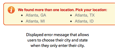
The text field label should say “City and State or Zipcode” so that users know they can enter one or the either. If the user mistakenly enters their city without their state, the form should gracefully suggest the different states the city is found in. This allows users to select their city and state with a click, instead of going back to the text field to type their state in.

It’s easy to see how one simple and flexible text field can do the work of many form fields. This approach works when a text field can accept different types of information to complete the task. It’s a general rule on forms to remove fields you don’t need. In this case, joining all the fields together removed the extra fields. Not only do users get to choose how they want to enter their information, but now they only have one text field to fill out. This is the perfect case where flexibility meets simplicity.


This is a classic example of ” Developer Friendly Versus User Friendly ” ,
having three distinct things to capture city,state and zip would easy the developer to write clean code , but having one text box to capture multi value things would result in clumsy code but would help users very much !
We need to evolve into more user friendly software applications than developer friendly ones ! Good example is given here !
Agree but this should only come after you have identified that the person is looking for a US store location. Its a pain being asked for your State or ZIP code in a country without states using post codes. Also, using the visitors geolocation as a “show stores near me” is nice!
Same thing goes for shipping calculations. Just ask for a zip. If your programmer can’t figure out how to figure out a state from the zip, you should get a new one.
Looking really simple now to use. Thanks.
In the case where the user forgot to include their state, using their IP address’s geolocation to assume the state can reduce the friction even further.