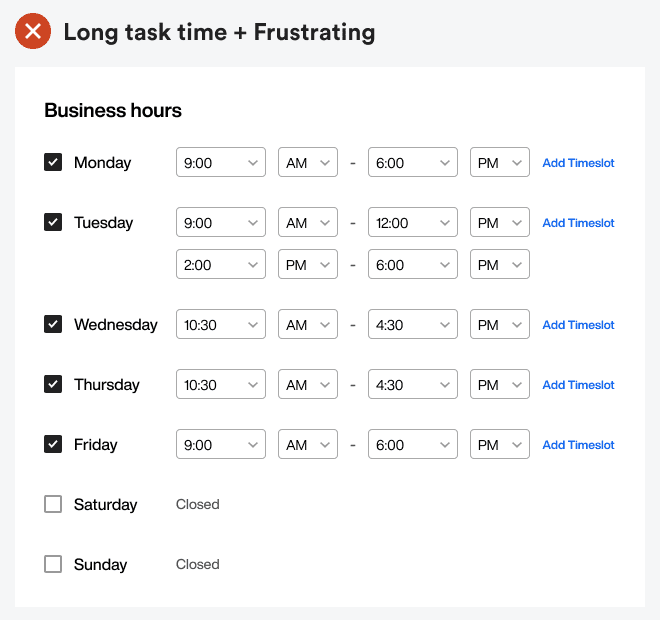
The sight of numerous select menus on a form can discourage anyone from completing it. That’s why designers should stop using select menus for selecting time.
Making this UX mistake leads to a longer task time and frustration. Luckily, there’s a better design approach to make entering time input easier without scrolling through multiple menus.

Subscribe to read the full article
Become a paying subscriber of UX Movement Newsletter to get exclusive access to this article and other subscriber-only content.

