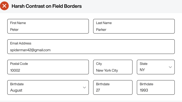
Every designer advocates for accessibility on forms, but they never discuss the issue of harsh color contrast. Increasing the color contrast of field elements makes them accessible but can also distract users from scanning and processing information.
For example, a black field border is overly accessible because it contrasts against a white background to where it becomes a distraction. As a result, it makes it harder for users to read the input they entered.

Subscribe to read the full article
Become a paying subscriber of UX Movement Newsletter to get exclusive access to this article and other subscriber-only content.

