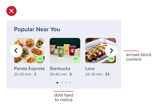
One of the most popular ways to display a content collection is to use the carousel component. Carousels save vertical screen space because they arrange items horizontally, allowing users to browse content without scrolling.
However, carousels are challenging to use on mobile devices. Many users fail to interact with them because they don’t realize there’s more content in a collection than what they see. This failure occurs when the visual cue for the swiping affordance isn’t clear. As a result, users don’t know they can swipe to see more items.

Pagination dots are often used as a cue, but they aren’t easy to notice due to their small size. Arrow buttons are also used, but they’re often ignored because they don’t incentivize users to click. Not only that, but they signify a tapping affordance, not a swiping one. Another drawback is that they block content since they use up horizontal space.
Get Full Access
Get full access to this article to learn more about clearer cues for swiping carousels. Full access allows you to read all current and future premium articles.

