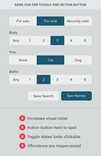
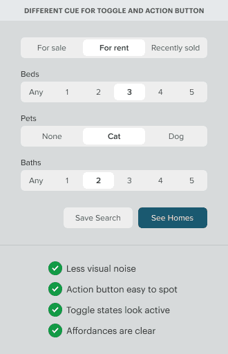
Toggle buttons should never look like action buttons. A common mistake is to use the same color cue on them. Doing this increases visual noise and makes every toggle button look like an action button. As a result, the action button has a weaker signal and is harder to spot.

Not only that but using the same color cue will make the user think the active toggle is clickable when it’s not. An active toggle should only tell users that an option has been selected. But when it uses the same cue as an action button, it causes users to click the active toggle by mistake.
Toggle and action buttons need cues that don’t compete with each other. A variation in cues tells users that they can expect different affordances when they interact with them. It’ll also reduce visual noise and allow users to recognize action buttons easier.

Access Full Article
The full article will show you how to design clearer cues for toggle buttons. You’ll learn different design techniques to apply to your projects. Subscribe below to access the full article.


Wow, a huge difference. The Beds/Pets/Bath labels feel a little lost to me still though. The pets question is obvious, but the other two use the same scale. Is that a concern?