How many ways can users view your content? Chances are there’s more than one. Right now, you’re only displaying your content one way. This is fine if the amount of content you have is small. However, if you have a large site with content that grows exponentially, you should allow users to customize your content.
Doing this can give your users a flexible and personalized experience. Depending on the kind of content you have, there are a few ways you can do this. Let’s look at a few sites that offer their users different ways of viewing content.
1. Text & Imagery
Yahoo News is a huge site that publishes many stories per day with updates every hour. Instead of displaying content in a one-dimensional way, they allow for a few different ways to view content. You can view news stories by headlines only, with summaries or with photos. This gives users a customized experience based on their personal preferences.
Headlines are useful for the intense scanner. This suits users who like to scan and click many headlines at once that meet their interests. Headlines with summaries are useful for the careful clicker. These are users who are hesitant to click on a story unless a brief summary gives them the assurance they need.
Showing a photo that’s associated with the story helps the emotional viewer who would view a story based on its emotional appeal. Yahoo News offers all these different ways to view content to gives users a personalized experience.
![]()
2. Colors
Threadless.com is a site that sells t-shirts. An interesting way they let you browse their t-shirts is by color. This works great for clothes because there are some people who only wear certain colors. Narrowing down the large collection of shirts to only the colors they would consider buying is a great way to display content.

Dribbble.com also makes use of color customization with the designs users submit to their site. This is useful for designers when they’re looking for design examples and inspiration of a particular color. Without this feature designers wouldn’t be able to filter such a large collection of designs by the color they’re designing with.
 3. Size & Quantity
Flickr lets users view images by size and quantity. When you search for an image, you can choose to view images by a small, medium, detail or slide show size. The small view gives users more images per row, but the images are smaller. The medium view gives users less images per row, but the images are larger. The detail view shows the data attached to each image. The slide show view gives users a full screen for viewing images.
![]()
Thrilld.com similarly allows users to view images by size and quantity. You can choose to view images by full or cut thumbnails. You can also choose to view images in 2 or 3 columns. These flexible options allow users to customize the size and quantity of images they want to view. It’s not only what content they’re viewing that matters, but how they’re viewing it that matters too.
![]()
4. Layout
iTunes Movie Trailers allows users to view movies by different layouts. Users can choose between a grid view with movie covers or a list view with movie titles only. The grid view focuses on the images, giving users an emotional and compelling experience for browsing movies. The list view focuses on the movie titles, giving users a useful and efficient experience for scanning movies.
![]()
Metacritic offers a similar type of layout customization. With the thumbnail view users can see the image along with the movie details. It’s a comprehensive view that gives users detailed information about a movie. The movie title view displays movie titles with the review scores only, making the view much more task-focused and suitable for scanning.
![]()
5. Topics & Interests
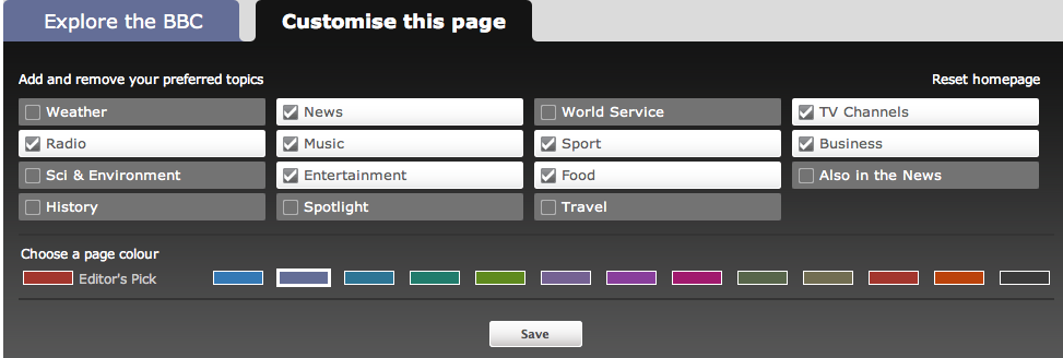
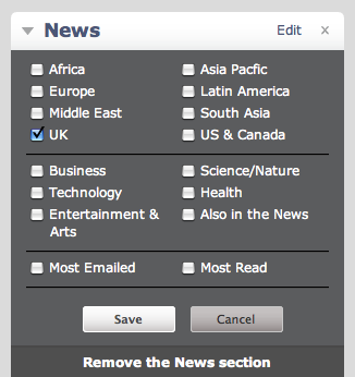
The BBC gives users all the news they want any way they want it. Their site lets users customize the home page based on selected news topics and interests. Users can choose which topics they want displayed on their home page and which topics they don’t displayed. By removing unwanted topics, the home page is much more efficient and personalized. Users can also choose particular interests within topics they want to see. For example, within the news box they can choose which regions they want news stories from. This allows for an efficient, flexible and personalized experience.


Customization among websites is a trend that is starting to grow. They’re useful for large sites with content that continuously grows. If you have a large site with growing content, think about which approach would benefit your users the most.

