Asking users for their birthdate on a form is complicated. Birthdates have various formats depending on the country that consist of three separate data strings. It’s easy to confuse and frustrate users if the birthdate field doesn’t use simple controls and isn’t in a clear format.
The Confusing Way
Users are either used to seeing a birthdate displayed with the month first (month/day/year) or day first (day/month/year). When they see a required format that’s different than what they’re used to they have to think hard about their input.

What users commonly see in a birthdate field is “mm/dd/yyyy” or “dd/mm/yyyy.” Although it may be easy for some users to intuit that “mm” stands for month and “dd” stands for day, other users often get confused by this or they ignore it.
Users might also pause to wonder whether they need to use leading zeros (e.g. 09) for the month or day number. This makes them think about the input format and slows them down.
Another problem is that users may see the required format but instead type the date in the format they’re used to by force of habit. This user error leads to receiving incorrect user data.
The Difficult Way
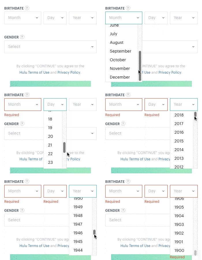
Sometimes the birthdate field is spelled out with Month, Day, and Year labels. While this is less confusing for users, it can be difficult if the user has to scroll through three different select menus.

The number of options users have to scroll through is tremendous. There are 12 month options, 31 day options, and 118 year options (from 1900-2018). Scrolling through this many options is difficult and time-consuming to do.
On top of that, desktop users have to switch from keyboard to mouse when they get to these select menus. Switching causes them to exert more effort and slows them down. It’s possible to navigate them with your keyboard, but few users do so.
The Complex Way
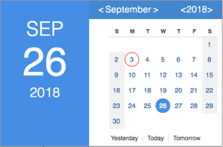
On rare occasion, you’ll find a calendar widget being used to select a birthdate. This is complex for users because they have to click tiny arrow buttons to select the year and month. Since most birthdays aren’t near the current year, users will have to click that button a lot.

When they finally finish selecting the correct year and month, they have to scan thirty-one numbers to find the correct day. These numbers are often in small font and hard to read.
The Clear and Easy Way
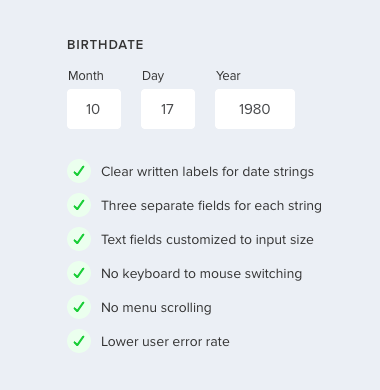
Writing out the label for each birthdate string and separating them into three fields instead of one eliminates the format confusion. Users may have to press the tab key to hop to each field, but if correct user data is important to you, a clear format is essential.

Custom sized text fields are also important for clarity. When you customize each text field to the length of each birthdate string, you’re giving users a visual cue. This signifies them to type the month number not the month name. It also signifies them to type the full year instead of abbreviating it (e.g. 80 for 1980) since the year field is wider.
Text fields are easier to use than select menus and calendar widgets because desktop users don’t have to switch their hands from keyboard to mouse. Mobile users also don’t have to swipe and tap options in the menu wheel.
Too Many Choices
Like the phone number field, the birthdate is a complicated field to design because there are too many formats and controls to choose from. The way most birthdate fields are designed today is confusing, difficult, and complex. Choose the clear and easy way and leave the other choices behind.


Wouldn’t the preferred birthdate format be highly dependent on locale? Where I’m from, neither day-month-year nor month-day-year is the expected format, rather YY-MM-DD.
Seems like a slightly careless blanket statement to make, in lieu of research.
The order of the birthdate strings only matter when you use “the confusing way” format. Written labels prevent format confusion.
If you want to make it extra clear, you can IP locate users and order the birthdate strings by their country format.
Indeed, the XX-XX-XXXX format seems confusing for older folks, or for people with non-latin alphabets, who might never seen it. It is also more clear for older people who are not digital natives. Think thast ou might be internet savvy, but most of the world population isn’t as internet savvy as you, hence “month” is more easily understandable than “MM”, specially for, let’s say, a 50 year old or a greek buyer.
Also, as a frontend dev, I find the IP location solution easier, you can easily implement and script on Javascript that translates the word “year” to whatever language or charset needed, it can be even done at backend level. Going back to non-latin alphabet users, translating the word “month” is done by a translator in the blink of an eye, so it’s not any extra cost, and the benefits are immense.
I agree if the solution is for desktop but for mobile devices the picker still delivers that mobile moment, you don’t need both hands to write a date and its easier to move your thumb up and down than sideways.
On mobile, you still need to swipe through many options. “There are 12 month options, 31 day options, and 118 year options.” In addition to swiping, you’re scanning through irrelevant options to find the right one. This is a lot of finger work and cognitive work.
I think when a page asks for your date of birth it is often part of a form with several text fields. I.e. for forms with date of birth it is likely you’ll already be using both hands.
I like your final solution on desktop. Agree with other comments that I’d probably prefer to flick through to find my year of birth. It’s not too mentally taxing to remember when I was born. I find it to be six of one, particularly on older users.
However this statement: “Although it may be easy for some users to intuit that “mm” stands for month and “dd” stands for day, other users often get confused by this or they ignore it.”
This needs some qualification for this claim. I don’t think I’ve ever encountered anyone struggling understanding a shorthand terminology for something as common as birth inputs. I’d like to see some research you have undertaken that shows this. Otherwise nice article that works through to a solution if not a little linear in its application.
I notice that you say “I’d like to see some research you have undertaken that shows this.” But you also say: “I don’t think I’ve ever encountered anyone struggling understanding a shorthand terminology for something as common as birth inputs.” Just an observation 😉
The Digital Service team of the British government has done some research on using date fields, see https://designnotes.blog.gov.uk/2013/12/05/asking-for-a-date-of-birth/ (also check out the comments) and https://design-system.service.gov.uk/patterns/dates/ (where they only recommend date pickers for dates “in the near future or recent past”. So, I think Anthony’s article is in line with their research.
Well said
Any tips on how to address this within native mobile apps? There seem to be a lot of resources out there about how to do this well on web, but very few examples of how this can be done on mobile apps where space is limited. The three separate fields don’t always fit nicely and can sometimes still be a lot of effort for users to tap into.
You can rearrange the fields. Month and Day beside each other and Year below it.
Usually there’s a way that people are used to filling in their date of birth for government forms etc. that should guide how these fields are set up.
Here in Norway, everyone’s national ID number, which is used for all official purposes, starts with a person’s birthdate in the format DDMMYY.
Therefore I’ve started recommending implementing date of birth fields in forms with a single field with that format, because it’s something every adult is used to using all the time. That might not apply to all countries, but I would assume that there’s some similar phenomenon in most countries.
In the “Clear and Easy Way,” your example has the fields filled in. What does it look like without data? I ask because I wonder if anyone would enter a three letter abbreviation under Month like JUN or MAR etc.
Would there be a hint or no?
No hint needed. A numbers only input constraint would solve that.
Hi!
I like your articles, but can’t agree with you here. From my experience, some users would have to use mouse to switch to next field (which takes time and needs accuracy) – as they don’t use TAB key.
In case you want to make them auto switch to next field when first is filled… that’s wrong too for users who actually use TAB key. Why? They will fill that first input, get auto-switched to another field without noticing, press TAB (so she can get into “day” input) and gets to “year” input out of nowhere. MUCH confusing 🙂
About rearranging fields: Best way would be to ask for country first (if needed) so you can auto-arrange fields for default combination in that country (DD/MM/YYYY here in Poland)
Sure, some users might not use TAB, but if you look at the majority, there are far more users who use TAB for text fields than keyboard shortcuts for select menus. Good UX designers design for the majority, not the few exceptions.
How about “The Combined Way” where you use a dropdown for Month and Day, and Text Entry for the Year, or dropdown for just month, and text for year and day? See these links for more discussion of those two options:
https://designnotes.blog.gov.uk/2013/12/05/asking-for-a-date-of-birth/
https://ux.stackexchange.com/questions/91019/best-display-for-date-of-birth-inputs
The very best way. Simple text input field that will parse any format and non-intrusively alert in case of ambiguity like 5/7/80.
The “The Clear and Easy Way” allows user to make mistake unless you have serious validation on month/day/year dropdowns. For instance, If I go by proposed UI, when user selects February then the day will limit to how many days(28 or 29) ? Even after selecting the day, would some years be disabled (29 days in Feb happens every 4 year)? This is extreme example but same validation applies to when selecting month that doesn’t have 31 days.
I think it’s better to improve on “Complex way”
[Suggestion only applies for mobile only]
On rare occasion, you’ll find a calendar widget being used to select a birthdate. This is complex for users because they have to click tiny arrow buttons to select the year and month. Since most birthdays aren’t near the current year, users will have to click that button a lot.
– Make buttons bigger and only have year dropdown
– For mobile, allow user scroll up and down to the month
When they finally finish selecting the correct year and month, they have to scan thirty-one numbers to find the correct day. These numbers are often in small font and hard to read.
– Make calendar view full screen
This way, user only selects what’s possible. No validation needed.
I was trying to find a faster way to input a birth date on this awfully-set up website:
https://is.breezecard.com/marta/signup.do?dispatchTo=displaySignUpPage
Perhaps you could suggest a way or showcase as an example
Hi Anthony,
Thanks for the nice write up of the options. How did you validate which of those options was the most clear and easy? Do you have data to support that conclusion? It would be easier for me to make a case to implement your last solution if I had some data to support it.
Cheers!