Before you spend hours debating with your colleagues and clients on how your navigation menu should look, there’s something you should know. Users spend more time with content links than they do with navigation menus.
In fact, some users don’t even look at menus. What users look at is page content. That’s where they often go to navigate. One firm has experienced this with users in their eyetracking research.
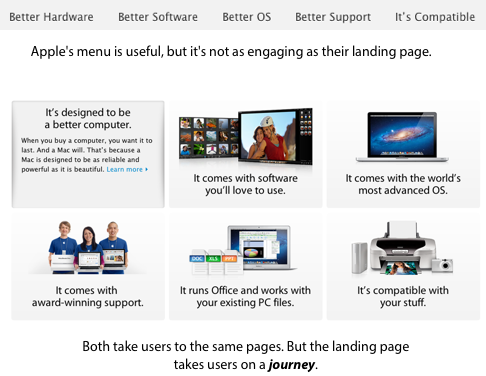 One of the reasons users use content links more than menus is because they’re more engaging and can take users on a journey of what they’re interested in. As users view page content, they can click on links they find interesting.
This takes them to another page of content with links that leads to another page of content with more links and so forth. Before they know it, they’ll have consumed many pages of content through the clicking of content links.
Menus don’t have this engaging effect. They’re a boring list of links on the sides of the page that users only use when they’re already familiar with the site and know what they want. Menus are handy and your site should have one, but they can’t engage users on a level that content navigation links can.
This is because menus don’t come with content. They’re ambiguous labels that have little meaning to users who visit your site for the first time. First-time visitors aren’t looking at your menus to navigate. They’re looking at your content to navigate, which is why you should focus more effort on designing landing pages than menus.
The landing page is where the user’s journey begins. Most designers obsess over the details of their menus because they assume that most users will use the menus to navigate. However, the truth is that most users will use content links to navigate.
While it’s important to have a usable menu, an engaging landing page matters more. If you aren’t seeing many page views, you should worry less about your menus and focus more on improving your landing pages and content links. That’s where users spend most of their time. And if you design that well, that’s where you’ll get a lot of your conversions.
Book

Affiliate

Interesting article and a reasonable conclusion…do you have any specific research or user-testing data that backs this?
Interesting. When I hear “in-page navigation,” I think of links that take a person to content farther down the same page, not to another page. I’m trying to think of an unambiguous term. Perhaps “content-based navigation”? Or just “links in content”?
That said, this observation rings true with me. Much is being said lately about improving landing pages by making them more engaging, rather than devoting more time to defining one site-wide information architecture.
In many cases — perhaps most — both need attention, but I’ll bet the take-home I get from this post is on target. And that’s to be sure that navigation menus are functional, but don’t worry about them beyond that — at least not until after you’ve invested significant effort in making your pages themselves perform flawlessly.
I call those ‘jump’ links. You certainly got the take-home message of this post. Well-done.
I think it’d be good for you to clearly define what you mean by “in page links” and how it is different from what you call “jump” links and links found inside copy. I think it’d be easy for anyone to call all three “in page” navigation.
I think by saying that the top navigation wouldn’t be used is a little bit of a stretch. The main nav on Apple’s site is the only consistent navigation on the site. You can get to all of their products from that top nav. Sacrificing real estate on every page is ridiculously unrealistic for graphical navigation. On a landing page? Sure. On a promotional page? Ok.
However, what I think you’re dancing around is the idea of dropping a big dropdown for a simplified main nav with no dropdown and offering some sort of graphical representation of the subpages on that “landing page” overview.
That makes sense and is a decent argument, IMO. Then again, comparing the ability to catch attention between a bucket of dropdown links and a stack of beautifully designed “mini banner ads” is like comparing a Kia to a Ferrari.
Good comment Nick! In fact big dropdown menus can engage user in specific way and show him (or her) additional content or navigation.
God showcase you can find on Superdit: http://tiny.cc/drop-menus
Of course, we can’t fully compare menus to content navigation, but we also can’t ignore the importance of this element in user journey. When user is lost, menu can help find himself. And we must remember that 🙂
I’m a little surprised that this is news to anyone who spends more than a minute a week online.
Good bloggers, and by that I mean informed, skilled writers who blog, have used hotlinks as attribution and evidence for, oh, for-freaking-ever, easily better than 10 years. Hotlinks take the reader deeper into a given article or topic. Menus are for unpacking the writers’ interests, a secondary or tertiary order of importance.
When I’m reading an article online and the editor/writer has not bothered to put links in obvious places, my esteem for him or her plummets. It’s as if the writer utterly fails to understand the tool he’s using, like typing on an unplugged IBM Selectric.
My high school students must know and use both MLA attribution and hotlinking, depending on audience and media.
Thanks for this. We’ve been having this discussion within our team for the last couple of months. I’ve experienced this in my user testing – people just don’t look at the local (on-page) menus once they decide where to go.
I call this strategy “contextual linking” because the links are in context, which is much better than ambiguous words on the side of the page.
Carrie, thanks for sharing your user testing experience with us.
Hello Anthony,
This is a useful observation or rule-of-thumb to share.
These “in-page links” are all about linking from one piece of (hopefully useful) content to another, where as menus are about linking to pages or sections of a site.
The important difference, I suppose, is context, and that helps to manage the user’s expectation about where this link is about to take them.
In my work, I’m beginning to try to help people design content for their users, and that might include this kind of “in-page linking”. To that content, we can obviously apply an architecture, and then an overall navigation design. Also very important, as a couple of your commentators point out.
Does this idea also apply to web applications? I am thinking No because the websites deal with content and in the web apps I am involved with its all about function.
Would be interesting to hear more background information around the eye-tracking research that informed this. In my experience users who have set tasks in mind (of their own creation) when visiting a site almost solely rely on a global navigation, however if users are given a vaguer task or are asked to find content of interest then they will concentrate more on content navigation.
Very interesting article, thanks.
It’s all about developing a sound content strategy. UX design is more than designing boxes on the page and navigational elements – it’s about doing the research and figuring out the keywords, interests, and links that will drive users deeper into the site and respond to the call to action.