The email address is one of the most corrected form fields. It’s easy to mistype because the input contains a long string of various characters. This can lead to users submitting an incorrect email address. Is the solution to make users retype their email like the password confirmation field?
The Email Confirmation Problem
Designers believe they can prevent this by adding an email confirmation field. This may prevent some incorrect submissions, but not all, and at a cost.
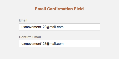
Many users tend to copy and paste their email field input into the confirmation field. This defeats the purpose of the confirmation field because users can end up pasting an incorrect email. The confirmation field does nothing to prevent them from mistyping their email.
One research study discovered that “60% of the test subjects consistently copy/pasted their e-mail when they retyped it in a confirmation field”. Users copy and paste their email often because retyping it is too much work. The users also didn’t believe that they would mistype their email but were surprised when they did.
The email confirmation field does not solve the incorrect submission problem. Not only that, but it forces users to do more work than they’d rather do. Users can end up making typing errors in both fields. This will cause them to spend more time correcting their input which can frustrate them.
Redesigning the Email Field
If you want to increase correct email submissions, you need to redesign your email field. You’ll need to change your email field’s placement, sizing and labeling.
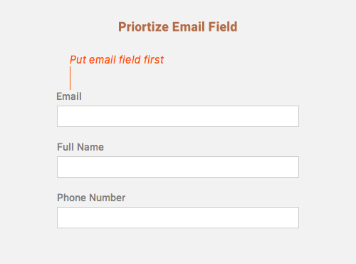
Place the Email Field First
Filling out forms is a mundane task. Users tend to rush through them because they want to move on to their next task. But when users rush they’re more likely to make typing errors.
Placing the email field first can prevent this. This is because it’s the start of the form and they don’t feel the need to rush. Placing the email field in the middle or at the end of your form is not ideal because that’s when users get tired of typing and are most eager to finish.
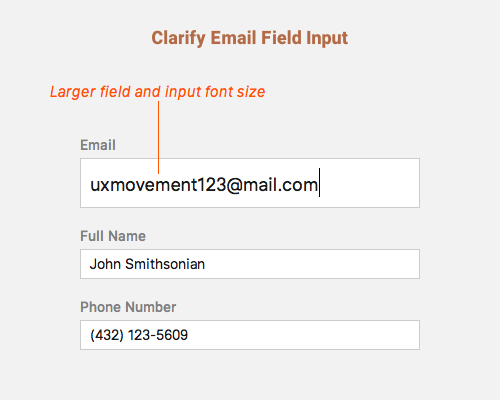
Increase the Size of the Field Input
The email field is the most mistyped field on sign up forms. One study illustrates this in their data table at the bottom. It’s important to increase the size of the email field to help users notice their typing errors.
Many forms use too small of a font size for their email field input. If users make a typing error, it’s harder to notice. When the font size of your field input is larger, users are able to identify specific characters easier. This will help them spot typing errors at a glance when they check their input.
You can make your email field larger than the others but that may give your fields inconsistent styling. Instead, you should make the email field expand when the user selects it. The font size of the input should also appear larger. When the user unselects the email field it should return to its normal size.
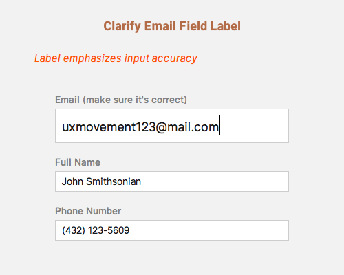
Emphasize Input Accuracy in the Field Label
Most designers label their email field “Email”. While this is short and straightforward, it doesn’t emphasize the importance of input accuracy. If you want users to double check their input, your field label should stress that.
A field label such as “Email (make sure it’s correct)” reminds users to check their input after they type it. This is important to emphasize because most users don’t believe they’ll mistype their email, so they don’t bother checking their input.
All You Need Is Clarity
Not all form data have the same level of complexity. The email field deserves special treatment because its input is more complex than other fields. It contains alphanumeric characters and symbols that make it easier to mistype.
It’s time to take a new approach on how you design the email field. The solution is not another field to fill out, but to give clarity to the existing field. Prominent placement, larger input size and a specific label are what you need. Make this change and kill the email confirmation field once and for all.
Book

Affiliate

I agree fully with this article. I believe you can add another point though:
If the user is going to make the mistake of typing their email incorrectly in the first field, then they’re just as likely to make that exact same mistake again when they type it again in the second field. This will be due to the muscle-memory of the fingers repeating the exact same movements as they did just a second ago.
The label “Email (make sure it’s correct)” look like a “Hey stupid, type it correctly this time”.
I don’t think it’s usefull…
I agree on this… +1
It depends on the person and mood, some might take it offensively, some not.. worth a research and then argument
If you want to make an omelette, you have to crack a few eggs. Don’t focus on the cracked eggs, focus on the delicious omelette.
I agree with you, It’s not necesary create double field email.
I could add one tips, for example if I typing errors the input should change the bacground red (alert) this change means that there area error of typing
What you write about adding an alert presumes that you know that the user is making errors–which is impossible in majority of cases (misspelled name, transposed digits, etc.–no way for a system to “know” this and alert user to it).
I concur, horribly annoying, but even worse is when you can’t copy and paste from your Password Manager of choice and have to retype your credentials, thus opening the door further for possible keystroke logging malware intrusion.
Well, the post makes sense for a sign up form.
However there are times when we need to use *Confirm Email* field. For example when we allow a logged in user to change their account email in their account settings.
Now a wrong email ID there (a typo) means that the process for new email is never started. There will be no confirmation email to the new ID, and when users notices it in the inbox of current/old email, it is a useless exercise for him to do it again. No?
You can perhaps solve that by having the system ping the address for validity?
I don’t think implementing a confirmation field is the optimal experience for this use case. I would suggest sending a confirmation email with a validation code. The change can be considered completed once the code is retrieved from the email and entered on the email change form.
Most of the websites don’t allow you to use copy/paste of your email adress in to the second validation field.. it’s annoying, but it’s working.. i noticed this many times..
One of the sites we developed uses this technique. We do not allow the copy/paste feature in both fields and for a while even the Chrome’s email saving feature was not working as well as intended, but it seems it is now. We have a strong point though to not disturb the user’s browser but our client insisted on making this feature. It turns out it worked. Again, the approach here is valid. My opinion is that if you need a confirmation of the email field, then send a confirmation email. There is no way a user can receive the confirmation if their email was incorrect in the first place.
Agreed. If you want absolute email confirmation, send a confirmation email.
Disabling copy/paste is a terrible experience for the user that will only increase their frustration. Being forced to type their email twice is frustration number one. That’s why they try to copy/paste it in the first place.
Then they try to copy/paste it but it doesn’t work. Now frustration number 2 sets in. But this one is exceptionally frustrating because there is no error message that tells them they can’t copy/paste. So confused users are selecting input and copy/pasting it into the field and wondering why it’s not showing up. After a few tries they realize that copy/paste isn’t going to work.
Frustration 3 is now the concern of whether the problem is with their computer or the website. Some users may copy and paste random text just to check that the function actually works and that it isn’t a computer issue.
Disabling copy/paste is user-unfriendly. It not only frustrates users but wastes their time. Opt for the methods in the article that allow you to get the correct email the first time.
Totally agree.
I hate it, so much that when paste is disabled most of the time I just give up on signing up and close the page–the website then loses any business they might have gotten from me.
I can understand having to re-enter a password hidden behind asterisks (*) but emails are not hidden, you can see them in plain sight, so there should not be any reason to re-type.
I’ve gone to the trouble of popping open DevTools to see if I can disable the paste-protection via editing the markup–sometimes I get lucky and can just remove an inline script reference and it works. I think I once used the console to set a needlessly disabled field’s value via JavaScript. Am I insane? Probably.
Would it make sense to ask for only email, send the “e-mail address confirmation” email, and once you click the link in there, you fill in more details such as password, username, etc? The idea being that if you need to confirm the email do it as early as possible.
I really like this idea. By simplifying the most important part of the sign up process, you’re going to limit mistakes.
you right !
Also you don’t have to check for the form of the email, it’s clearly impossible to to do the right job there.
I have emails with emoji as domain 😉
For me, putting the email field so close to the top would cause me worry: “do these guys just want to harvest my email?”.
I agree on not asking the user to re-type the email field but maybe echoing it back with JavaScript next to the submit button would be less condescending than “make sure it’s correct”?
I really like that idea. I think it’s a very elegant compromise.
In some cases you could add a dialog box before proceeding to he next step asking the user if the email provided is correct. In this case the user will be forced to read the email and check its correctness. It adds another step but it is easy and quickly enough.
Nice, I’m always interested in people spinning the ‘done thing’ on it’s head.
I wonder whether it’d help to break up the e-mail box into two inputs; first is the section before the @, then a label with an ‘@’ in the middle and the host after that in a second input.
Certainly something worth to try.
A couple of notes:
1. In your CodePen demo the Email label is missing your recommended text “(make sure it’s correct)”. Your demo should reflect your recommendation. Just sayin’.
2. To enhance the experience when clicking the email field, add transition: .3s; to the input class, that will make the field grow and shrink in a more comfortable way.
Very well thought out post. Putting the email field first is such an obvious improvement to the structure because it’s the point of contact. As long as you have the email address, you can correct the name anytime.
Such a simple, but crucial improvement. Nice work!
It’s also worth questioning a UX that solicits an email address. There are more sympathetic alternatives such as supporting Google/Facebook login etc.
If it’s critical to collect the email address, another approach is to make that the sole focus of the form. The rest of the required information can be requested via an email to that address.
A couple of question to the community:
– has anyone tested the error rate on the no-email-confirmation pattern? Example: how many people have misspelled their email and created duplicate accounts, or had to contact customer service to get it fixed, etc.
– how can the interface handle dyslexia or people that type very fast and continue trucking thru the form? It feels wrong to me to just blame the user for their mistakes, regardless if its for a disorder or carelessness.
Do you have a source for your statistic “60% of the test subjects consistently copy/pasted their e-mail when they retyped it in a confirmation field”? I feel like that is the starting point of your article and very critical.
I would like to implement your suggestions but I need proof to convince my team.
The page to that source no longer exists but it was this URL: https://joshwayne.com/do-you-need-a-confirm-email-field/
Side note HTML5 inputs include a type=’email’ and the browser performs a string validation to make sure the string is correct.
This validation only tells you that the email is properly formatted, not that it belongs to the user that is filling out the form. HTML5 constraint email validation also appears to invalidate valid email addresses with quoted-string local-parts; IPv4 and IPv6 address literals for the domain; and, depending on the browser, non-Punycode internationalized domain names. It also doesn’t take into account that a top-level domain cannot start with a number to distinguish it from an Internet Protocol address.
In the websites I create I always add validation to the e-mail field, so it checks for the presence of “@” and “.”. Also, it tests the typed domain against a list of most common ones. So if there seems to be an error, it asks the user to correct or confirm it. For example, if the user types “johndoe@yaho.com”, a validation just below the field ask him “Did you mean yahoo.com? Change or dismiss.”
Love the pattern of enlarging the email field. I’ve never actually seen this done in the wild. I do wonder if this action might look inconsistent (“why did that just happen here?”) but I would think the pros of it far outweigh this negligible con.