Every eCommerce website has a segment of users who add products to their cart but never end up buying them. What can designers do to prevent this? Here are a few design tips that’ll help lead users all the way through the checkout process.
1. Keep Browsing Features to a Minimum
The checkout process is about making a purchase. That’s why all browsing features, from left-hand menus, product category filters to search bars and latest products feeds are redundant. Content-rich checkout pages distract customers from their purchasing task.

Once users proceed to checkout, the website should switch from being a showcase to a purchase finalization center. You can always offer a ‘go back to your shopping’ option, but don’t clutter the page with unnecessary features.
Instead of distracting users with browsing clutter, offer a simple and distraction-free user interface. Make use of whitespace and create a clear and focused layout. By keeping the browsing features to a minimum, you’ll be able to direct user attention towards completing the purchase.
2. Show the Multi-Step Process
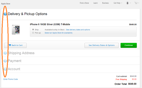
Checking out is a multi-step process. Make sure to keep users informed about what step they’re in and how many steps it takes to complete the process. Clear multi-step numbers and labels will clear up confusion and prevent users from abandoning the cart when they can’t see the end of the process.
Also, letting users know that they can modify or cancel the order at any step of the checkout process is also important. It assures them that any mistake made when placing their order can be corrected without restarting the process.

3. Add ‘Back’ buttons
Right before directing users to the payment page, you should provide them a summary of their order with a clear ‘Back’ button. Knowing that they can go back and change the data they entered or modify their order is a great relief to users. Even if they made a mistake, they know they can correct it at any time during checkout.

Some sites make the process of going back problematic by means of pop-up windows and error messages – make sure not to repeat their mistakes. These can be very annoying, especially for those who are finalizing their purchase on mobile devices. Sometimes it’s best to keep the checkout process to one page only.
Should the user want to revisit previous pages, all data they entered in forms must be saved. Typing the same data all over again is a cumbersome user experience. The key here is to use a session data storage system, such as $_SESSION or WP_Session, which stores semi-permanent data ranging from user interactions to shopping carts.
4. Make User Registration Optional
Never require users to register an account before they can shop. Give them the option to register during the checkout process. Why spoil their shopping experience and not wait until they’re ready to buy and willing to take the time to register?

Still, for some users, registration is a nuisance. Asking users to login or register in order to proceed requires considerable interaction investment from users. You’re asking them to remember their info and fill out yet another form.
That’s why it’s best to provide two purchasing options – one for registered users and guests. The latter will of course have to fill out a form as well (shipping address, payment info), but giving users a choice in this matter is already a step forward to improving the user experience. This is important if the product is not something users buy regularly.
5. Allow for Easy Order Modification
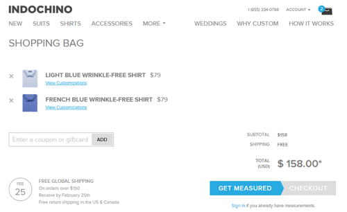
Users are bound to make mistakes going down the purchase funnel. Allowing customers to correct and modify their order in the middle of the checkout process can prevent abandonment. Provide a ‘Remove’ link next to each and every item. Making users type the number zero in the quantity field is less convenient.
Place the ‘Continue Shopping’ button somewhere close to the order specifications. This way when users spot a mistake, they will be able to correct it immediately by choosing a different item.

The right design of the checkout process will prevent what has in recent years become the bane of the online retail industry – the growing shopping cart abandonment rates. Designers need to keep user expectations in mind and aim for a simple, functional checkout process that helps finalize the purchase.


I think a couple other things that are quite important are missed:
* Show shipping estimates on the shopping cart
Shipping can often be a significant factor in a purchase, but don’t hide the shipping rate until the very end. Allow an estimate to be seen even if the user is not logged in, simply by entering a zip/postal code.
Also, be up front if you don’t ship to the user’s location.
* Keep the cart for a long time
Many sites store the cart contents in a cookie or server-side session that expires after 24 hours, or when the browser is closed. This is a mistake. Set the expiry to something really long (months), or even better, don’t expire at all. Sometimes a user may not get to the purchase today (they were busy, they were trying to decide on an option, comparing other sites, whatever), but that doesn’t mean they’ll never purchase.
At the very least, if a user does abandon their cart, if they ever make their way back sometime later, they may be reminded of the purchase they had forgotten about and make it anyway.
Amazon is actually very good at this part; they will tell you when something in your cart is no longer available or has changed prices. Not everyone needs to be this sophisticated, but at least don’t erase it after a day.
Hi Greg,
Thanks for adding more information about these checkout forms.
I like the upfront shipping estimate, this could have a vastly impact on the conversion. I like to add some upselling idea to this.
If you put “no shipping above 50 dollars/euros” right beside it, upselling gets even better. But mind the extra clutter you have to add.
Can I ask you about this comment part: “Also, be up front if you don’t ship to the user’s location.”
How can you detect the location of your visitor upfront? Or did you ment if they put in there address etc.?
I think you can easily detect users location by their IP address.
What I’ve seen that really helps with shopping cart abandonment is Live Support (proactive chat) software. So when a customer has stopped making progress towards completing their transaction, the proactive chat will invoke a pop-up or graphical invitation to the visitor to enter a chat with one of your customer service people to help with the transaction.
i think You missed one thing “Keep the cart for a long time” because it helps you a lot for more than one day cookies storage. it must be needed.
Back button and easy modification “Delete” button, this is such a great trick. This is implemented on my site. Thanks, Monique Rivers.
Hi Monique Rivers, This is a really gorgeous post. The first, second, and fifth point are really helpful I will be implemented in my web. Thanks for such a helpful content.