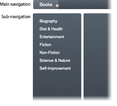
Most websites with large navigation menus overwhelm users by showing them too many items at once. This happens when the user opens a dropdown menu in the navigation. The more choices you give your users, the longer it’ll take them to make a decision. You don’t want users spending a lot of time in your menu figuring out where to go. You want them spending their time on your page content. If you want to simplify your navigation, dropdown menus are not the answer. Here are some better ways to do your navigation.
Show Sub-Navigation Items After Click
There is no need to show users all of your main and sub-navigation items at once. This is overwhelming and does not help the user make sense of a website’s content structure. You want the user to have a sense of how the website is laid out. You also want them to make a decision as soon as possible so that they can start engaging with your website. To do this, only show your main navigation items first. Once they have clicked a main item, use the sidebar to show them your sub-navigation items.
This approach allows the user to get to content in a progressive manner so that they’ll know exactly how to get back to that spot again if they need to. Taking them to the main item page first also allows the user to see other content of that general category that they normally would not see had they jumped to a sub-item immediately. Main item pages are great for showcasing the most popular content for a category.
 Use a Small Down Arrow to Show Sub-Items
Expert users who use your site may want to get to a sub-item immediately without having to go through the main item page. A way you can give your expert users a shortcut approach without overwhelming them is to place a small down arrow next to your main navigation items. When they click the down arrow, it’ll display the sub-items for them. When they click the main item text, it’ll take them to the main item page.
This approach allows for both novice and expert users to navigate efficiently without being overwhelmed by seeing too many items unexpectedly. It’s ok to give users a lot of menu items if they click on the shortcut arrow to ask for it. Many dropdown menus display a large amount of items before the user is ready for it. This can frustrate many novice users who visit the site for the first time.
Next time you’re thinking about using a dropdown menu, think again. There are better ways to do your navigation, and these are two excellent ways that won’t overwhelm or frustrate your users. Users should not have to think when they see your navigation. Showing too many menu items at once will slow users down and make it harder for them to choose an item.
Users also need to understand how they got to a page so that they can navigate back easily. Forcing them to a sub-item page before they go to a main item page can prevent users from getting a sense of the website structure. Simplify your navigation menu by avoiding dropdown menus and giving users a progressive navigation approach.


Hi Anthony… any ideas on creating a mobi nav with 114+ menu items… These are individual chapters of a book, left nav burgerstyle – each nav opens main page per chapter. I’m thinking accordian for mobi RWD. I use a similar format when frames were in vogue that worked well for this item. I had a scrollable frame on left/ content on right of frame.