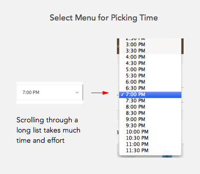
Scheduling events and meetings online require user time input on a form. But selecting a time isn’t easy when users have to use a select menu. Research has shown that users often abandon forms with select menus.

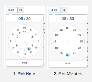
It’s time for designers to get rid of the select menu and offer users a clock widget to select time. The calendar widget is already in prominent use for selecting dates. It’s intuitive because users are familiar with how calendars work. The clock widget would have the same effect.
A clock widget is faster to scan than a long list in a select menu. A select menu would need to include both AM and PM time which would double the length. A clock widget would only need to display the numbers once with an AM or PM button.

It’s also faster to select because users don’t need to scroll through a list. All they need to do is look at it like a clock. It not only saves time but it also prevents mistakes. The user can mistake an AM time for PM time if they scroll to the wrong end of the menu. Users won’t make this mistake with the clock widget.
When users click on the text field the clock widget will appear. Users will then click the numbers to select the hour and minutes. The hours dial will display first and the minutes dial will display after.

If you have international users, you should use a 24-hour clock. But use a 12-hour clock if most of your users live in a 12-hour clock country.
Select menus are a pain for users to use. Save them time by giving them a clock widget to select their time. More designers should use a clock widget so that it becomes the new standard. If the calendar widget can work, the clock widget can too.


Hmmm… This design pattern does not seem to be keyboard-operable, I would seriously define this as a dark anti-pattern until this widget is accessible to all users. ‘User experience’ designers: Do not use widgets that are not designed to be accessible and inclusive for all users!
I think your solution present a little messy interface. It’s ok in the logical point of view. But visually is very polluted. I don’t know the right solution. You consider IoS solution with Day and time picker who provide a straightforward interface for managing date and time selection? It’s possible use this principle in others contexts?
Even if your users live in a 12 hour country, there are good reasons for providing the option of a 24 hour clock, as they may work with the military, aviation, logistics, or other arenas that use such a clock. Besides, some of us simply prefer it.
Many years ago I worked on a project where users needed to enter specific moments in time (for example, 10:32am or 16:54). As you mentioned, select lists are horrendous, but I also found that clock widgets, while good for selecting approximate times, were not sensitive enough to more exact selections.
Similarly, the same users needed to enter birth dates, which most calendar widgets make tedious through select lists, drilling down through poorly-arranged month/year/decade selectors, or hitting back-arrow buttons dozens or even hundreds of times.
In my experiments, I found that the fastest and most accurate interface in both cases that still ensured valid input was to provide the user with sets of buttons that minimized clicks while being laid out in a more intuitive manner. It also uses simple, straightforward markup and supports keyboard access, tons of formatting options and even time zones! And, when I was done, I decided to share it with the world:
https://www.ama3.com/anytime/
Although the default styling is now quite outdated, you can jazz it up with more modern, custom CSS (or even jQuery UI themes). It’s not quite open source, but you can use it on any website that’s freely and publicly accessible (even if the website sells other things).
“The user can mistake an AM time for PM time if they scroll to the wrong end of the menu. Users won’t make this mistake with the clock widget.”
I completely disagree, more often that not I click the wrong hour on these things as they are usually in a small space on my mobile.
I think most people are quite capable of typing 11:30 within a second or two. Select menus aren’t even necessary so long as the field hints at the correct format.
The best way to input time is through a keypad. A good example is Yuriy Kulikov’s alarm app.
( https://goo.gl/7M6h0I )
I appreciate your efforts in offering a new standard for this interface as I am not convinced that a selector is the best method. However, can you back up your hypothesis with testing? I am not convinced the clock is the new standard interface either. Case in point, up until recently, I typed a number when I wanted to set an alarm on my phone, now, due to the latest Android OS update on my device, I have to select a time on a clock and I find that it actually requires me to think in order to do so.
I understand that I am not “everyuser” however, visually, a calendar is still a date reference standard. I would argue that the numerical display of time is more standard than a clock display which is where I feel this falls apart.
Usability issues aside, there is no easy way to implement this on all browsers and devices consistently. Only latest Android has a native time picker that works like this. On all other systems you would need to build your own widget using JavaScript and that has it’s own difficulties.
Certainly an improvement over select menus.
A simpler solution: two text fields. One for hours, one for minutes. For a 12 hour clock, add a pair of radio buttons for AM/PM.
This is a creative and inspiring solution, never thought of it this way. But I am not sure if the users will interpret it as a clock…..Especially the 24 hour clock. That aside, the numbers are very close to each other. What if I end up clicking the wrong one? Also will it translate directly to mobile? It is too close in proximity….
How about using a plain masked input text field? I feel that might actually be the simplest solution.
Couldn’t the inner numbers be for the hour and outside numbers be for minutes so everything is on one widget?
The primary method for time input should be the keyboard. Clock widget can be used only as a (masochistic) alternative to keyboard input.