Nutrition labels have looked the same for decades. But the FDA plans to redesign them. By comparing the old and new, you can see why the new design is faster to scan and easier on the eyes.
Increasing Text Size Increases Visual Acuity
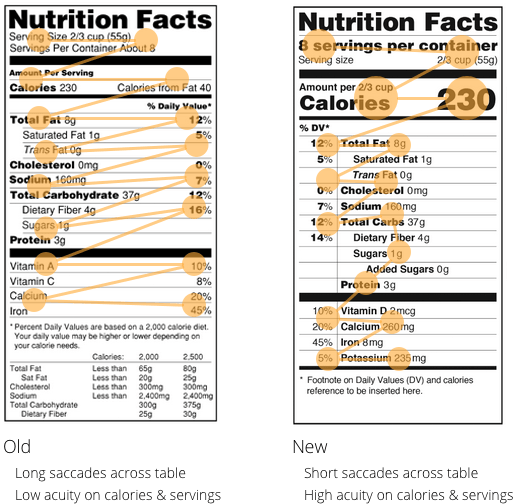
Notice how the title, calories and servings are the first information pieces you see when you look at the new nutrition label. This is because they are the largest text in its space. When you increase the size of a text in relation to the text around it, you increase the visual acuity for the larger text. This makes important information quicker to spot. The FDA is putting importance on both calories and servings. In the old nutrition label, the text size of every information piece is the same. This lowers the visual acuity for any particular information piece.
Closer Text Alignment Shortens Eye Saccades
The old nutrition label forces users to have long saccades when they scan. This is because the table aligns the nutrients and % daily value from each other with too much whitespace between. The new nutrition label shortens eye saccades by eliminating the whitespace and aligning the two information pieces side by side. Instead of whitespace separating the two, there’s a vertical line. The shorter eye saccades allow users to scan and compare nutrition values faster.
Final Thoughts
Increasing visual acuity and shortening eye saccades improves text readability. Larger text sizes are effective for increasing visual acuity. Closer text alignment is effective for shortening eye saccades. Apply these readability principles to your user interface, and you’ll make it faster and easier for users to scan information.
Book

Affiliate

Bigger font = good.
One query: I know it’s only a mock-up of a design but surely it’s wrong to include a value for cholesterol.
Isn’t cholesterol something the body makes when we eat fat rather than something that’s in our food?
Cholesterol exists in some foods as well 🙂
Looks like “Calories from fat” is gone. That’s not good. Ah, but “Added Sugars” is a nice improvement.
Calories are calories, The value of calories from fat is actually very easily obtained with simple math if you *really* want to know it, which is not the general public..
My wife is in packaging and this will make her life a living hell but I think it all makes sense from a design/UX perspective..
Thanks for this interesting article. Agree with lot of things but not with the place of the value of servings in the first line. I think it would be better with a vertical alignment with the value of calories in order to make use of Gestalt grouping principles and help the user read.
This was great! Can’t wait for your upcoming content! What have you got planned for us?very nice… i really like your blog…