“It doesn’t matter where it’s placed as long as it’s there.” This is how designers who don’t understand user experience think about buttons. In UX, every detail matters, especially button placement.

Buttons work like door knobs. People wouldn’t be able to use doors efficiently if door knobs weren’t placed in a consistent area. But because they are, everyone with a hand can walk through doors without much thought. The placement convention of door knobs across doors creates an unconscious habit in people.
Users Are Creatures of Habit
Like door knobs, buttons need placement conventions. Consistent button placement allows users to move through apps like they move through doors.
Most apps fail to follow a button placement convention and end up breaking the user’s habit. This leads to errors between what the user wanted to do and what the app actually did.
Case Studies
Here are a couple cases where a lack of button placement conventions caused users to commit serious errors. What guides users are not always their eyes, but their habits.
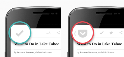
Pocket learned that “new users were instinctively tapping the Archive Button to go back, expecting the Up Button to be there. The Reader would close, but the item they saved would disappear, and they would return to their list empty or missing their article” (source).

The checkmark icon they used for the Archive button doesn’t look like the icon for the Up button. But because they placed it where the Up button would be, user habits kicked in and led them to tap archive when they meant to go back.
Pocket thought removing the Up button and moving the Archive button a few pixels over wouldn’t do much harm. But these little details affect the user experience because users are creatures of habit.
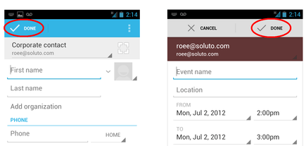
In another case study, one user was confused when he was setting up a meeting because he “filled in all the details, invited a couple of people, and then accidentally cancelled it” (source).
The two button labels ‘cancel’ and ‘done’ are different. But the user still made the mistake of tapping ‘cancel’ because the button is in a place where the user expects to see ‘done’.
It’s said that “the hand is quicker than the eye”. But in this case, “the habit is stronger than the eye”. Designers need to take this into account and set button placement conventions for their apps.
Follow Button Placement Conventions
Whether you believe the ‘cancel’ button belongs on the left or right, set a convention and follow through with it on all pages of your app. This consistency sets user expectations that’ll reinforce their habits.
When you don’t follow button placement conventions, you violate their expectations. Don’t leave them frustrated and confused. Reinforce their habits, so that they can walk through tasks as easy as doors.

