Many designers assume that center or right aligning their website logo will make their brand more memorable. Research has shown this assumption is not true.
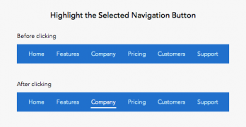
Users rely on navigation bars to find information they need. If your navigation button labels and states aren't clear, they'll have trouble navigating.
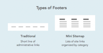
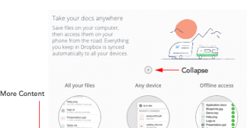
Years ago it was common practice to place a link to your sitemap in the footer navigation. Those days are over because the footer has become the new site map.
Is the user interface an extension of the user or a separate entity that speaks to the user? This is a question designers need to answer when labeling their menu items.
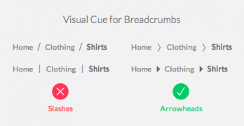
If you’re ever lost in a large territory, the first thing you’d want to know is where you are. Once you know that you can figure out how far you are from your destination.
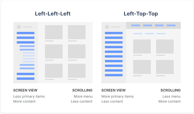
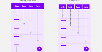
How well could you use a website if your hands had limited muscle control and movement? One task you’d have trouble doing is scrolling through web pages.
What do you notice about the website above? It doesn’t have a navigation bar. The text links are floating in space and obscured by the background image.
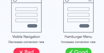
Did you know that your website navigation can affect your conversion rate? Several studies have found that minimizing navigation on signup pages increases conversion rates.
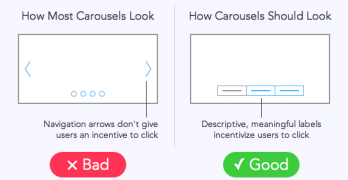
A website study found that out of 3 million home page visits only about 1% clicked a carousel slide. How could a large, graphical element on the home page get such few clicks?
Most modal windows on the web take over your screen when they open. They pop up on the page and block you from viewing the content underneath until you close it.
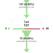
Every user who visits an eCommerce website is a potential customer. A successful online store is one that converts a high number of visitors into buyers.